What rate of return does it take to attract money into community renewable energy?

Scores of towns and villages around the UK are working on community energy projects. Micro-hydro is planned in Sheffield, more wind turbines are promised in the Forest of Dean and PV in Newport is in the middle of fund raising. To get local people to invest, the schemes need to offer a return on the capital employed. Rates offered to investors vary from about 3% to over 10%. What is the right level to pitch the projected returns on your project? I’ve put together a table of many of the successfully financed projects over the last couple of years to help deliberations. Most UK community renewables projects use an unusual form of corporate organisation for their schemes. Quaintly called an ‘Industrial And Provident Society’ or ‘IPS’, this structure has offers several advantages to communities

  • It is quick and cheap to set up and run.
  • One variant - usually  called a ‘BenCom’ because it must be conducted for the ‘benefit of the community’ - restricts the owners from benefiting from the sale of assets. This means the community can be sure that the assets of the company, such as a wind turbine, cannot be sold for a profit and the company dissolved to the benefit of investors.
  • It does not need FSA authorisation to issue a prospectus
  • Perhaps most importantly, it can offer investors in renewable energy the chance to claim Enterprise Investment Allowance (EIS) relief of 30% of sums invested.
  • Both variants, the Bencom and the Cooperative form of IPS, are able to devote some of their resources to pursuing aims that are not simply to return profits to shareholders.

Against these advantages, there is one crucial restriction placed on IPS companies. They are obliged to offer ‘interest on capital (that) will not exceed a rate necessary to obtain and retain sufficient capital to carry out the society's objects. In other words, an IPS cannot propose to pay – or indeed actually pay - a very high return because to do so would exceed the percentage return required to attract investment.

As far as I can see, neither case law nor regulators have ever defined what an excess rate might be. Perhaps the best judge is the marketplace: if a renewable energy venture struggles to raise money despite a clear and promising business plan, then it is probably not offering a high enough return. This may be because the project isn’t fundamentally very profitable or it may be that  too much is being devoted to the worthwhile altruism. If the IPS is planning to divert a substantial part of its free cash flow to community benefit, then perhaps some of this money will need to be promised as shareholder return instead.

Bluntly put, most potential investors want to see a reasonable return. If the IPS is being too altruistic to the local community, the project may never get financed because funders aren’t happy with the interest rate that is promised.

The table below summarises the prospective returns offered on recent projects run by communities in the field of renewable energy. One major caveat: the prospective returns mentioned in the prospectuses of these companies often cannot easily be reduced to single number. When I write ‘4%’, this number may only be offered (always in a forecast, of course) after year 3 or it may qualified in some another way. Second reservation: some ventures are also buying back shares over the life of the project. But the return offered may be on the full original investment. The buyback of shares in later years will increase what financiers call the ‘internal rate of return’ or 'IRR' of the project. I’ve tried to adjust for this but may have done so inappropriately. (Any corrections, or additions, please email at chris@carboncommentary.com)


Year Project Tech Amount Rate of Note
an IPS? type raised or return
to be raised offered
Westmill Solar (Swindon) 2012 Yes PV £4m 11% (IRR)
Abundance Generation/REGD (Gloucs) 2012/13 No Wind £1.15m 6.75-8% Debt, not equity
Gen Community (Newport, S Wales) 2012/13 Yes PV £1m 11.2% (IRR) Not fully funded yet
Bath and West Community Energy 2011 Yes PV £0.72m 7%
Ovesco (Lewes) 2011 Yes PV £0.3m 4%
Jordan Dam (Sheffield) 2013 Yes Hydro £0.21m 3%
Brighton Energy Coop 2012 Yes PV £0.2m 4% Increasing with RPI
Leominster Community Solar 2011 Yes PV £0.15m 6%
Oncore (Oxford) 2012 Yes PV £0.15m 4.20% Lower return withdrawable shares
Community Power Cornwall 2011 Yes Wind £0.14m 7% Lower returns pre year 5
Eden Solarfair (Cornwall) 2011 No PV £0.14m 10% (IRR)
WOCR (Oxford) not final Yes Hydro/

wind/PV

not known <5% Only after year 5

How do I interpret this table? (Your views may very well be different)

  • Large projects seem to think that returns of 7% + are needed to attract capital. These schemes will usually need investors well outside the band of committed local activists behind the project.
  • Smaller schemes (perhaps sub £200k or so) may be able to raise money at 4% or so. Is the difference that investors will tend to be very local, value the community benefits highly and personally trust the individuals driving the project?

Comments on this post will be very gratefully received.


'Peak Farmland' in 2012? Unfortunately not.

In Sustainability: All That Matters I write that the world faces two particularly difficult challenges; the urgent requirement to reduce fossil fuel use and the need to stop global deforestation.  Land use changes, including the loss of wooded lands to agriculture, are responsible for almost 20% of carbon emissions to the atmosphere. A recent paper, entitled Peak Farmland and the Prospect for Land Sparing, suggests that my concern over the conversion of forest to agricultural land is misplaced. The distinguished authors of this new paper assert that the global acreage given over to cropland has reached a peak and will now fall steadily, implying that carbon emissions from deforestation may now fall sharply. Is their optimism justified? In my opinion, no.

I believe that their paper substantially overstates likely future growth in agricultural yields, meaning that world population growth between now and 2050 will require a continued substantial expansion in global farmland, not the reduction that they project. This may seem a technical or abstruse issue. It is not: humanity needs to stabilise the percentage of the earth given over to farming – already 12% of land area - in order that the rest of the surface can perform the vital functions of carbon sequestration and biodiversity maintenance. 

The forces that determine the amount of land required for farming

The amount of land needed to feed the world is driven by five separate forces. These are

  1. The size of the global population. As the number of people rises, the land needed to feed them increases.
  2. The average calorific intake of the population. More food per person requires more land to grow it on.
  3. The percentage of all agricultural output that finds its way into human diet. Crops grown for biofuels are turned into motor and aviation fuel. These crops use agricultural land but do not feed people (although the residues of maize and wheat that remain after the starch in the grain has been converted to ethanol provide nutritious animal feed). More important than biofuels, a large portion of all agricultural land grows food that is used for the diet of meat animals. The conversion process is inefficient: it requires at least seven calories of grain to create one calorie of beef. The greater percentage of meat in the global diet, the more agricultural land that is needed.
  4. The mix of foods grown. A hectare of productive land growing wheat will produce more calories than acre of strawberries.
  5. Lastly, and most importantly, the yield of individual crops, expressed in tonnes per hectare.

Today’s typical global citizen has access to over 2,700 calories a day. (The actual amount produced is over 5,300 calories a day per head, but much of this food is fed to animals). The number of calories per head available as food has increased reasonably steadily over recent decades because the rate of population growth, compounded by the increase in average meat intake and the switch to more varied diet, has been more than counterbalanced by the forces adding to food production. These have been the robust and remarkably consistent growth in average yields per hectare and, less happily, the substantial increase in the land area given over to cropland. The destruction of the Amazon rainforest and the rapid loss of equally important forests in Indonesia and other Asian countries has been primarily been caused by the demand for more agricultural land on which to grow such crops as soya for cattle feed and palm oil for biofuels.

The task taken on by the authors of ‘Peak Farming’.

Jesse Ausubel and his colleagues produce an estimate of the likely evolution of each of the five forces listed in the previous section and the net impact on the demand for cropland. In summary, they conclude as follows.

  1. Population. Their central estimate is that the world’s population will grow at 0.9% per year to 2050.
  2. Average calorific intake. They assume an increase of 0.2% per year. This growth is concentrated in developing countries of course. The richest states will see a flattening or reduction. (I argued in Peak Stuff that average UK calorific intake has been falling for a generation and shows no signs of changing direction).
  3. Their paper merges the forces 3 and 4 into one. It proposes a figure of 0.4% p.a. as the yearly increment to food production necessary just to provide for increased biofuels output, greater diversion of food to meat animals and increased production of low nutritional value foods, including such crops such as coffee and other stimulants.
  4. (Combined with 3 above)
  5. Yield per hectare. Ausubel and his colleagues suggest that the average yield per hectare will continue to grow rapidly for the next forty or so years. They look for average increases of 1.7% a year across the period.
Source of reduced global demand for farmland as proposed by Ausubel et al
(Percentage increase per year 2007/2050)


Source: Jesse H Ausubel et al, Peak Farmland and the Prospects for Land Sparing, 2012

Taken together, these five forces suggest that world nutrition will be provided by the output of fewer and fewer hectares of farmland. The authors’ central estimate is that the cropped area will consistently decline by about 0.2% a year. This implies that farmland hectares will decrease by almost 10% from today’s levels down to about 1,400 million hectares in 2050, almost completely reversing the increase since 1960.

This conclusion was greeted enthusiastically by free-market proponents such as Matt Ridley in the Wall Street Journal and by the Freakonomics blog. To these commentators no doubt the results of the research seemed another welcome instance of environmental problems being cured, rather than worsened, by the progress of humanity.

Ausubel and colleagues alos provided some sensitivities to their central forecast.  One optimistic projection suggest a further decrease of more than 250 million hectares as a result of less rapid population growth than expected or the abandonment of the use of food for biofuels. Since the world currently uses about 1,600 million hectares of land for agriculture, these changes are very substantial.

The problems with ‘Peak Farming’

At some point in the future, the need for farmland will indeed probably peak. Population growth will fall to about zero, perhaps as early as mid-century. Almost all humankind will have access to sufficient calories for satiation, the diversion of increasing volumes into grain into animal feed will cease as the amount of meat in diets ceases to grow and agricultural yields will continue to edge upwards. (However, even if these forces operate favourably, Peak Farmland will still be dependent on a reversal of the almost universally condemned policy of turning large quantities of food into vehicle fuels.)

But the decline in the area of farmland needed to provide human nutrition is probably still some way off, perhaps half a century in the future. The central reason is that Ausubel and colleagues probably substantially overestimate the likely evolution of crop yields over the next decades. Instead of the 1.7% annual increase that they project every year to 2050, a figure of about 0.8% is a much more reasonable central estimate.

What is the source for the figure of 1.7% yearly yield increase as forecast by Ausubel et al? The paper refers to a joint OECD/FAO note from 2011 that provides some forecasts for global agriculture and suggests an annual increase of total production of 1.7% until 2021. It does not deal with years beyond this date.

Unfortunately I think Ausubel et al make two errors in using this figure as the basis for their forecast to 2050. First, the OECD/FAO projection covers the nine year period between 2012 and 2021 and makes no forecasts whatsoever for 2050. The rate of increase in global agricultural yields has been dropping rapidly in recent decades and there is no reason for this deceleration to come to an end. Any estimates of yield increases out to 2050 should therefore be very much lower than figures intended only to cover the period to 2021. Second, I believe that the OECD/FAO figure of 1.7% is an estimate of the expected increase in total agricultural production not the increase in average yield per hectare. The estimate of gain in total production includes an element arising from additional agricultural land. This apparent mistake is less important than the first error because the OECD/FAO is only expecting agricultural land to increase by about 0.1% per year during the decade from 2011 to 2020.

What estimate of yield increase should Ausubel et al have used? In my opinion, the most complete and up-to-date forecasts are provided by Alexandratos and Bruinsma (AB) in a FAO document produced in the middle of 2012. Unlike the OECD/FAO study, AB examine the prospects for yield for each individual major crop in each type of agricultural region. They conclude that the best estimate for the growth rate of yields to 2050 across all crops and geographic areas is 0.8% per year. Very surprisingly, the Ausubel paper make reference to their document but does not discuss – even cursorily -  the reasons why their figure of 1.7% annual increase in yields is so different to the much lower forecast from the larger and very much more detailed study of Alexandratos and Bruinsma. [1]

A chart taken from Alexandratos and Bruinsma makes the reason for relative pessimism about long term yield growth clear. The rate of increase in tonnage per hectare for the major cereal crops is shown below.

Twenty five year rolling estimates of annual yield increases


Source: Nikos Alexandratos and Jelle Bruinsma, World Agriculture Towards 2030/2050, 2012

The average growth in yields of cereals in the twenty five years to 1985 was about 2.5% per year, falling to about 1.8% in 1995 and 1.5% in 2005. (Cereals provide almost 50% of global calories – yield increases in these crops have provided a large part of worldwide nutrition gains over the past two generations).The paper projects wheat yield increases falling to 0.86% annually over the period to 2050, rice increasing 0.63% and maize 0.83% per annum. These numbers combine to make Ausubel’s figure of 1.7% yield growth look extremely optimistic indeed:  their  forecast for 2007-2050 wasn’t even achieved for cereals in the 25 year period to 2007.

The AB paper also provides estimates (sometimes indirectly) for the other four forces that combine to drive the degree of expansion or contraction in agricultural land between now and 2050.

  1. Population growth is expected to be lower than Ausubel expects. The latest forecast from the UN is for annual increases of about 0.7% compared to the 0.9% figure he and his co-authors use.
  2. Average calorific intake per person is expected to rise by about 0.2% in both papers.
  3. (and 4). The switch in food production towards meat and toward biofuel use, as well as the change in mix of foods grown is expected to add less than 0.1% to agricultural production needs, compared to 0.4% per annum in the Ausubel paper.

Combine all these forecasts and the world still appears to need to add to the land area given over to arable agriculture. The net increment is only 0.1% per year but this means that another 69 million hectares will be needed by 2050, adding over 4% to the total area under some form of cultivation.

Implied change in global area devoted to cropland from Alexandratos and Bruinsma FAO study, 2012

(Percentage increase per year 2007 to 2050)


Source: Nikos Alexandratos and Jelle Bruinsma, World Agriculture Towards 2030/20502012

All these extra hectares will be in developing countries. As has been the case since the 1980s, the developed world will continue to slowly reduce the land area given over to agriculture. Most developing countries are in the tropical regions and a hectare lost to forest in the tropics is far more important for carbon sequestration than a hectare gained in regions where trees grow slowly.

Finally, it is worth pointing one of the crucial expectations underlying the Alexandratos and Bruinsma forecast. Their predictions are based on an assumption that the number of agricultural hectares used for biofuel production rises to 2020 but then remains unchanged. This may be a correct view but the world’s political systems are surprisingly unimpressed by the growing chorus across the ideological spectrum that making biofuels from food is a thoroughly bad idea. The reality of the 2020s and beyond may be a continued conversion of forest to farmland as food-based biofuels continue to grow in importance.

‘Peak Farmland’ will happen sometime. The worry is that it will take another half century, and by then the climate change consequences of decreasing forest size will have resulted in increased drought, flood and excess temperatures. Ausubel and his colleagues praise the sustained increase in US maize (corn) yields in the past half century up to 2011. Perhaps they should also have mentioned the impact of the drought in 2012? Who knows whether the strikingly unusual scarcity of rainfall across most of the US is a consequence of climate change. But what we do know is that 2012 corn yields were the lowest in almost a decade. If productivity around the world is consistently affected by similar disasters in the future we can be unhappily confident that all Ausubel’s predictions about land sparing are going to be mistaken.


[1] A increase of 1.7% between 2011 and 2050 would add 96% to the initial figure, almost doubling initial yields . A growth rate of 0.8% between these years would add less than 38% to output per hectare. The difference between the two figures is thus of extremely high significance.

Alarmism from the Climate Change Committee must stop

There is a shockingly alarmist comment in today’s press release from the normally restrained Committee on Climate Change. ‘continued reliance on unabated gas-fired generation carries the risk of electricity bills for the typical household being up to £600 higher than under a low-carbon power system over the next decades.’

We need the CCC to be an objective and thoughtful analyst of energy and climate change. Its (entirely correct) opposition to extensive unabated gas-fired power generation must not cause it to get as careless with the truth as its political masters. Today’s statement risks severely diminishing its standing.

(There's a response from the CCC to the points made on Carbon Brief, and other web sites such as this one, here.)

The rationale for the Committee’s £600 figure is as follows:

a)     If we use use gas to provide nearly 100% of our electricity, the UK is vulnerable to gas price rises raising the cost to generate power.

b)    Similarly, a  carbon tax of £500 per tonne of CO2 would add to the cost of generating 100% of our electricity with fossil fuels such as natural gas.

c)     Add these two factors together and the CCC sees a wholesale cost of electricity of about 26.4p per kilowatt hour in 2050, compared to about 8.3p for low carbon technologies. Since the average household consumes about 3,300 kilowatt hours of electricity a year the additional cost is the difference between 26.4p and 8.3p (18.1p) multiplied by 3,300 kilowatt hours. This arithmetic produces an incremental cost for gas-generated electricity of about £600.

The problems with its analysis.

a)     It doesn’t make clear that its arithmetic refers to the year 2050 and not ‘over the next decades’ as specified in its press release. Price differences are much, much smaller before 2040.

b)    Gas fired power stations last about 20 years. If we (wholly mistakenly, I believe) dash for unabated gas today, all the plants will be demolished by 2050. Today’s decisions, or even those of 2025, won’t affect electricity prices in 2050

c)     None of the main low-carbon technologies will anywhere near as expensive as 26.4p per kilowatt hour in 2050. Today, farm-sized PV farms are being built to provide power at about 12p per kWh. Onshore wind is about 9p. Biomass is similar. Even the most expensive mainstream renewable source – offshore wind – is no more than 14p per kWh. The Severn Barrage will cost less. And all renewables will get cheaper over the next forty years. As a result, if it did cost 26.4p/kWh to generate electricity using gas in 2050, no gas power stations would be built. They would be hopelessly uncommercial against renewable competitors.

d) No-one is suggesting that the 30% of UK power that will be generated by renewables in 2020 will disappear. The assumption that nearly all generation is gas powered in 2050 is strikingly unreasonable.

d)    The main ingredient in the CCC’s high electricity price is a carbon tax of £500 per tonne, approximately 60 times current levels. But the Department of Energy’s ‘central’ carbon price estimate is £200 per tonne in 2050. It’s close to propaganda to use the £500 figure without explaining why is reasonable to employ a figure so far from standard estimates.

e)     In addition, the CCC uses a projected gas price of 102p a therm in 2050 but only publishes the sources of its estimates out to 2035. These show ‘central’ costs of about 70p in the period 2020 to the end of the period.

The profoundly wrong government decision to incentivise more exploration and encourage the construction of unabated CCGT power stations is frightening the CCC into taking a more aggressive stance against gas. This is understandable because its world-leading work is being largely ignored. Nevertheless it must remain an impartial and evidence-based research institute and resist the understandable temptation to overstate its case.


Fracking for geothermal energy as important as fracking for gas

The UK government has moved towards active support for shale gas, indicating its intent to support exploration with tax incentives. Meanwhile another energy source that also uses hydraulic stimulation ('fracking') but which doesn’t have any carbon emissions, has minimal landscape impact and will not pollute local water supplies struggles to get established. Deep geothermal energy is available in abundant amounts in several parts of the UK but is almost ignored by policy-makers even though a recent report suggested that geothermal sources could provide a third of the country's electricity and much of its heat. It languishes unloved at the bottom of the energy department’s list of low-carbon technologies while shale gas is seen as the salvation of the UK economy. Is the disparity in treatment between the two sources of energy justified? Should the 'shovel ready' plan for a geothermal electricity plant at the Eden Project get more support?

(Eden Project photo by Tamsyn Williams)

Deep geothermal

Four kilometres and a half kilometres beneath the Eden Project in south Cornwall the temperature is about 180 degrees centigrade. Eden and its engineering partner EGS Energy have planning permission to drill down to the heat. One well will pump water down to the hot rocks while a second will collect the now superheated water and return it to the surface. At 200 degrees, the water will turn to steam at the surface and drive a turbine, producing about 3 megawatts of electricity. Free flow of the water from the downward well to the upward well will require hydraulic fracturing (fracking) of the hot granite, very similar to gas drilling.

The water used in deep geothermal requires no additives. It circulates in loop, and thus doesn’t deplete local supplies. Once the drilling is completed, the steam-powered generating station occupies small low rise buildings. In theory, the energy from four kilometres down will provide steam for ever: heat will gradually seep back into the well area from the almost unquantifiably huge amounts in surrounding rocks.

The problems are are similar those that face pioneer Cuadrilla in its proposed shale gas drilling operations in Lancashire. The geological conditions more than four kilometres down - deeper than Cuadrilla’s 3 km deep wells – are unknown. Will it be possible to push enough water through the fractured granite? Will enough liquid reach the upward well? Will the geology mean that drilling is even more expensive than expected?  A major R+D programme in the 1980’s at Rosemanowes, not far from the Eden Project, spent almost £40m of government money without  proving that energy could be extracted at a realistic cost. Cuadrilla knows this problem well: it has so far spent $100m in Lancashire without any certainty yet that it will ever be able to extract gas in significant quantities.

The Eden geothermal project

The two wells at Eden will be hugely expensive. One estimate is that each will cost over £10m with the generating plant and other works costing another £15m or so. For £35m the owners will get a plant that generates a net 3.2 megawatts of electricity almost constantly throughout the year with very low operating costs. At today’s retail prices, 3.2 MW of electricity is worth about £3m a year. In addition, the plant produces heat which could be used in the Eden domes but this isn’t as financially important as the electric power.

There is some subsidy under the Renewables Obligation and Renewable Heat Incentive but these are unlikely to add more than another £3m to the value of the annual output of the project. After operating costs, the annual cash flow might be about £5m. On a capital cost of £35m, these returns aren’t enough to excite most investors and the project has struggled to get fully financed.

Perhaps more important to potential investors than the limited returns, the Eden geothermal project may fail ever to produce the full 3.2 MW. The conditions 4 kilometres down may be utterly unsuitable. No one can know until the £10m first well has been sunk. Some of Cuadrilla’s early wells have also failed. But in the case of shale gas, the potential is so vast that commercial investors continue to risk their cash. At Eden, the cash flows aren’t rich enough to incite the gamblers seeking to exploit shale across the UK. More generous levels of support in Germany have just produced the second fully operational deep geothermal electricity plant at Insheim.

Should the UK provide more support to deep geothermal?

At £35m for 3.2 megawatts of electricity, deep geothermal is very expensive. However the experience of fracking companies in the US can give confidence that costs will come down. The Economist reported that wells drilled 2.5 km into the Marcellus shale in Pennsylvania cost $6-7m each, less than half the figure at Eden. Shale gas exploitation in the UK should eventually help pull down the costs of geothermal wells. If the Eden plant cost £20m rather than £35m, geothermal would be close to competitive with fossil fuelled power stations. (However if a shale gas boom reduces gas prices in the UK by two thirds to the current level of the US, the prospect of cost parity would recede).

The UK has a stuttering plan for electricity for electricity decarbonisation but its proposals for replacing gas as a source of heat are remarkably thin. Geothermal energy provides realistic potential for replacing gas for domestic and industrial heating. Of course heat is difficult to move around and geothermal sources don’t exist across the whole of the UK. The limitations are clear. Nevertheless deep geothermal offers large amounts of genuinely reliable and low carbon heat with no problems of potential pollution.

A recent analysis by leading engineering consultancy SKM suggested that deep geothermal could provide about 25% of the UK’s electricity and a significant fraction of its heat need. Some estimates of the potential from shale suggest much larger figures but more sober commentators have offered estimates not  much different from SKM’s calculations for geothermal. Energy from geothermal will be available for ever – unlike gas – and doesn’t cause CO2 emissions. It justifies far more support in its initial stages than it is currently getting.


[1] http://www.economist.com/node/21558462

[2] http://www.egs-energy.com/images/stories/Symposium_2012/3_Geothermal_Potential_in_Great_Britain_and_Northern_Ireland_ver_12.pdf

Goodbye to a tight decarbonisation target? It looks like 200 grams a kilowatt hour

Today’s Energy Bill contains no pound signs. [1] Although it has been broadly welcomed for the changes it proposes to the electricity market, in itself it neither strengthens nor weakens the move to a lower carbon economy. However in the small truckload of documents published alongside the Bill, more financial detail is provided. Deep in that documentation is a quietly voiced suggestion of a high 200 gram per kilowatt hour decarbonisation target for electricity supply in 2030. This should worry us. Such a limit allows unabated gas to provide up to 60% of all electricity supplied. And under current rules, gas turbines operating in 2030 are permitted to carry on until at least 2045. A 200 gram rule means the pathway to the legally binding 2050 UK carbon budget is unattainable. Until recently campaigners hoped the Energy Bill would set a target for the carbon emissions of the electricity sector in 2030. The prolonged debate within government seems to have resulted in a compromise that provided sufficient support for renewables up to 2020 but has left the 2030 emissions limit to be decided in 2016.

Why is electricity decarbonisation important? As the Climate Change Committee (CCC) has repeatedly pointed out, we can more easily reduce CO2 from generating electricity than we can from any other source of emissions. If we slacken the focus on electricity how can we expect to sharply reduce CO2 from, say, cement manufacture or aircraft travel? In its 2010 recommendations (now put into law) on the emissions budget for the period 2022-27 the CCC said

To meet the indicative 2030 target, putting the UK on the path to 2050, it is essential radically to decarbonise power generation, cutting emissions intensity  from today’s level of around 500 gCO2/kWh to around 50 gCO2/kWh in 2030.


No bureaucratic hedging or tentative assertions. The CCC says a 50 gram limit is ‘essential’. But here’s what today’s material from DECC says: [2]


To reflect the decision to take a power to set a decarbonisation target range (and the decision on the levy control framework) and show the wider range of costs and benefits of EMR, the Impact Assessment will be updated early in the New Year to include analysis of decarbonising the power sector to an average emissions level of 200gCO2/kWh in 2030.


To be clear, the Impact Assessment does also mention looking at a 50g limit. However, as far as I know, the repeated mentions of a possible 200g target in 2030 is the first time government has indicated the possibility of such a lax figure.


This week’s press coverage has repeatedly stated that the carbon targets for 2030 have not yet been set by the CCC. However the Committee has extensively trailed what it expects the figure to be for that year. Its indicative carbon budget for 2030 is 310 million tonnes. [3] (This is about half current levels, including non CO2 gases). The approximate composition is indicated below:

The main sources of UK greenhouse gases in 2030: indicative budget from the CCC

The figure for power generation is about 20 million tonnes a year in 2030. This assumes a power sector emissions ratio of less than 50 grams for each kilowatt hour generated, or about 10% of today’s level. A 200 gram target would raise emissions to about 80m tonnes in 2030, assuming electricity demand is roughly the same as it is today. So moving from less than 50 grams to 200 grams adds 60 million tonnes of carbon emissions and uses up almost 20% of the 2030 indicative budget.


The first question is: can the UK achieve lower levels of CO2 emissions in other sectors to compensate for this? In all probability, no.  In the case of transport emissions, for example, the 2030 budget assumes 10% of all cars on the road are fully electric and 20% are hybrid. But to get to that level, the new cars sold in 2030 will have to be 60% electric and the emissions from the average conventional new car will have to be about half today’s best levels.


Alternatively, take emissions from domestic heating. A new boiler installed tomorrow may still be working in 2030. The poor quality of UK housing stock will take many decades to improve. The CCC’s 2030 existing targets are already stretching. Even looking through optimistic lenses, I cannot see how non electricity emissions can be compressed by an additional 60 million tonnes by 2030.


The second question is: what will a 200 gram target mean for the structure of electricity supply?  If electricity needs remain constant, this means that gas turbines can generate about 60% of all supply in 2030, rather than 15% or less envisaged by the CCC.( A new gas plant puts out about 330 gram of CO2 for each kilowatt hour generated).  In other words, we will continue to rely principally on fossil fuels.  In simple terms, we will have replaced coal with gas and achieved little else.


Optimists will say that it will be more profitable to operate wind turbines or nuclear by 2030 and investors will happily finance the ten thousand offshore turbines and fifteen nukes that the government wants built. On the other hand investors may say that the possible 200 gram 2030 limit allows complete freedom to increase the rate of construction of gas plants. I’m on the side of the pessimists.


[1] This isn’t strictly true. There are 16 £ signs in the report, almost all referring to levels of fines for offences under the Act

[2] http://www.decc.gov.uk/assets/decc/11/policy-legislation/Energy%20Bill%202012/7105-contracts-for-difference-impacts-assessment-emr.pdf

[3] See http://downloads.theccc.org.uk.s3.amazonaws.com/4th%20Budget/CCC-4th-Budget-Book_plain_singles.pdf

Is the cap on subsidy for renewables compatible with the target of 30% renewable electricity in 2020?

The government has announced today (22/11/12) a £7.6bn cap on the subsidy payments under the Renewables Obligation (RO) and Feed-in Tariffs (FiT) in 2020. At the same time, it has reiterated its commitment to providing 30% of all electricity generation from renewables in the same year. Are these two aims both achievable? Probably yes – using an assumption about the mix of generating technologies, each benefiting from different RO rates, £7.6bn of support will get the UK close to 30% renewables by 2020 at a total cost of about £90 per domestic customer. In 2011, the government published an outline of how it expected to get to 30% renewables. It provided a range of estimates of the installed capacity of the main technologies for achieving the target.

Technology Range of likely capacity in 2020
Offshore wind 11-18 gigawatts
Onshore wind 10-13 gigawatts
Biomass electricity  generation 4-6 gigawatts


For simplicity, I use a single number  for each type; offshore 14 gw, onshore 12 gw and biomass 5 gw. How much electricity will this produce in a typical year? This requires us to estimate the output of each technology as a percentage of what would be achieved if the generator worked flat out all the hours of the year (the ‘capacity factor’)

Technology Assumed capacity  factor
Offshore 38%
Onshore 31%
Biomass 80%


This mix would produce about 111 terawatt hours a year which is just over 30% of current electricity demand. Demand by 2020 may be higher than it is today, or it might be lower. (Over the last few years, electricity demand has fallen quite sharply – partly as a result of recession, partly because of efficiency gains).


Technology Assumed production
Offshore 46 terawatt hours
Onshore 30 terawatt hours
Biomass 35 terawatt hours
Total 111 terawatt hours
Total 2011 production 368 terawatt hours


So, if the 2011 predictions are accurate, the UK will get 30% electricity from the 3 main renewable technologies though personally I doubt that biomass will grow much. Solar PV, hydro and marine renewables are additional to these forecasts but together their contribution is unlikely to be more than 5%, probably about balancing the shortfall I think is likely in biomass generation.

Will the proposed cap on support in 2020 provide enough cash to incentivise the increased installation? New offshore wind earns about £90 a megawatt hour from ROCs, onshore about £40 and biomass averages about £60. So the question to ask is: what will the estimated levels of electricity output from these new installations, multiplied by the RO subsidy per megawatt hour, actually cost?

To get the answer, we need to know the current RO cost (about £2.1bn this year) which pays for existing installations. This leaves about £5.5bn to fund the new installations. (The RO itself stops accepting new sites in 2017 but I’ve assumed the level of support remains at the same level in any scheme replacing it).

What will the levels of operating generation be at the end of this financial year? These are my rough estimates.

Technology End 2012/13 operational generation
Offshore wind 3 gigawatts
Onshore wind* 5 gigawatts
Biomass 3 gigawatts


£2.1bn pays for the subsidies for these technologies. Will the remaining £5.5bn pay for the new capacity due to come on stream by 2020?

Technology Capacity installed between 2012/13 and 2020
Offshore wind 11 gigawatts
Onshore wind 7 gigawatts
Biomass 2 gigawatts


Applying the RO to these new installations yields a cost of about £5.0bn per year, less than the available £5.5bn. The subsidy cap announced today, 23rd November 2012, will therefore pay for enough new capacity to fulfil the UK’s promises to get 30% of its electricity from renewable sources.

In addition, smaller installations, such as PV developments, will take subsidies from the separate FiT scheme. The cost of FiTs will probably rise to almost £400m this year and will increase in future years as new PV roofs and farms are put in place. The FiT rates in place will encourage large schemes but the cost is unlikely to rise very much from today’s levels. Probably correctly, the government has decided to prioritise large scale RO developments rather than hundreds of thousands of more expensive household FiT installations.

In summary, the FiT cost is likely to rise much more slowly than in recent years. This will mean that it will use up all the remaining £500m in 2020 but will not massively exceed this figure. The £7.6bn promised in subsidy for 2020 is enough to buy the renewable energy necessary in 2020 to meet the government’s 30% target.


UK energy companies get their retaliation in first

  Energy companies are blaming government policies for increasing the price of domestic energy and gas. They say that the regulations that force them to buy renewable electricity and alleviate fuel poverty are having a huge effect on home energy costs. But I show in this article that the full impact of these policies is no more than 6% of average household bills in 2012 and this number will probably only rise marginally in 2013. The published justifications for recent price rise imposed by the Big Six UK energy companies on domestic users substantially exaggerate the effect of government regulations to reduce carbon emissions and improve household heat loss.

This article asserts that the scale of the price rises imposed increase seems to be driven not by the likely level of costs in 2013 but rather by two decisions made by the energy companies. First, their choice to load the costs of government policy on to domestic – rather than commercial – users and, second, to recoup their unexpectedly high expenditures on home insulation in 2012 by levying increased prices on homeowners in 2013. These are highly contentious points and I approached three of the Big Six to discuss them in detail. None returned my calls or emails to the press offices. I’m nevertheless providing the incomplete analysis in this article because I believe that the energy companies are – consciously or unconsciously - stoking up unjustified public resentment about the impact of carbon saving measures. This threatens public support for continued action to reduce greenhouse gas emissions.

The background

The big utilities – bar E.ON – have now announced price rises coming into force for November 2012 onwards. The typical percentage change for homeowners is said to average about 9%, although no outsider is able to check this figure because of the complexity of the charging structures used by the companies.[1]

The justifications used in the companies’ press releases are superficially similar: higher costs to implement government schemes, increased wholesale energy costs and more money spent on distributing the energy to the home.

The suppliers all agree on the increase in distribution costs. They say this element of a customer’s bill has risen by about 10%. It now  represents about a quarter of the bill. Estimates of the increase in wholesale energy charges, which are about half the bill, vary dramatically. Scottish and Southern (SSE) says they have gone up 14% while npower suggests the figure is 5%. Scottish Power is in the middle at 8%. EdF says gas costs have risen by 5% but electricity is much more expensive than last year.

These are big differences but the real surprise lies in the third explanation for the need to increase the bill. The costs of what are usually called something like ‘environmental and social charges’ are, on average, said to be about 10% of the total bill, although this varies from 20% (British Gas’ stated figure for electricity) to 4% (EdF’s estimate for gas). These costs include the following elements.[2]

Scheme Purpose of the scheme
Renewable Obligation Certificates for Electricity To encourage the production of large scale renewables
Feed In Tariffs To encourage the production of small scale renewables
CERT To improve the insulation of houses and reduce energy consumption in this and other ways
CESP To improve the insulation of houses in the most deprived parts of the UK
Warm Home discount To reduce the bills of the most vulnerable households


Scottish Power and SSE say that costs they have to bear that are imposed by government have risen by about 30% while npower claims that costs in 2013 will ‘be approximately double’ the figures for 2011. The company places this explanation first in the list of why prices have to go up. There is no consistency about any of these figures, even though the companies are all under exactly the same obligations.

The companies’ press releases about their price rises reflect their apparent irritation with the government schemes, particularly the CESP and CERT.

Why are the companies complaining that ‘environmental and social charges’ are increasing sharply?

The costs of providing each of the five programmes in the table above are published by government bodies, at least in estimated form. The following table gives the estimated costs for the years 2012 and 2013. (I have adjusted the cost of the Feed In Tariffs upwards because I believe latest figures show the published estimate to be significantly too low).

Scheme Approximate 2012 cost

Approximate 2013 cost

Renewable Obligation Certificates for Electricity £2,055m[3] £2,456m
Feed In Tariffs £300m[4] £450m
CERT (‘ECO’ in 2013) £1,300m[5] £1,300m
CESP £100m[6] 0
Warm Home discount £250m[7] £265m
TOTAL £4,005m £4,471m


The expected rise in 2013/14 is about 12% above the figure for the financial year finishing in April 2012. Not the 30% or 100% quoted in energy company press releases.

Let’s also calculate what should be the impact on the average domestic bill of these five different schemes.

  • Assume that the £4.5bn ‘social and environmental’ costs borne by the utility companies in 2013 is recouped equally all units of energy supplied by gas and electricity companies. (This, broadly speaking, is the assumption made by the government when it calculates the cost of carbon cutting and insulation schemes).
  • About 38% of electricity sold in the UK is supplied to domestic users. About 65% of gas that is supplied to final users (ie excluding sales to power stations to be used to convert into electricity) is sold to households.[8] (Combine these two figures and just less than 50% of all units of gas and electricity sold in the UK are supplied to homes.)
  • ROCs and Feed In Tariffs only relate to electricity. So the cost of these schemes should probably be ‘smeared’ (the technical term for spreading a cost across users) according to the share of electricity consumption
  • Other costs relate principally to gas use. The cost should be allocated according to the share of gas supply.
  • Multiply these numbers together and the 2013 ‘social and environmental costs’ borne by domestic users should be about £80 per household, up from £75 in 2012.


Scheme Share borne by households Cost per household in 2013
ROCs 38% £35
Feed In Tariffs 38% £6
ECO 65% £32
Warm Home Discount 65% £6
Total £80


To put this figure in context, £80 is approximately 6% of the average 2013 bill of a domestic customer, assuming the current prices remain for the entire year. This compares with the 10% figure proposed by SSE and the 16% or so estimated by British Gas. (I suspect that BG has lumped VAT into its ‘governmental charges’ and the real figure it wishes to use is 11%. My call to the BG press office about this was not responded to).

British Gas also provides an estimate that in 2013 the cost of Government social and carbon policies will add £40 to the average domestic bill. (Please see the last paragraph of note 6 in its price rise press release of 12th October 2012. http://www.centrica.com/index.asp?pageid=1041&newsid=2588). This is an inexplicable exaggeration and cannot be justified by any prospective costs. Nor can Scottish Power’s figure of a 34% increase or npower’s 30% estimate. EdF is the only supplier of the five companies that have increased prices that doesn’t exaggerate these costs.

It therefore seems to me that the utility suppliers are doing two things. First, they are loading far more of the cost of their obligations on to domestic suppliers than can be justified. In the case of British Gas it appears that the company has pushed all these charges onto domestic users. This means that industrial and commercial suppliers are paying relatively less. Second, they are justifying high levels of increase in domestic prices by reference to very high levels of prospective increase in carbon and fuel poverty mitigation costs. These increases will not in fact occur.

Why are the energy companies acting in this way? The loading of the cost of government policies entirely on to domestic users has two possible rationales. The utilities know that large users find it easy to switch suppliers and so their prices to these customers have to be keen. Few, and decreasing, numbers of domestic customers switch and it is therefore easier to offload the costs of government policies onto them. Competition for large commercial customers pushes the prices for large users down and smaller customers are paying the price.

The second possible rationale is that the energy companies are seeking to avoid public criticism of their pricing increases. By blaming government for 10% or more of the domestic bill (and giving this group of costs far greater prominence than the much larger portion of the bill represented by distribution expenses for example) they are seeking to distract consumer groups from focusing on the energy companies themselves.

It’s also a possibility that the energy companies seek to exaggerate the financial implications of government policies because they are unhappy with the drive towards renewable energy. Permission to engage in a ‘dash for gas’ power, rather than building wind farms, biomass plants or nuclear power stations, would give them a much easier life, at least for a few years.

These are the possible explanations for why they exaggerate the absolute size of the charges the government forces them to bear. But why have they separately overestimated the rate of increase in these costs in 2013? Here I think we have to look at the problems the energy companies have had over the past couple of years in meeting the government’s requirements for home insulation under the CERT and CESP rules. Both schemes demand that the electricity companies use their cash to reduce carbon emissions from homes, initially mainly by filling cavity walls and now by solid wall insulation.[9] Each successful home insulation is awarded a certain number of tonnes of CO2 and the companies have to provide evidence of meeting a target CO2 reduction over the course of the scheme.

The cost of achieving these targets has risen sharply over the course of the last year. CESP, in particular, requires that most savings are achieved in areas of high levels of financial hardship. The companies complain that identifying and persuading homeowners to take insulation is increasingly costly. The schemes are burdened with expensive bureaucratic requirements, they say, making it difficult even to get initial approval for proposals to work in specific geographic areas. These are reasonable concerns. They haven’t provided the data for outsiders to assess their assertions but the massive flurry of marketing spend (incidentally including three spam calls to my  office in the last 48 hours) to try to meet the 2012 deadlines for carbon saving must be breaking the government’s £1.3bn 2012 budget for the CERT scheme.

SSE says that the cost of insulation measures have ‘more than doubled’ in the last year and ‘are continuing to increase’. ‘Energy suppliers (are) compet(ing) for the limited number of opportunities that will enable them to meet their targets ahead of the December 2012 deadline’. The problems of cost inflation in the provision of domestic insulation in 2012 were probably not predicted by the energy companies and this year’s profits will have been knocked, perhaps badly.

But will this inflation continue in the way that the energy companies are asking us to believe? January 2013 will see the complete replacement of the CERT and CESP schemes by the ‘Green Deal’ and the ECO. The Green Deal will involve no net cost to the energy companies, or to their customers. The budget for ECO, which will cost the utilities and thus their customers’, is set at the same level as this year’s CERT cost – around £1.3bn. From the energy companies’ point of view the crucial change is that next year’s money is required to achieve far lower carbon savings than CERT. Next year, the figures I have seen suggest the number will be less than a quarter of the 2012 saving.

ECO is focused on insulation of homes without cavity walls and the companies will concentrate on finding older homes with brick or masonry walls and no cavity between the external and internal surfaces. The UK has about 7 million of these – any home built before about 1925 has solid walls. Under the new ECO scheme, the utility industry has to reach a couple of hundred thousand of these houses each year and install internal or external insulation. External insulation is very expensive, costing over £10,000 in some cases compared to a few hundred for filling a cavity wall. The carbon savings are larger but only by a factor of perhaps two or three.

The energy companies have accepted the principles behind the new scheme but, scarred by the cost inflation of the last six months in cavity wall insulation, they have sought to increase domestic energy prices by a sufficient amount to meet any conceivable unbudgeted increase in solid wall work. In the language of city centre Saturday nights, this is called ‘getting your retaliation in first’.

Perhaps we should see this as properly conservative financial management. But I’m tempted to suggest that the companies are also trying to recoup from customers this year’s unbudgeted costs by exaggerating the likely costs of next year’s schemes. Second, I suspect that by engaging in apocalyptic talk about the costs of ECO they are seeking to give ammunition to those politicians who want DECC and Ofgem to reduce the emphasis on carbon reduction targets. CERT and other schemes have been nothing but trouble for the Big Six, and by  publishing estimates of cost inflation such as npower’s forecast that costs will be ‘approximately double’ in 2013 what it was in 2011 they may hope to get some aid from sceptical politicians. And several newspapers are only too willing to swallow the line that carbon reduction is adding many hundreds to householder bills.

To summarise: the costs of ‘social and environmental’ programmes are a small fraction of the customer’s bill, nothing like the level estimated by most of the Big Six. (In particular, the subsidies for renewable electricity are no more than 3% of an individual bill). The companies appear to be loading almost all the government-mandated costs on to domestic customers, rather than spreading them among all users. Supporting more renewable generation will mean that ‘environmental’ costs will rise in the future, but at a far lower level than suggested by the suppliers. The shrill warnings of cost inflation in the future in the provision of home insulation are a response to unbudgeted losses in 2012 rather than carefully constructed forecasts of the costs of implementing ECO in 2013. If the costs of ECO turn out to be in line with what the government and other third parties currently believe, we are all due a substantial rebate in 2014. We are unlikely to get it, of course.


[1] In fact, even the companies cannot work out what the percentage price rise is, or what the average customer bill is likely to be. Prior to its September 2011 price rise SSE (Scottish and Southern) said the industry standard calculation meant that average dual fuel customer would pay £1,265 a year in 2012. It reduced its average gas bills by £28 in early 2012, implying an average cost of £1,237. But in its most recent pricing press release it wrote that the calculation showed its customers paying £1,172. These figures are all on the basis of the standard assumption of 16,500 kWh of gas and 3,300 kWh of electricity used in the average household.

[2] I have not included emissions trading certificates under the EU ETS as they should be part of the wholesale cost of the wholesale electricity purchased by the supplier.

[3] August 2012 Parliamentary Briefing Paper by Dr Elena Ares at http://www.parliament.uk/briefing-papers/SN05870. I have calculated the figures for the calendar year by  assigning 2011/12 one quarter to 2012 and three quarters to 2011.

[4] This is my estimate based on the Ofgem figure for the cost of FIT payments in the latest published quarter (April-June 2012). Dr Ares uses a much lower figure for 2012/13 and onwards that I believe does not fully reflect the likely payments.

[5] CERT will cease on 31st December 2012 to be replaced by the Energy Company Obligation (ECO). Government estimates that the cost of CERT will be about £1.3bn in 2012. The press release at http://www.decc.gov.uk/en/content/cms/news/pn10_075/pn10_075.aspx suggests a figure of £2.4bn for the period March 2011 to December 2012. The energy supply industry organises the installation of insulation or improved heating measures and is allowed to reclaim the cost from all its customers.

[6] CESP is a much criticised scheme that targets homes in the poorest areas. Like CERT its aim is to improve insulation and energy consumption. The costs are borne by the energy companies. It will cease on 31st December 2012 and not be directly replaced, though ECO is partly also directed at the poorest households.

[8] Figures from http://www.decc.gov.uk/en/content/cms/statistics/energy_stats/source/total/total.aspx. Converted from Thousands of Tonnes of Oil equivalent.

[9] Emissions reductions caused by replacing old and inefficient boilers are also allowed.

The hunt for gas price riggers shouldn't be directed at the Big Six

The alleged rigging of wholesale gas market seems to involve a deliberate manipulation of the price for gas for delivery the following day. More precisely, the whistle-blowers allege that unspecified traders successfully forced down the spot price at 4.30pm on a specific day in September at the end of the gas year. Some commentators have darkly asserted that this suggested manipulation might influence gas prices paid by UK consumers. The assumption seems to be that it might be in the interests of the Big Six suppliers to force down spot prices at a particular moment. This theory doesn’t bear examination and needs to be immediately abandoned.

There may be good reasons why a trader or group of traders tried to illicitly force down the price for immediate delivery but there is no basis for thinking that this price-fixing would affect retail gas prices in a way beneficial to the Big Six. Though the amount they actually need will depend on the weather on each day, these companies buy most of their gas well in advance. That is, they enter into contracts with suppliers to buy defined amounts for each specific future period. Some contracts will be struck for delivery several years into the future. (If the Big Six didn’t do this, they wouldn’t be able to offer retail fixed price offers).

Their retail prices, which were all recently adjusted upwards, reflect among other things their costs of buying gas from wholesale suppliers in this way. Below, I’ve extracted statements from their press releases on how they look at wholesale gas prices and the effect these have on costs to retail customers. I’m afraid their comments are written in technical language but I think they give a reasonably clear impression of how they estimate their future gas costs and what is the consequent effect on consumer prices. The utilities say that they look almost exclusively at a range of what are called ‘forward’ prices that reflect gas markets well into the future. The spot price for delivery on one particular day has no influence on their perception of prices they will have to pay over the following months and years.

SSE

‘..it is the two year rolling average price that is the most relevant in determining future domestic energy prices’.

Figures for increased gas costs are ‘(b)ased on the average forward price for winter 2012 during the 24 months prior to July 2012 compared to the average forward price for winter 2011 during the 24 months prior to July 2011'

Scottish Power

Scottish Power’s estimates of the rising wholesale cost of gas is derived from a calculation of the 'Average percentage (rise) based on the 12 month forward wholesale energy cost as at September 2012 compared to the 12 month forward wholesale energy cost as at January 2012'

British Gas

‘The 13% rise in the wholesale market is based on the average forward price for winter 2012 during the 18 months prior to October 2012 compared to the average forward price for winter 2011 during the 18 months prior to October 2011..’

EDF

‘Wholesale gas energy costs based on the average wholesale gas prices for delivery in each quarter in the coming year.’

Last point: we may believe that the Big Six aren’t completely open (see the previous post on this web site) but how can market rigging that reduces the market quotation encourage them to increase their prices?

Sustainability: All That Matters

In my new book, published this week by Hodder in the UK, I put forward a idiosyncratic view:  I suggest that we are wrong to conflate sustainability and the living of an ethical life. Sustainability is essentially a problem of engineering. Can we build an economy that allows all 9 billion people in 2050 to live with approximately the same standard of living as the richest 1 billion of today? I think the answer to this question is unambiguously ‘yes’, but with one important caveat to which I will return. An ethical life – perhaps one which rejects standard Western norms of high levels of consumption of material goods – is a set of rules we may as individuals wish to follow. But such a lifestyle is very little to do with sustainability. If global society manages to achieve sustainability I suggest it will not come from millions of people living better lives (which we all ought to do anyway) but from using science and economic growth to help us dramatically reduce the impact we have on the planet’s operations.

The crucial finding in the book – and one which I was very surprised to come across – was that the earth’s crust is very  likely  to contain enough minerals to provide the world of 2050 with all that it needs. With reasonable care, we won’t run out of anything important. Some metals will get quite scarce, but humankind will simply switch to reasonable alternatives. There are few materials that cannot be substituted quite easily by others. Even rare earths are abundant and distributed across the globe. It is simply that only China is mining them at the moment (partly because of the highly polluting nature of some extraction techniques). If we build a proper recycling and reuse infrastructure – ‘the circular economy - we can expect to be able to manage quite well.

Another finding which I didn’t expect is that there is quite strong evidence that wealthy human societies reach a peak in their consumption of material resources. Perhaps the best way of putting it is that we need a stock of important metals, of which steel is the best example, and once attained, our needs fall sharply. In the case of steel, even the richest countries require about 10 tonnes per person and no more. So we don’t need ever increasing amounts of metals or other materials to live an increasingly prosperous life. There is a natural limit on human material requirements. We really  don’t have infinite needs.

I know this is a contentious view which is rejected by almost everybody working in the field of sustainability. I’m suggesting that economic growth is perfectly compatible with sustainability. In fact I go further, saying that the improvements in science that come with GDP growth will enable us to face the challenges of sustainability more effectively. Once we have reached a certain standard of living, more economic growth doesn't result in us using more natural resources. We may even require less. Growth is good, I tentatively hypothesise.

What about the stresses and strains put upon the earth’s natural systems by thoughtless human exploitation? Aren't we likely to disrupt vital but little understood ecologies by, for example, our horrifying indifference to falling biodiversity? Perhaps with slightly more confidence than warranted, I say  no, the loss of biodiversity  is a tragedy and an ethical disaster but is not likely to affect mankind’s ‘sustainability’.

There’s one important exception to my optimism. Climate change seems to me to represent a threat to human life. Market mechanisms and good sense may enable us to live reasonable lives in 2050 were it not the threat from increased temperatures, rising sea levels and magnification of weather extremes. I conclude that reducing the rate of increase in global concentrations of greenhouse gases is the only really difficult challenge posed by the requirement for sustainability. Everything else I think we can deal with.

In the space allowed by the publisher I could only write a short book. I couldn't include much of the numerical analysis my thesis really requires. And so perhaps I won’t convince anyone that we need to separate out the really good reasons to live simpler and less material lives from very different challenge of using advances in science and technology to enable us to reduce our impact on the planet. And I won’t make any friends by  emphasising that many things we regards as ‘natural’, such as cotton, are actually far more destructive of the world’s sustainability than manufactured alternatives such as polyester. Unfortunately perhaps, a sustainable world is a less natural one than one we might ideally want. But as writers such as Stewart Brand and Mark Lynas have pointed out, this is Anthropocene and humankind has to engineer itself out of its problems.

Myths about Heathrow expansion

The proponents of a third runway at Heathrow-  and the many others who think that airport expansion is necessary to boost the economy - have convinced many of the reasonableness of their arguments. But do modern economies need more aviation to boost business? Do the arguments of the expansionists have any validity whatsoever? A quick comparison of 2000 and 2011 traffic levels at Heathrow shows that the advocates are quite simply wrong in many of their assertions. BAA lobbyists have invented reasons for expansion that have no factual basis. Using Civil Aviation Authority (CAA) data, this article examines their arguments in turn.[1] 1, ‘Heathrow is predominantly a business airport’ and therefore economic growth depends on its expansion.

Most of the airport’s traffic comes from passengers travelling on leisure purposes. Only 31% of the people arriving at the airport are there on business. (And ‘business’ is widely defined to include such travellers as au pairs, students and armed forces personnel).

2, ‘Business travel is growing’ and Heathrow’s capacity shortages are constraining business.

As George Monbiot recently pointed out, business air travel is consistently shrinking in the UK. Heathrow is no exception to this trend. In the period between 2000 and 2011, businesspeople’s travel numbers fell by 12%, compared to a rise of 17% in Heathrow leisure travellers.

The percentage of all Heathrow passengers travelling for business purposes fell from 38% in 2000 to 31% in 2011. Heathrow is rapidly losing reliance on business travellers.

3, ‘Heathrow is principally a hub airport’

There is a grain of truth of this assertion. More passengers do use Heathrow in order to take connecting flights than any other major UK airport. And the percentage of all travellers taking connecting flights from Heathrow is tending to rise. But the percentage of connecting passengers is still only 34%, up from 30% in 2000.

(The number of terminating passengers, as opposed to those connecting to another flight has barely changed in the last ten years. The sense that Heathrow is full to overflowing entirely arises because of the increase in connecting traffic.)

4, ‘The connecting passengers are business customers – and we need to encourage their travel through London’.

This is untrue. 72% of connecting passengers in 2011 were leisure passengers, up from 70% in 2000. Today’s number is marginally higher than the 69% of all travellers who were flying for leisure through Heathrow. The growth in connecting passengers is driven by non-business travel.

In 2011 almost a quarter of Heathrow’s total passenger traffic arose from leisure travellers switching planes. In terms of absolute numbers, over 60% of the increase in passenger numbers at Heathrow between 2000 and 2011 arose from connecting leisure passengers.

Perhaps like many others, I’ve never understood why the UK should inflict aircraft noise on millions of people in order to enable international travellers with no connection to the UK to switch from one flight to another. If travellers want to connect at Schipol or Frankfurt rather than Heathrow that seems perfectly OK to me.  The argument that the UK’s status in the world depends on the possession of the biggest airport hub seems lamentably weak.

5, ‘UK business need Heathrow to expand, otherwise we will lose out to foreign companies’

The number of UK nationals using Heathrow for business purposes fell by 19% in the period. Foreign business travel numbers only declined by 3%. Part of the decline in UK numbers probably arises because of the fall in intra-UK flights over the last eleven years as national links have moved to other London airports. But the number of international business travellers from the UK also fell much faster than the number of foreign businesspeople using Heathrow.

6,’ Heathrow has flights to fewer destinations in China and other rapidly industrialising countries’ and so it needs more capacity

I tried to deal with this argument in an earlier article on this blog. In summary, Heathrow doesn’t connect to as many cities in China as some other airports. This is because the preponderance of Heathrow flights go to Hong Kong, from which UK travellers can connect to other cities in China. The number of flights from Heathrow to China is actually far greater than the numbers from other main European airports. The Heathrow/Hong Kong link dwarves all other European connections, with almost three times as many flights as any other airport pair.


[1] The numbers in this piece are derived from the CAA’s 2000 and 2011 Passenger Survey Reports, to be found at http://www.caa.co.uk/default.aspx?catid=81. I used 2000 to avoid the impact of the 9/11 suspension of flights, and large consequent drop in air travel, in 2001.


Wind power variability

In his response to the article on wind power written by Mark Lynas and me, Professor Gordon Hughes says that gas turbines need to be kept running because the amount of electricity generated by wind varies so rapidly. This short note examines the actual variability of wind power generation over the last three months and compares it to the variability of total demand for electricity. I show that the demand for power is typically over ten times as variable as the supply of wind generated electricity. The point is this: if the National Grid can cope with large half hourly swings in the demand for electricity, then it can cope with the erratic supply from wind farms. Because supply and demand must balance on an electricity grid, swings in demand have exactly the same impact as similarly sized variations in supply. I analysed the electricity produced each half hour from 2nd July to today, 2nd October.


Degree of variation between one half hour and the next Number of instances 2nd July to 2nd October
Less than 50 MW 2698
51-100 MW 1087
101-200 MW 550
201-300 MW 91
301-400 MW 11
401-500 MW 2
501-600 MW 1
601-700 MW 1
Average variation 52 MW


The average variation in wind output was 52 MW. I then compared this figure to swings in total electricity demand in the same period. The average variation in demand was 678 MW, more than ten times as great as the average variability of wind output. In fact, the maximum variation in wind output between adjacent half hours (674 MW) was less than the average variation in total demand. The maximum half hourly swing in demand was almost four gigawatts, or about six times the maximum variation in wind power output.

The National Grid can cope with much more rapid changes in the supply or demand for electricity than are currently ever likely from the use of the current number of wind farms.

Some criticisms can be made of my simple comparison. First, I am using data from a time of year when wind power generation is relatively low. In winter, variability of wind generation will be greater. But variations in demand will also be much greater in the dark months of December and January. Second, it can be contended that demand variations are more predictable than swings in wind power. This point has some validity: demand moves up and down each day according to a relatively predictable pattern. However unforecast variations from the predicted level of demand can and do occur and these will be far greater than today's wind variability. Weather forecasting allows good prediction of when power will increase or drop. Third, what is true today may not be true when the UK grid has to cope with perhaps five times as much wind power as at present. However even if we multiply the maximum half hourly variability of wind power in the last three months five-fold, we would still see less variation in supply than the maximum variation in demand experienced over the last three months.

Wind does not impose on the National Grid a substantial extra burden to balance supply and demand than exists already.


Spain's grid operator shows how CO2 changes as wind and solar vary.

One of the common responses to the article that Mark Lynas and I wrote for the Guardian earlier this week was to question our assumption that a lower fossil fuel share of total generation would result in lower emissions. It seemed obvious to us that if we showed that higher wind generation reduced the number of gas-fired power stations operating it would cut CO2 emissions. This certainty was not shared by some readers. Other national electricity grids provide real time data on CO2 emissions that may help settle the issue. Non-UK data will enable enthusiasts - for want of a better word - to track estimated greenhouse gas emissions and watch how they change as the balance of suppliers on the grid adjusts to higher and lower wind.

I’m a particular fan of the Spanish graphics.

https://demanda.ree.es/demandaEng.html

Follow the yellow line with your mouse and the site will provide the CO2 and generation at each time period. The wonderful pie chart on the right adjusts to reflect the changing balance of supply. If you want to check that wind cuts emissions without doing any boring spreadsheets, look through some of the days this week when the wind was blowing and compare them to when it was not. The data for previous days can be shown by adjusting the date in the bottom left hand box. The tabs on the bottom right allow you to look at the CO2 emissions or power output.

Really, really lovely visualisation of data.

Wind reduces carbon emissions

Plenty of people still say that wind power is useless because fossil fuel power stations still have to operate to back up the wind turbines just in case the wind drops. This is an incorrect view. Yes, the operator of the national electricity grid has to have surplus capacity waiting to generate in case of the unexpected loss of major power station, as occasionally happens. But the amount of wind power rises and falls relatively slowly across the UK and the grid doesn’t need to have a separate back-up to deal with the variation in this source of power.

Put at its simplest, when the wind is blowing the UK is using less fossil fuel to create electricity. This saves money on fuel and reduces carbon emissions.

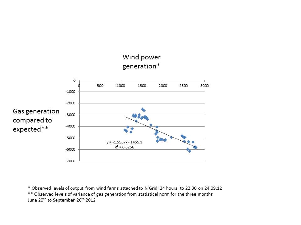
In an article on the Guardian web site to be published on Wednesday 25th, Mark Lynas and I estimate the reduction in greenhouse gases arising from the UK’s rapidly growing fleet of wind farms. Our calculations use data produced every half hour for the three months to 20th September 2012 to show that – on average – a one gigawatt increase in wind power reduces the amount of gas generation by almost exactly the same amount. If you are that type of person, all the numbers are available to play with on the Guardian’s pages.

The last couple of days have also been very windy. So I thought it might a good check to look at the data and show visually that wind turbines save carbon emissions. This chart uses only 48 data points, compared to the 4,400 in our main statistical analysis. The technique employed is the same. We estimate the expected level of gas powered output (which varies strongly with the demands placed on the national grid). Then we plot the difference between the actual and expected use of gas power stations compared to the level of wind power available. The correlation is immediately clear to the eye.

Lord Lawson gets his facts wrong

In a speech on climate change to an Italian conference, Nigel Lawson concluded with a fierce attack on the honesty of China’s published policies on climate change. He said that the country has ‘no intention whatever of taking the decarbonisation route’ despite its strong public stance on climate change. China, Lord Lawson continued, ‘firmly intends to remain a carbon-based economy’. He implied that the massive growth in wind turbine installation has happened merely to ‘impress credulous foreigners’. Most of the country’s large number of highly successful solar PV manufacturers ‘are on the brink of bankruptcy’, he said. The purpose of this article is to provide some of the figures to contest Lord Lawson’s assertions. Does China intend to remain a ‘carbon-based economy’, in Lawson’s words?

Over the last five years, China has consistently pointed to the severe impacts of climate change. This is what a government white paper said in November 2011: ‘Climate change generates many negative effects on China's economic and social development, posing a major challenge to the country's sustainable development.’ The government further says that ‘China is one of the countries most vulnerable to the adverse effects of climate change’.

Across the world ‘In recent years, worldwide heat waves, droughts, floods and other extreme climate events have occurred frequently, making the impact of climate change increasingly prominent’. The government’s response has been to introduce some of the most aggressive carbon reduction programmes in the world. It claims ‘remarkable results’ and that the current five year plan ‘established the policy orientation of promoting green and low-carbon development, and expressly set out the objectives and tasks of addressing climate change.’

Can we believe these statements any more than similar claims made by other governments? Or should we follow the Lawson line that China is dishonestly pretending to back renewable energy in order to increase the sales of its PV and wind turbine manufacturers? This question matters enormously: if China continues to expand its economy on the back of increased use of coal, the prospects for an early peak in global emissions are substantially reduced.

China’s share of installations of the major renewable technologies

Chinese companies have aggressively expanded the number and average size of renewable energy projects. Table 1 gives an estimate of the share of total global installations.

Installed capacity at end 2011 (in Gigawatts or GW)


World capacity

China capacity

China share

Hydro

970

210

22%

PV

70

3

4%

Wind

238

62

26%


In other words, China has over a quarter of the world’s total wind generating capacity. Chinese wind resources are substantial, particularly in the west of the country and huge further expansion is possible. One source suggests a potential of over 2,000 gigawatts. Nevertheless Lawson asserts that the huge number of Chinese turbines is nothing more than a front for the sales efforts of its manufacturers, stating that ‘almost half’ are not actually connected to the electricity grid. This assertion is incorrect. Just over 50 GW of capacity was delivering power in June 2012, or almost 80% of the installed wind turbines. It is certainly true that large amounts of investment are needed to connect wind farms in the west of China to industry and homes in the east. While this is happening wind farms often have to wait for new transmission lines. But no electricity company in the world erects turbines without planning to have them generate revenue from the sale of power.

China has almost a quarter of worldwide hydro-electric power capacity. The massive Three Gorges dam, which finally reached full power this year, is the most important of its plants but is only about 10% of China’s total hydro capacity. Several other huge projects are under construction.

Until last year, most of China’s solar panels were exported. The high feed-in tariffs in Italy and Germany provided a substantial market and helped push the cost of PV down to less than half the figure of even a few years ago. The Chinese government responded by introducing its own PV feed-in tariff and local installations soared in 2011.

New capacity in 2011

China’s investment in renewable technologies in 2011 dwarfed all other countries.

Capacity added in 2011 (Gigawatts or GW)

World growth in 2011 China growth China share of growth
Hydro

25

12

49%

PV

30

2.5

8%

Wind

40

18

44%


Of the 40 GW of wind power added worldwide, China’s share was almost half. The figure was about three times that of the USA, the next most important market. A similar share of new hydro capacity was gained. China’s PV installation were smaller, but grew from a very much smaller base. The country completed by far the world’s single largest PV farm in 2011, a park of about 200 MW.

Share of investment captured by renewables

According to the respected industry newsletter Platts Power in Asia, China invested about $53bn in electricity generation and transmission in the first seven months of this year.(1) This was split roughly 50:50 between transmission and new power stations.

Share of electricity capital expenditure

Power generation 51%
Of which, fossil fuel power 14%
Of which, non fossil power 36%
Power distribution (‘the grid’) 49%


Similar total amounts were invested in the corresponding months of 2011. The percentage of all expenditure devoted to renewables and nuclear was also about 36% in that year. The share devoted to fossil fuel plants fell from 17% to 14% between 2011 and 2012. The impression conveyed by Lawson that China continues to emphasise investment in fossil fuel sources is wrong: China puts over twice as much money into low carbon technologies as it does into coal and gas power stations.

Low carbon technologies require much more capital investment per unit of expected annual electricity output. (On other hand they cost much less in annual operating expenses). As a result of its investment China added about 31 GW of new electricity capacity in the first seven months, of which about 18 GW uses fossil fuel. Wind and hydro was about 11 GW. I cannot find an accurate figure for solar PV but it was probably about 2 GW. (For comparison, the total fossil fuel generation capacity of the UK is about 70 GW).

Share of electricity generation held by renewables and nuclear

China’s economy continues to grow at high rates. Electricity demand now grows substantially less fast than GDP as a result of energy efficiency improvements, particularly in industry. Measured power generation rose only 2% between July 2011 and July 2012. In this period, electricity production from fossil fuels actually fell from 337 to 322 terawatt hours. (For reference, total UK electricity use is about 350 Terawatt hours a year).

Coal and gas generation is still almost three quarters of total electricity production. But non-carbon sources produced 26% of Chinese electricity in July 2012, up from 20% a year earlier. This increase was largely due to higher rainfall levels improving hydro production from 68 to 92 terawatt hours. But wind power rose by over 50 % to provide 1.5% of total Chinese electricity.

Lord Lawson threw several insults at the Chinese wind industry. As well as claiming that ‘almost half’ the turbines are not connected, he said that wind would not reach 1.5% of electricity production until 2015. July 2012 proved him wrong.

Lawson also said that PV would only account for 0.1% of Chinese power production in 2020. Precise figures are not easily available but on the basis of the installed capacity of panels, I calculate that his pessimistic figure was also exceeded – and quite comfortably - during July 2012. As PV installations are growing at an extremely rapid rate, 2012 annual production is likely to be at least twice what Nigel Lawson predicted for 2020. Lawson’s prediction was made in August 2012, suggesting that his researchers at the Global Warming Policy Foundation are simply not keeping up with the pace of Chinese investments in clean technology. A couple of days careful research would have shown that his figures for wind and solar do not remotely reflect the current reality.

Future trends

I’ve tried to suggest so far that China is investing extremely heavily in low carbon sources of electricity and that this capital expenditure is beginning to show in the total capacity for power generation and in electricity output.

What about the longer-term future? Nigel Lawson focused his disparaging remarks on the position in 2020. Can we make reasonable estimates of the share held by renewables in eight years’ time? We have to guess at rates of electricity demand growth and forecast how much cash will continue to flow into newer types of electricity generation.

In the case of wind power, a Chinese state research organisation worked with the International Energy Agency to produce a roadmap for 2020. The report suggested a possible total of 200 GW of power, or nearly three times today’s total UK power generation capacity. Hydro will rise from about 210 GW to about 330 GW, an increase of over 50%. I cannot find an official figure for PV, but I think a figure of 70-75 GW is easily possible. Nuclear capacity is forecast by a leading state organisation to rise from about 11 GW to about 70-80 GW.

If overall electricity production rises at 5% a year – very low by the standards of the last decade but in excess of recent figures – the major renewables and nuclear will capture just under 35% of the electricity market by 2020. Biomass will add to this but I cannot find an estimate for this technology at the end of the decade. Wind will contribute over 5%, nuclear 8% and solar PV in excess of 1%. Hydro power will still dominate with about 20%.

July 2012’s electricity production figures were only 2% above a year earlier. If this pattern continued, the major renewables and nuclear would contribute over 43% of supply in 2020. But whatever the pattern of growth in demand, China’s investment in renewables and nuclear may mean that fossil fuel use barely rises in the next decade. This isn’t mistaken charity on China’s part. Though its coal reserves are large, they will only provide about 35 years of power at current rates of consumption. Oil is scarce. Natural gas reserves may be in easier supply but availability will depend on fracking.  As important, the poor air quality in cities caused by coal burning is affecting health. Climate change, almost invisible in the temperate UK, is already severely affecting Chinese western regions.

Lord Lawson seems to be utterly wrong: China is making prodigious efforts to hold down its fossil fuel use in line with its international commitments and its own national self-interest.

(1) Thank you very much to Raj Gurusamy of Platts for providing me a copy of this newsletter.

At last, a plausible biofuel

Most species of algae contain oil that can be refined to make motor fuel. For ten years or more, entrepreneurs have been looking at ways of growing algae quickly, harvesting the product and then crushing it to create ‘green crude’ oil. What is probably the first commercial scale algae production plant has just opened in New Mexico. Does it look as though algae-to-fuel will be commercially viable? It is certainly a vastly better biofuel than corn ethanol but doesn’t yet appear to compete with solar PV as a source of low-carbon motor fuel. (I’m classing electricity as a fuel for cars). Using photosynthesis, almost all algae capture CO2 from the air as their source of growth. They produce oil and when this oil is burnt, the CO2 returns to the air. Motor fuel made from algae can thus claim to be close to carbon neutral. Most algae grow best in warmth and strong sunlight, meaning that the product is potentially well suited to sunny deserts where the land has few alternative uses.

The Sapphire Energy bio-refinery in Columbus, New Mexico is an extraordinary new venture that demonstrates the viability of commercial algae cultivation. Make no mistake, this seems to be a huge technical success. Huge ponds 200 metres long grow different species of algae depending on the time of year. The refinery extends over 120 hectares (300 acres). All the processing is done on site. It doesn’t use potable water.

By most metrics, Sapphire’s plant isn’t yet competitive with solar PV. And since most places (hot deserts) that are suited to algae are also suited to PV, the long-term future of algae refineries isn't immediately clear. Nevertheless, my quick calculations suggest that the plant produces about five watts of power for each square metre of space.  (The numbers to support this assertion are appended at the bottom – if you find a mistake, please tell me). By contrast, a big solar farm in sunny New Mexico may achieve 15 watts/sq metre, about three times greater.

(Is there a logic to this difference? Yes, PV cells turn about 15% of the energy falling on them into electricity, although not all space is used because of the gaps between rows in solar farms. Photosynthesis is much less efficient, averaging less than 2% in most circumstances. So PV will always tend to be more efficient in terms of energy conversion per unit area.)

Although algae cannot easily compete with PV at generating power, they are far better than corn ethanol, a petrol substitute made from corn cobs. My calculations suggest that land growing corn/maize produces about 0.2 watts per square metre, less than a twentieth of the figure for algae. So the mad and immoral policy of mandating that almost half the US corn crop is converted into motor fuel is clearly an extremely inefficient way of generating biofuels. Algae production is a much, much better tool for the decarbonisation of oil.

So does it matter that PV is better at converting light into fuel than algae? In the US, with its huge resources of unused desert, probably not. Sapphire has produced some estimates of what its new bio-refinery will produce and my quick calculations suggest that the entire crude oil need of the country could be grown on about 3% of the area of the continental US. This is a huge expanse of land, but slightly less than the approximately 3.5% given over to growing corn.

But more important than the land taken up by algae is the capital and operating costs of a biorefinery. The company’s press releases suggest that the cost of constructing the algae farm exceeded £135m. Dividing this by the energy value of the output of oil suggests a capital cost of about $2.40 for every yearly kilowatt hour. In the same sun-drenched location, PV would cost around a third as much. Of course, the cost of the refinery reflects that it is an ambitious prototype. Perhaps the cost will halve by the time the tenth bio-refinery is constructed? But it will still be more expensive than PV today.

The much higher operating costs of the algae farm also weight the economics in favour of PV, which needs no permanent workforce once it is constructed. But all these disadvantages are comprehensively outweighed, you might say, by the fact that Sapphire Energy delivers liquid energy, able to be poured into cars and planes as a direct replacement for refined oils. Algae may well turn out to be the most efficient way of generating low-carbon liquid fuels outside those areas lucky enough to be able to grow sugar cane. It is difficult to see any other way of replacing aviation fuel at reasonable cost to people and to planet.

Nevertheless, the better overall performance of PV should cause us to hesitate before backing algae for petrol replacement for land-based vehicles. And there’s one crushing final argument in favour of using electricity for powering cars. The energy coming from a PV panel flows into the grid and is extracted to charge a battery in an electric car. The car then uses this electricity with about 80% efficiency (the ratio of useful power delivered to the wheels as a percentage of the energy value of the electricity taken from the grid). By contrast, even efficient modern internal combustion engines only deliver about 25% conversion. Not only are algae plants probably more costly, far more space-using and have higher operating costs, they also produce a fuel with a third the value of electricity when converted to the energy of motion. Fantastic achievements Sapphire Energy, but we still should be pushing for electric cars.


Energy performances per square metre – back of the envelope numbers drawn from Sapphire Energy’s press releases

Expected eventual oil output per day – 100 barrels

Energy value barrel of oil - 1,600 kWh

Daily energy value of algae oil – 160,000 kWh or 160 MWh

Yearly energy ouput – 58,400 MWh

Space used – 120 hectares

Energy output per hectare – about 487 MWh

Square metres per hectare – 10,000

Annual output per sq metre – about 48.7 kWh

Hourly output per sq metre – about 5.5 watts compared with substantially less than 1 for other biofuels.


No rationale for Heathrow expansion

A growing number of influential people are saying that Heathrow needs a third runway. The main arguments being voiced are

a)      There’s a crushing shortage of airport capacity in the South East of England.

b)      Heathrow’s status as a business airport  is threatened by congestion

c)       The shortage of runway slots means that flights to China and other important business destinations are unavailable.

The numbers don’t support any of these conclusions.

a)      Shortage of airport capacity in the South East

The number of flights handled by London airports in the year to the first quarter of 2008 was about 975,000. This was down just over 9% from the same figure 4 years earlier, when the figure was 1,073,000. In other words, we know that London can handle at least 98,000 flights than it does at the moment. There’s no shortage of capacity.

b)      Heathrow’s status as a business airport is threatened by congestion

Only 37% of Heathrow passengers were business users in 2011. 63% were leisure fliers. Any problem is caused by holiday passengers.

c)       Flights to China and other boom economies are too few in number

The number of passengers flying to and from the Far East, including China, fell about 2.5% between 2007 and 2011. Only about 3% of UK passengers were going to the Far East. More went to Switzerland.

More details about the abundance of UK flights to China can be found in an earlier post on this web site.


Business air travel is not rising. This may be a function of the state of the world economy or it might reflect a decreasing need for people to get into aeroplanes to do business with each other. The arguments of politicians and journalists that suggest that UK exports are being held back by the lack of Heathrow capacity are palpably weak.

After a ruling from the Competition Commission, Heathrow's owners have sold Gatwick and have recently reluctantly agreed to dispose of Stansted. Is it unfair to suggest that the public relations campaign to try to convince us that UK plc is being held back by the lack of a third runway at Heathrow is driven simply by a desire to win back business from the newly competitive Gatwick and the threat from Stansted?

Matt Ridley says we are apocalypse junkies

The ever-stimulating science writer Matt Ridley has just published another of his doom-laden warnings about human susceptibility to doom-laden warnings. He tells us that the history of the last fifty years shows that when policy makers are goaded into action by naïve environmentalists, they invariably make things worse.  Scientists exaggerate the potency of ecological threats and their expensive cures often achieve nothing. His closing theme is an increasingly common one: ‘why should we trust the scientists on climate change, when they have been wrong about every single environmental issue of the last half century?’ Fifteen years ago, the Economist published a very similar article to Ridley’s in an attempt to get us to stop worrying about global warming. The examples of false catastrophe were strikingly similar to those that Ridley uses this week: the population explosion, the depletion of oil and gas, acid rain, cancer causing chemicals, exhaustion of metal supplies, food production, Ebola virus and so on. In both cases, the writers are eager to tell us that things are actually getting better every day and ecologists should button their lips. Time for a quick retrospective check: how well has the Economist’s Panglossian optimism about the next decades been matched by reality? Very badly indeed, it turns out.

The price of metals

The Economist article started with the conventional attack on Malthus (also a target for Ridley, of course) for suggesting that population growth would outstrip food supply. But it rapidly switched to the 1972 Club of Rome report (Ridley goes for this as well) which projected a rapid exhaustion of available resources of important minerals, such metal ores. Prices would rise rapidly, said the Club.

What foolishness, exclaimed the Economist in 1997, as it displayed a chart showing metal prices falling by nearly 50% since the apocalyptic report. There is no shortage of ores and no reason for concern.

How have things changed since 1997? Below is a chart showing the price of probably the important metal, copper. (US $ per tonne). The cost has more than quadrupled since the Economist article. Other metals have also substantially increased in price.

The magazine went on to make the obligatory reference to the bet between Paul Erlich and Julian Simon. Erlich, a deep environmental pessimist, lost money to Simon who had correctly predicted that metal prices would fall.

Ridley also covers the wager in detail. Surprisingly, he makes no mention at all of the sharp rise in the price of most commodities since 1997. Instead, he says, ‘they grew cheaper’, a comment that will surprise anyone buying any industrial commodity in 2012t. The Economist made light hearted fun of the school textbooks that said that minerals would run out. Ridley does the same.


Food

In 1997, The Economist showed that food prices had fallen significantly since 1960. The prevailing pessimism about agricultural yields was unwarranted.

Was its rosy view of the future correct, or would food prices start to rise again? Unfortunately for the world, food prices have become much more volatile and typically much higher than they were. How does Matt Ridley deal with this inconvenient fact? He says that ‘food prices fell to record lows in the early 2000s’…but ‘a policy of turning some of the world’s grain into motor fuel has reversed some of that decline.’ Not quite correct – current world food prices in the last five years are substantially higher in real terms than at any time since 1990.


Cancer

In 1997, the Economist said that mortality from cancers not related to smoking ‘is falling steadily’ in the age group 35-69. Ridley repeated the claim last week saying that ‘in general, cancer incidence and death rates, when corrected for the average age of the population have been falling now for 20 years’.

Not strictly true: according to research from Cancer Research UK, 61,000 people in the 40-59 group were diagnosed in 2008 compared to 48,000 in 1978, a substantial rise even after taking into increased population numbers. Part of this increase is due to better screening and earlier diagnosis, but Ridley is choosing to ignore the many troubling signs that cancer rates may well now be rising. The Economist of 1997 and Ridley of 2012 pour ridicule on the idea that ‘chemicals’ have much to do with cancer incidence - and they are probably right – but any complacency over the number of cases is severely  misguided.

Amazonian deforestation and deserts

The Economist said that the problem was exaggerated and the area logged each year was falling. True: 1997 saw a figure of only 13m hectares (about 5% of the area of Great Britain). But by 2004, Amazonian deforestation had risen sharply again, to a level over double the earlier figure. After sustained action from the Brazilian government, the rate of loss has fallen but almost 20% of the total forest has now been lost.

Even more surprisingly, the Economist felt able to assert that in dry areas there had been ‘no net advance of the desert at all’. The UN thinks differently today, suggesting that 23 hectares are lost to the desert every minute. Unusually, Ridley doesn’t mention this theme at all, probably acknowledging the overwhelming evidence that fragile drylands are turning into deserts at uncomfortably rapid rates.

Acid rain

It’s on acid rain caused by power station emissions that the Economist of 1997 and Ridley of 2012 are most at one. They even use the same quotation from a 1990 US government report. Ridley calls acid rain ‘a minor environmental nuisance’ and both authors point to 1980s opinions that acidification didn’t affect the total volume of standing wood, once thought to be a severe threat. Ridley asserts that there is little evidence of any connection between acid deposition and increasing acidity of streams and lakes. (He is in a very small minority in his scepticism on this).

Both the Economist and Ridley imply that the environmentalists who demanded restrictions on the pollution from coal-fired power plants had needlessly panicked. Woodlands ‘thrived’ in a more acidic environment said the Economist. Not so, says the US government in its latest (2011) report on the impact of acid rain. ‘Despite the environmental improvements reported here, research over the past few years indicates that recovery from the effects of acidification is not likely for many sensitive areas without additional decreases in acid deposition’. Even now, the acidification of land and rivers remains a serious problem.

****

To both these two authors, separated by fifteen years, environmentalists constantly over-estimate the impact of humankind  on the world’s ecological systems. The globe, they say, is a much more robust organism than we think and can withstand our meddling. We should look to find technological solutions to ecological problems and not needlessly impose costly  regulation.

Most sceptics have the intellectual honesty to stop at this point and admit that the degradation of stratospheric ozone is a good counter-example. If the planet’s governments hadn’t introduced a restriction on ozone-depleting chemicals such as CFCs in the late 1980s and early 1990s, the ozone hole would still be rapidly increasing and letting in increasing quantities of dangerous UV-B radiation. (Too much UV-B causes skin cancer in humans and some animals and affects plant growth).

Matt Ridley won't have any of this nonsense. In a jaw-dropping series of paragraphs, he asserts that the connection between CFCs and other chemicals known to react with ozone and the decreases in ozone levels is unproven. The careful work by Paul Crutzen and others that won a Nobel Prize for showing how a single atom of chlorine can unbind many molecules of ozone is not good enough. Nor is the evidence of the impact of the ozone hole on skin cancer. Ridley says that the ‘the mortality rate from melanoma actually levelled off during the growth of the ozone hole’. It’s not unfair to describe this conclusion as utter nonsense: increasing skin cancer incidence has been linked to rising UV-B radiation for several decades.

But to Matt Ridley it seems more important not to allow the environmentalists to be right about anything. He appears to be worried that his readers might believe if scientists were right – just once in the 1970s - to link man-made chemicals to the extreme dangers of rapid ozone destruction, they might also be correct to say that global warming threatens mankind’s future. I really think we could have expected more from one of Britain’s best writers on science.


James Hansen on extreme weather events

James Hansen’s recent paper uses detailed temperature records to demonstrate that the chance of an area experiencing extremely hot summer weather has increased dramatically in recent years. Several similar publications have shown recently how climate change has increased the likelihood of very adverse weather. Scientists like Hansen do this work because they are wrestling with the need to communicate to the general public that global temperatures won’t increase every year but that the chance of extreme events in the form of ferocious heat or catastrophic rainfall is rising rapidly. Hansen’s conclusions are important in that they are the first attempt to show how the frequency of very high land temperatures has risen. But the second major finding of his paper has not been noted by the scientific press: temperature variability has increased. Not only has the average temperature risen but the distribution of temperature has widened, meaning that extremes are more likely. We didn’t know this, and the finding is deeply worrying.

The ‘bell curve

Many natural phenomena demonstrate a pattern called the ‘normal distribution’ or ‘bell curve’. Measure the height of Finnish women or the IQ of Singaporean children and the results will follow a predictable form that resembles the shape of a bell. Most observations are clustered around the mean with increasingly small numbers of results away from the central peak.

Temperatures follow this pattern. If I logged the average noon temperature for August days in London each year, I would find that the observations followed a bell curve pattern. Findings would be grouped around a central (mean) figure. The number of years above this level would be approximately equal to the numbers below it. The shape of the observations would be roughly symmetrical above and below the mean.

The bell curve is reassuringly familiar. In fact, it seems to me that humankind naturally assumes that most natural phenomena follow this pattern. This ‘normal distribution’ follows a clear statistical pattern. A calculation called the standard deviation predicts the width of the curve. Some distributions are quite tight, meaning that the curve has a small standard deviation and the curve falls sharply away from the mean. Others are fatter, with a high standard deviation. Whatever the size of the standard deviation, a proper bell curve has about 68% of all observations within one deviation of the mean. This percentage is almost universal.

Hansen’s paper calculates the standard deviation of summer temperatures (June-July- August) over land in the northern hemisphere. He shows the standard deviation was about 0.5 degrees C in the period 1950-1980. This number tells us that about 68% of all average 24 hour temperatures over the three month period for a particular spot will fall within the range +0.5 degrees to -0.5 degrees of the average. So if London’s average (24 hour) temperature is 16 degrees in the summer, it will be within the range 15.5 to 16.5 degreees just over two thirds of all years. This is quite a tight curve. Extreme variations of, say, +2.0 degrees are therefore very rare indeed.

Most models assume that the impact of climate change will be to shift the bell curve upwards. So if land temperatures rise by an average of 1 degree C, then London’s summer warmth will also rise by 1 degree, and the standard deviation will stay the same. One standard deviation (68% of observations are within this figure) will remain 0.5 degrees C. This is a convenient assumption: it implies that the effects of climate change are predictable and smooth. All that happens as the world warms is that the curve of likely future summer temperatures rises but the shape of the curve remains the same.

Hansen and his colleagues show that this is probably an incorrect assumption. They demonstrate that the curves of temperature are widening. The mean temperature is rising but the probability of extremely warm periods is increasing as well. The change isn’t massive. Hansen says that for the average spot in the northern hemisphere the standard deviation was 0.5 degrees in the period 1950 to 1980 but had risen to 0.54 or so in the period 1981 to 2010.

Also, the curve of possible outcomes is no longer symmetrical. Assessed against the average, the chance of very warm summers has increased sharply but the likelihood of colder summers has risen much less. (This means that the curve of temperatures doesn’t resemble a true bell curve any more – there’s a bulge on the higher side). All-in-all, the chance of really hot summers has increased quite sharply, even when assessed against a rising average global temperature. Global warming is significantly raising the chance of really extreme hot periods.

Until now, most climate scientists have assumed that bell curve will stay in shape. If Hansen’s research is correct and rising greenhouse gas concentration are producing a sharper increase in extreme hot events than predicted, we have yet another reason to worry. Adapting to a changing climate is more difficult if the extremes of hot weather or major rainfalls are more severe. (As we see in the American corn belt or the rain-hit north-west of England this summer.)

Even more fundamentally, some scientists have wondered whether the earth’s response to rising greenhouse gas concentrations would follow a bell curve type pattern or not. A doubling of pre-industrial greenhouse gas concentrations, which seems an increasingly likely outcome by 2050, was predicted to increase temperatures by between 2 degrees and 4.5 degrees with probability  distributions within this range that resemble a traditional bell curve. Marty Weitzman at Harvard has led the questioning of whether this is a reasonable assumption. He suggests that the right hand side of the probability curve may be much ‘fatter’ than the left (and therefore resembling what is known as a Pareto distribution rather than a normal curve - think of the shape of a beached whale). Hansen’s latest gloomy paper gives some important support to Weitzman’s hypothesis of the fat rightward tail.

This may seem abstruse and academic statistical worrying. It is not. Humans are brought up to expect the normal distribution in natural phenomena. Measure the height of your colleagues at work, or the time they take to drink a cup of coffee and you will find an approximately standard bell curve. We have instinctively assumed that temperature changes will continue to exhibit the same probability distribution as they have in the past. Remove that comfortable assumption and we have another major uncertainty to worry about.


Two reverse ferrets on energy policy

British journalists use the expression ‘reverse ferret’ when identifying changes in an organisation’s stance on an important issue. An important feature of a good reverse ferret is that the abrupt switch must never be acknowledged. In the last week the Department of Energy (DECC) reversed five years of British policy in two crucial ways. First, it has abandoned any pretence of technology neutrality in sponsoring additions to electricity generation capacity and now supports nuclear and gas in preference to renewables. Second, it has indicated that gas powered generation is no longer assumed to be accompanied by Carbon Capture (CCS) by 2030.

A successful reverse ferret is usually accompanied by a decoy: a story that distracts journalists attention while the U-turn is carried out. In this case DECC allowed a minor competing story about the rate of change in wind subsidies to attract press coverage. Masterly work, at least if you don’t worry too much about climate change.

The end of the orthodoxy of technology neutrality.

In its Carbon Plan of December 2011, published less than eight months ago, DECC wrote ‘In the 2020s, the government wants to see nuclear, renewables and CCS competing to deliver energy (meaning electricity) at the lowest possible cost. As we do not know how costs will change over time, we are not setting targets for each technology..’.

This summarised the energy policy of the UK government. It would set not targets but treat each potential source of low carbon electricity equally. Whichever technology forced down costs fastest would end up as the dominant provider of electricity. That’s all changed. The ministerial announcement on support for renewables on 25th July reduced support (as expected) for wind and for large scale solar PV.  Onshore wind now gets 0.9 Renewable Obligation Certificates (ROCs) worth about £40 a megawatt hour. PV will no longer be eligible for ROCs and will have to rely on the feed-in tariff of about £68 a megawatt hour, a figure which will be cut to about  £41 by  2015. (In both cases, these subsidies will be supplemented by payment for electricity, probably at about £45 per MWh.)

Where does this leave onshore renewables compared to nuclear? Nuclear will benefit from a different form of subsidy, the so-called ‘contract for difference’. In all important respects this is a feed-in tariff disguised to enable government ministers to be able to claim that nuclear receives no direct subsidy. The Times recently reported that the nuclear industry was demanding feed-in tariffs of £165/MWh. Denials rapidly followed from both government and electricity generator and the level at which the tariff will be set will probably be around £130/MWh. This support will continue for several decades.

Total payments for low-carbon electricity

Onshore wind £95/MWh
Solar farms £123/MWh (falling sharply to around £96 by 2015)
Nuclear £130/MWh


Nuclear power is going to be subsidised far more heavily than low-cost renewables.. This may well be a logical decision by government. Without baseload nuclear power, guaranteeing electricity supply is going to be very tricky. But let’s be clear: nuclear is going to receive a higher rate of financial support, guaranteed for longer, than the currently lowest cost renewables. In order to make the nuclear renaissance happen, we now see huge subsidies to draw in EdF and Chinese money. Financial neutrality has gone. We now have an industrial policy that incentivises one technology against another.

Support for gas

Until a few months ago, government policy documents routinely asserted that almost all electricity production would be low-carbon by 2030. The amount of CO2 emitted from power stations would have to fall to an average of a fifth or even a tenth of current levels. If gas or coal were used, they would have to be accompanied by CCS. The December 2011 Carbon Plan said ‘Fossil fuels without CCS will only be used as back-up electricity capacity at times of very high demand’.

That commitment has gone. The 25th July ministerial statement said ‘We do not expect gas to be restricted to providing back up to renewables’. If gas remains cheap ‘we expect it to continue to play a key role ensuring that we have sufficient capacity to meet everyday demand and complementing relatively intermittent and inflexible generation’.  It is only ‘in the longer term (that) we see an important role for gas with CCS’. The statement didn’t admit this, but the carbon targets for 2030 have in consequence been abandoned.

Accompanying the new explicit support for gas was a nice sweetener for the offshore exploration industry. A fund of £500m was announced to back investment in less financially attractive gas fields. We should put that in context. The current support regime for marine renewables is expected to provide £50m for wave, tidal and offshore wind R+D over the next four years. In other words, offshore renewables will get one tenth the help given to offshore gas.

That’s how it stands – high and guaranteed support for nuclear and subsidy for gas. Renewables are to have financial help withdrawn. These extraordinary reverse ferrets were largely ignored by the press, which focused on whether the UK Treasury or DECC ‘won the battle’ over the precise level of support for onshore wind. Did Chancellor Osborne or Energy Secretary Davey beat the other into pulp? A great tactic from the DECC press office, ensuring that a minor skirmish attracted attention while huge policy changes were left unnoticed.


The world’s largest community owned PV farm achieves minimum fund raising target

Westmill Solar, a 5 megawatt PV farm sited between Swindon and Oxford, is one of the largest arrays in the UK. It was built a year ago to profit from the high feed-in tariffs then available to large PV installations. Adam Twine, the farmer on whose land the 21,000 panels were sited, kept a right to buy back the solar farm from its original financiers. Twine is an enthusiast for community ownership and recently set up a cooperative to purchase the whole array. Small investors can apply to buy shares now, with local residents given priority. If successful, the new cooperative will be the biggest community owned solar farm in the world. The new business announced yesterday that it has raised the minimum £2.5m necessary to take the deal forward to the next stage. Other community should copy Twine’s scheme: the UK needs thousands of renewable energy projects like this one, giving decent returns to local people. (NOTE - on August 1st, Westmill announced it had exceeded its £4m total target and applications are now closed).

The investment opportunity

Westmill Solar is seeking to raise £16.5m to buy the PV farm. The business is looks to finance up to about a quarter of this (£2.5m  to £4m) from individual investors. The remainder (from £12.5m to £14m) is being sought from institutional bond holders at an interest rate of about 3.5% above retail price inflation (RPI).

The proposed financing has several unusual features. These make the investment opportunity more difficult to explain than comparable projects. Nevertheless, the innovations should form a model for future renewable energy fundraisings from communities because they improve the returns to small investors.

  • The business will buy back 5% of its years each year from year 2 to year 10. This is a tax efficient way of returning capital to shareholders.
  • The dividends[1] paid shareholders (as opposed to bond investors) will start low and gradually rise as the bond holders are paid off. By the end of year 24 - when the business is expected to be wound up as the Feed-in Tariffs cease - the returns illustrated in the prospectus appear to be over 50% a year on the shareholder capital remaining in the business.
  • The index-linked returns paid on solar PV investments create a very high degree of reliability of cash flow. Compared to wind, PV output is also far more stable from year to year. This means that businesses like Westmill Solar can run themselves with only a thin layer of shareholder capital, enhancing percentage returns on their cash.

The Feed-in Tariffs and revenue from exported electricity will produce a gross income of about £1.7m a year, rising with inflation. At today’s inflation rate, the bondholders will take interest in the first full year of about £0.8m. Running costs are approximately £200,000, leaving about £0.7m to begin to pay back some of the debt and provide a return to the small investors. As bond holders are paid back, an increasing fraction of the total income can be diverted to the shareholders enhancing returns. This isn’t likely to be a particularly  good investment for those seeking high dividends in early years but it could be an exceptional opportunity  for those seeking to make savings for financial needs in ten to twenty  years’ time, such as people wanting to improve their pension plans.

What are the risks?

By 18th July, 660 investors had committed £2.5m (an average of just under £4,000). This means that the equity fund raising has achieved its minimum target. The key remaining risk is that the investment bank seeking to raise the bond finance from institutional investors is unsuccessful in raising this money. If this happens, Westmill  Solar’s purchase of the PV farm will not proceed and the private investor money will have to be returned. The prospectus notes that the company will deduct up to 5% of investors’ money  to pay  for the costs of organising the offer to shareholders.

The other main risk is probably very high levels of inflation in the next few years. The bond holders’ return will be set as a percentage over RPI inflation. If, for example, 2015 RPI inflation is 7%, the interest payable to bond holders will use up almost all the cash coming into the business. Although the income from Feed in Tariffs will also rise, this will only partially compensate for the high interest costs. Until the company has paid back a large fraction of the £12.5-£14m debt to bondholders, very high inflation could represent a serious threat to the viability of the business. How likely is that we will see inflation rates well above today’s levels within the next fifteen years? Who knows, but  there is clearly a risk.

The other main risk is much more manageable. Levels of sunshine could be lower than projected. Levels of solar radiation hitting the UK don’t vary much from year to year but there is an obvious concern that the poor summer seasons of recent years might be a long-term pattern. Or a big volcanic eruption might affect sunshine levels for a year or so.

The wider importance of this fund raising

Communities around the UK can copy this scheme. Although the cuts in the Tariffs temporarily destroyed the viability of large scale PV, cost reductions now mean that big solar farms are financeable again. Westmill is financing a total of £16.5m to buy the PV farm but a new venture might well be able to build a similar array for less than £7m. Many prospective solar farms of this size are now in the planning approval process in the south west of England.

Many congratulations to the directors of Westmill, who have done an exceptional job in getting the project to this stage of development. My colleagues at Ebico and I remain keen to work with other communities to develop locally-owned renewable energy projects, providing good returns to smaller investors.

Owned by Eden Project employees, the much smaller PV array we developed in late 2011 was recently made runner-up in the Renewable Energy Association project of the year awards. Either using our model, or copying Westmill’s innovations, every town and village in the UK can now have its own wind, biogas or PV farm.

(Full disclosure: I myself haven’t yet applied for shares in Westmill but will probably do so over the next few days).


[1] Because the Westmill Solar business is what  is known as an ‘Industrial and Provident Society’ the dividends are paid as untaxed interest.