The UK needs 300,000 new houses a year. 'Pre-fabs' are the only way of achieving this.

The UK government recently abandoned the long-standing target that all new homes should be zero-carbon. Its justification was that high insulation standards raise the cost of houses and makes the current shortage more difficult to alleviate. And this was before we faced the need to admit many tens of thousands of refugees.

The government’s policy change is silly. I’ve written here before about how improving energy efficiency in existing houses is usually very expensive. By contrast, better standards in new houses are easy to achieve. It makes no sense to compromise building standard improvements. But the government’s mind is made up. So what should we do now?

The first priority is completely clear: we need to stop building new homes on muddy building sites using construction techniques unchanged since 1350. Instead, we should shift to modular, pre-fabricated housing, built in factories and only assembled on-site. For the first time, we’re seeing small, relatively cheap and comfortable tiny homes designed to be manufactured precisely. Precise measurements – impossible in homes constructed on building sites – mean better air-tightness and improved insulation. You get near zero-carbon performance at virtually no incremental cost.

The last time the UK faced a desperate housing shortage similar to today was in 1945. About 150,000 ‘pre-fabs’ were built and many stayed in place long after their design life of 20 years. Some suffered from damp, but there’s no reason why today’s pre-fabs should experience this problem. Factory-made  are built successfully around the world; the UK is an outlier in using medieval construction techniques. The Huf House, a range of prestige German manufactured houses, sells for millions of Euros across Europe.

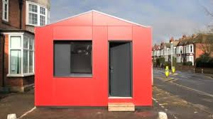
Here are five different designs developed by companies in the UK over the last few years. In my view, they all look good. However you may disagree and think that new homes should mimic the look of houses around them. I want to suggest in response that these modern houses are relatively cheap, use little energy, are massively easy to plonk down on concrete piles and, vitally, can provide people who would otherwise be in squalid rented accommodation with a decent place to live. In my view, this outweigh visual objections. Good housing for all has to be the UK’s top priority, not the maintenance of some particular look to a street or neighbourhood. Aesthetic consistency is an unaffordable luxury if we are to succeed in building hundreds of thousands more houses a year.

Here’s the first design. Green Unit, based near Oxford, makes an elegant curved house that is light and warm. I’ve been in one and even the smallest variant would be a lovely place for two people to live. The company says the Unit has a design life of over 40 years. The price is about £120,000 for living space of 80 square metres. (This is before land costs but including site preparation).

Source: www.greenunit.co,uk

Source: www.greenunit.co,uk

Dwelle comes from Manchester. 45 square metres of space, including two double bedrooms, will cost around £100,000 excluding the price of the land. 45 square metres isn’t huge but this is enough for a small family if space is well configured. For comparison, the average new home being built in the UK at the moment is about 85 square metres in size.

Source: www.dwelle.co.uk

Source: www.dwelle.co.uk

Y Cube is the new design from Richard Rogers’ studio. It seems to be mostly sited in urban locations, such as a Merton in London. This house is designed around a target cost of about £1,400 a square metre, perhaps two thirds of what a conventional small semi would cost. There’s criticism of some of its more untraditional aspects. But the views of the people who have moved in carry more weight with me. They seem to like their homes a lot.

Source:www.ymcalsw.org/ycube

Source:www.ymcalsw.org/ycube

QB2 is the innovative tiny house from Mike Page at the University of Hertfordshire. Attracting wide interest from TV programmes and newspapers, this accommodation uses a very small 4 metres by 3 metres footprint. It can go in many suburban gardens.  Heating and lighting will be very low cost indeed. At around £45,000, this is expensive per square metre of living space, but it works super-efficiently as a dwelling for young people who might otherwise be trapped in their parents’ home.

Source:http://www.cubeproject.org.uk/

Source:http://www.cubeproject.org.uk/

Lastly, here’s something that looks more like a standard home. The WeeHouse provides a two bedroom home of 68 square metres for £99,000. At less than £1,500 per square metre, this is well under the cost of a traditionally constructed house.

Source:theweehousecompany.co.uk

Source:theweehousecompany.co.uk

None of these houses get rid of the appalling constraint on housing developments provided by the restrictive planning laws, the high price of land or the dead hand of large developers.

So my proposal is this. We should accept that the UK needs to build housing on greenfield sites and give these homes planning permission for 20 years in areas currently not zoned for housing. We might also insist that they are all screened by fast growing trees or other vegetation so their visual impact is limited. We should also allow unlimited use of gardens for single story buildings without requiring planning permission. Third, we should encourage ‘self-build’, allowing individuals to buy the kits of the houses above and construct them themselves. QB2, for example, makes this perfectly possible.

Lastly, of course, we need to get local authorities to allow these homes to be plonked pretty much anywhere there is space in urban areas. There’ll be no garden but this is a small cost to getting people off the streets. Without the need for soil remediation, which is a big costof brownfield housing development, a large number of smallish areas within cities become much more available for housing.

None of this would be popular but I cannot see any alternative. 



Even the laggardly IEA admits solar PV is now competitive, having fallen in cost 75% in five years

The International Energy Agency published a report today (August 31st 2015) that focuses on the rapid decline in the cost of renewable energy. More precisely, it says that electricity costs from wind and solar have plunged, a word rarely used by international civil servants. On good sites around the world, renewables are now cheaper than fossil fuels.

Bizarrely, the IEA says that new nuclear is also inexpensive, a conclusion strikingly at variance with the rampant inflation in construction costs around the world. It may be that the absurd optimism over nuclear is influenced by the joint author of this report, the Nuclear Energy Agency.  (The cost estimate of $50 a megawatt hour is one third of what Hinkley C will be paid).

This note looks at how today’s figures compare with the last edition of this report. It'll be no surprise that expected solar PV costs are now little more than a quarter of the figure of just five years ago. We are living through a truly remarkable decline in the costs of PV, driven by the huge increases in the volumes of solar panels being installed.

The 2010 report

In 2010 the IEA said that solar costs ‘could drop 70% from the current $4,000-6,000 per kilowatt down to $1,200-1,800 by 2030’. It targeted reductions of ‘at least 40%’ by 2015 and 50% by 2020. These apparently aggressive assumptions presupposed ‘rapid deployment driven by strong policy action’.

Five years later, the IEA says that solar PV costs in the most competitive country (Germany) are now $1,200 per kilowatt for large-scale installations. In other words, costs have already fallen to the level that the Agency said ‘could’ be achieved in 2030 under very favourable conditions. What the IEA said would take 20 years actually took 5. Solar farms installed in low cost areas are now half the price that the IEA’s 2010 estimates suggested might be possible.  

The lower capital costs have fed through to reduced electricity production charges. In a very good location, the 2010 IEA report said it would cost $215 to generate a megawatt hour. (This figure is calculated by working out how much electricity is going to be produced over the life of the panels and spreading the full cost of this installation over this total).  This calculation used a cost of capital of 5% a year, which adds to the implicit price of electricity produced.

By 2015, the combination of a lower interest rate and reduced capital costs had cut that the cost of electricity to a low of $54 per megawatt hour in the US, parts of which have some of the best sun in the world. That’s a reduction of very nearly three quarters in five years, or 32% a year compounded. Although German installation costs are lower than in the US, better solar radiation more than makes up for this, leaving the cost per megawatt hour lower in places like Texas and Arizona.

Does the $54 figure correspond to the offers that solar farm owners make to electricity buyers? Yes, in parts of the US recent agreements between solar and utilities have been lower than $60 a megawatt hour, even after adjusting for the subsidies received by the PV industry.

What other technologies have ever achieved this rate of improvement? The early semiconductor industry achieved compounded rates of improvement of at least 35%. The cost of DNA sequencing has fallen by 90% since 2010, a rate equivalent to over 60% improvement a year. But apart from these two outliers virtually no technology has got better faster than solar PV. Importantly, although some experts suggest that semiconductors might now be approaching the limits of improvement, the scope for better PV is nowhere near exploited. The reduction in the costs of generating electricity from solar panels sitting in fields will continue for many more years.

Is PV competitive with fossil fuel technologies yet?

Where does this leave PV in relation to competing ways of generating electric power? The IEA doesn’t make comparisons easy because it uses a high interest rate of 10% in its own charts. Renewable technologies such as PV usually have high installation costs and low running costs whereas fossil fuel plants are cheaper to build but more costly to run. If interest rates are as high as 10%, this penalises those types of generating plant which need more upfront money to build.

At a 10% rate, PV in the best countries produces electricity at around $100 a megawatt hour, even when penalised by high interest. This compares with about $70 for the cheapest gas and just over $80 for new coal plants. This comparison makes solar PV still not quite competitive with fossil fuels.

Look at the numbers using a lower (and more realistic) interest rate and the picture changes markedly. In the chart below, the cost of PV in the US is lower than gas as long as the interest rate used is below about 4%. Is this a reasonable rate to use? Yes; new PV developments are now routinely financed at lower rates than this around the world.

The picture is even clearer in China, where gas for electricity production is much more expensive than in the US. There, PV beats gas at all interest rates. The significance of this probably hasn’t been fully realised.

It’s also striking that the in the five year period in which solar PV costs have fallen dramatically, most of the competing technologies for generating power - gas, coal and nuclear – have seen increases. The minimum cost for electricity from a new coal power station was put at below $40 a megawatt hour in 2010 and is now over $80. The same figures for gas are $45 rising to $70.

Nuclear costs are also assumed to have risen, although the people at the IEA still think it is possible to build a nuclear power station to deliver electricity at around $50 a megawatt hour with a 10% interest rate. Have they spent the last five years on the Philae comet or somewhere equally remote from Planet Earth? For a realistic comparison, the strike price actually agreed for Hinkley C is around $150 a megawatt hour, or three times as much as the IEA hypothesises. Other nuclear power stations currently in construction are similarly priced at multiples of what the IEA says is possible. But, for completeness, one does need to say that the IEA does conclude that nuclear is cheaper than PV at all levels of interest rate. However their data seems remarkably, almost absurdly, divorced from reality.

What about wind? The IEA says that onshore wind has reduced in cost by about 30% since 2010. In the best US locations the figures for wind are now as low as $33 a megawatt hour, down from $48 in 2010 if we use a 3% interest rate. At the moment, wind can be cheaper than PV. But its cost is falling much more slowly than PV. If current trends continue, PV will cut below wind within three years and the difference will then continue to widen.  

Or perhaps not. The foolish policy changes of the UK government may be mirrored around the world. It is the sheer volume of PV being installed that is crashing the price of solar. We need this hell-for-leather growth to continue for a few more years, supported where necessary by tax and regulatory support. Although PV is almost certainly cheaper than any other technology in the Middle East, much of the Indian subcontinent, parts of Africa and Latin America, large rich countries need to play their part in keeping global demand for panels surging. If a few more countries act precipitately like the UK, which during the first quarter of this year was probably accounting for 20% of global panel sales but now almost zero, then the rate of PV price decline will inevitably tail off. This is in nobody’s interest (except the fossil fuel companies).


Has the growth in PV caused the UK electricity network to become unmanageable?

Is the growth of PV and wind making it more difficult to manage the UK electricity system and ensure that supply matches demand? Many people think so. In this article I look at one piece of contrary evidence that suggests that balancing the electricity grid was no more demanding this summer than last year, despite the huge growth in solar power.

This summer actually saw a sharp fall in the number of times coal and gas power plants had to sharply adjust their output to balance the varying output of intermittent renewables. If solar and wind growth had been causing problems balancing the electricity grid we would have expected the reverse. This is just one piece of data in a very complex area, but it is very good news for renewables.

The analysis

The growth of PV in the last year (and, to a much lesser extent, unmeasured small scale wind power) has reduced the demand for electricity generation over the sunniest portion of the year. I’ve looked that the three month period from 9th May to 8th August and compared this year and last. All my data is taking from the Elexon portal.

This year, average electricity demand peaked at around 33.3 GW (33,300 MW) at 18.00 during this 92 day period, over two and a half GW, or about 8%, lower than in 2014. Some of that difference arises from the gradual fall in overall electricity use. Much comes from the striking jump in PV production this year.

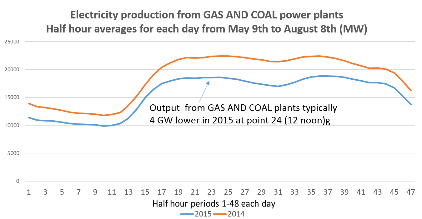
The chart below shows the amount of electricity being produced by fossil fuel plants, big wind farms, biomass, hydro, imports and pumped storage every half hour (1-48) for the 3 month period from May 9th to August 8th. It  excludes PV and small wind because these outputs are not measured centrally and are seen as net reductions in the electricity  generation required by the major generators.

This chart demonstrates that – on average – the amount of variation in electricity production over the course of the day is actually lower than it was last year. The typical peak is just over 10 GW higher than the half hour of lowest demand whereas in 2014 the average daily variation was over 12 GW. Everything else being equal, this would make the UK electricity network easier to manage because the need to ramp up and down gas and coal plants will be less.

Looking specifically at fossil fuel plants, their electricity production was substantially lower in 2015 than last year. As we’d expect, fossil fuel plants have born the full reduction in demand for electricity.

Nothing surprising thus far. However two of the readers of this blog have written emails suggesting that National Grid has been finding it much harder to manage the stability of the UK network this summer, perhaps as a result of the unexpectedly large addition to PV capacity. Solar is, of course, highly variable during each 24 hour period and is also somewhat unpredictable (particularly for non-users of SolarForecast). National Grid has limited information on what is being produced in large solar farms and none at all about the production from your roof. To keep the UK network stable on a second by second basis requires National Grid to oblige fossil fuel plants (and pumped storage) to adjust their output very quickly, and with little warning.

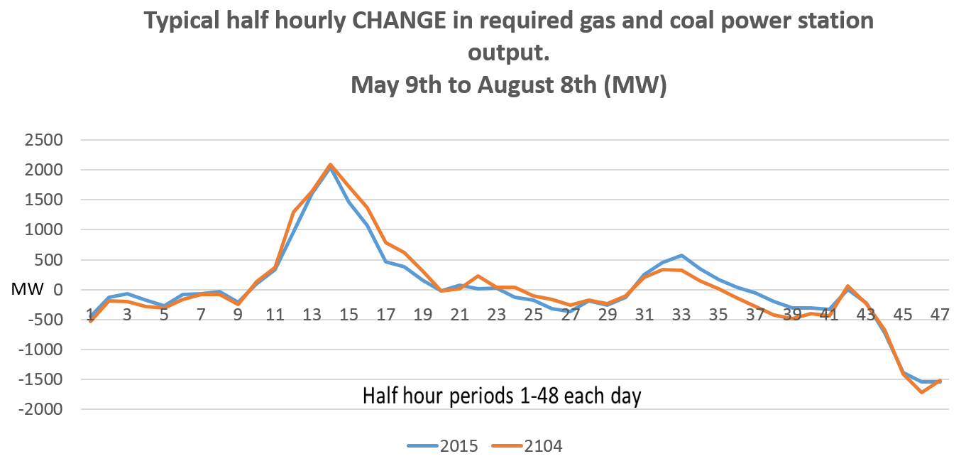
So the question I asked was this: although on average across the 3 month period the amount of power produced by coal and gas plants was lower than last year, did it have to vary more rapidly during the average day to meet swings in the output of variable renewables? Are gas and coal power stations being asked to increase or cut their output by larger and larger amounts to deal with the intermittency of wind?

The answer seems to be ‘no’.

First, if we plot the average change in required gas and coal plant output in each half hour, the figures do not look very different between 2014 and 2015. As we’d expect, the rate of ramp up in the morning as the nation goes to work look slightly lower. This is because the sun has begun to shine more strongly on to PV panels, choking off the need for more power station output. Between point 14 (7am) and point 20 (10am), the blue line for 2015 is consistently below the 2014 line, but the differences are not great. At the end of the day, as the sun fades, the blue line conversely tends to be above the 2014 figure. Between point 32 (4pm) and point 40 (8pm) the brown line is roughly 100 MW below the blue. 

These are averages for the 92 day period. And they show exactly what we’d expect. But the picture needs to be completed by looking at what happens on individual days. Is the degree of variability greater now? Once again the answer is no. The average movement between the required production from coal and gas power stations in each half hour has actually fallen slightly even as PV has surged. The average change - upward or downward - in fossil output from one half hour to the next has in fact fallen from about 530 MW to about 512 MW.

More importantly, perhaps, the number of times that the required output from fossil fuel plants has had to vary very sharply has also dipped, rather than risen.

Number of times output from fossil fuel power stations was required to RISE by 2 or 3 GW or more in a half hour period*

                                2014       2015

Over 3 GW          24           12

Over 2 GW          150         115

Number of times output from fossil fuel power stations was required to FALL by 2 or 3 GW or more in a half hour period

                            2014      2015

Over 3 GW          0              1

Over 2 GW          37           31

 *Data taken from all half hour periods between 9th May and 8th August.

If anything, it looks as though the period at which power output in the summer** needs to be ramped up fastest – around 7am – now looks easier to manage. The sun is rising at the same time, helping reduce the extra demand by flooding power into the local grids.

The amount of time which the system is trundling along requiring roughly the same amount of power from fossil plants hasn’t changed. The number of half hours in which the upward or downward variation fell between +500 MW and -500 MW was stable at just under 3,000 periods (out of 4,400 or so).

This note has looked at the needs for variability in power output from gas and coal plants. The relatively optimistic finding – that, so far, the system seems to be coping well and is not experiencing problems adjusting output – should not obscure the separate point that renewables are forcing fossil fuel power stations to work fewer and fewer hours per year. Many plants are said to be not profitable. Those of us eager for renewables to grow as fast as possible need to work out how to provide the back up to wind and solar when gas and coal plants have closed because of falling demand.

By the way, I found the results of this analysis surprising. i was expecting evidence of increasing half hourly variability. Please don’t hesitate to write in if you think I’ve done something wrong, or missed a key point. 


** This would be very different in the winter, when the fastest ramp up is around 4.30pm, just at the moment PV output - already low - zero.


Who killed the Green Deal?

Eight months ago Amber Rudd, then a junior minister in DECC, wrote the foreword to the annual report on the Green Deal, the government’s flagship scheme for energy saving that she closed last week. In December of last year she praised the number of energy efficiency measures completed under the policy. More surprisingly in view of last week’s decision to shut the scheme, she wrote ‘We have also proved that Green Deal finance works’.[1]

The evidence suggests otherwise. Under the Green Deal, householders were able to borrow money to carry out efficiency measures such as cavity wall insulation and the installation of new gas boilers. Their loans are repaid by a levy on the electricity bill and this repayment was intended to be less than the savings generated by the home improvement.

Despite Ms Rudd’s confident words, savings from energy efficiency projects in domestic homes do not cover the cost of installation after taking into account interest payments. This is what killed the Green Deal, not the ‘concerns about industry standards’ specified in last week’s announcement. The unavoidable but unfortunate fact is that home insulation improvements do not make financial sense if people have to borrow at commercial rates of interest. Blaming the insulation industry for the failure of the Green Deal is wholly unfair.

Ms Rudd ought to know this. In June this year her own department produced robust statistical assessment of the impact of the most frequent energy saving measures.[2] This analysis demonstrated that the average (median) reduction in energy use was as follows:


Cavity Wall Insulation     - 1200 kWh

Loft insulation                   - 400 kWh

Condensing boiler           - 1300 kWh

Solid wall insulation         - 2200 kWh


The annual cash savings from these four measures at today’s gas prices of about 4p per kWh will be


Cavity Wall Insulation     - £48

Loft insulation                   - £16

Condensing boiler           - £52

Solid wall insulation         - £88

To put these figures into context, it may be helpful to note that the median domestic gas usage in UK homes is about 12,400 kWh, a figure that has fallen by about 30% since 1990.

The small savings observed in real homes contrast sharply with figures routinely used by government and its affiliated bodies. Most relevantly, the Energy Saving Trust, a DECC sponsored body, publishes estimates of the savings from cavity wall installation (CWI) ranging from £90 for a flat to £275 for a detached house, between twice and almost six times as much as actually measured. These unrealistic figures from the EST are routinely used by web sites that householders will consult when thinking about investing in energy saving. I found the EST numbers copied (with proper credit) on the Which?, Money Saving Expert and British Gas web sites, for example.

If you believe the EST figures cavity wall insulation may have appeared to make sense under the Green Deal. For a typical semi-detached house, the savings from this measure are estimated at £160 and the EST says the cost will be less than £500. A Green Deal loan for this amount would have cost about £65 a year, meaning that the insulation savings suggested by the EST would have easily covered the cost.  

However if the real savings are only £48 a year, as specified by the government’s own new research, then the Green Deal loan will cost more each year than the reduction in the gas bill. Borrowing money to fund this improvement makes no financial sense. To be clear, the householder might still want to carry out the extra insulation to improve comfort and increase the speed at which a house warms up. But if she has to borrow money to do the work, the savings wouldn’t be enough to cover the cost.  The equation would be even more unfavourable, in fact much more so, in the case of all other home improvements.

This is what destroyed the Green Deal. It wasn’t stupidity on behalf of householders, rapacious sales tactics, poor performance from the insulation industry or the inadequate marketing of the scheme. Unscrupulous or careless exaggeration of the real savings by the EST combined with a government committed to privatising energy efficiency meant that the Green Deal was doomed from the start. It simply could never achieve what its architects intended.

In January 2014 I wrote a similar article to this one.[3] I showed how early statistical work from DECC had suggested typical savings from cavity wall insulation of around 1,400 kWh a year, slightly more than the new research now suggests is likely. At the time I criticised EST for using savings estimates of ‘up to £140’ for households carrying out this measure. Currently, EST is saying that the owner of detached house can save £275 and semi-detached house £160 from cavity wall insulation.

 In other words in the last 18 months the government’s own continuing research has marked down the average reduction in energy use from installing CWI from 1,400 to 1,200 kWh a year. In the same period the EST, a body charged by government with providing householders with independent advice on energy saving, has increased its estimate of the financial benefit from ‘up to £140’ to a higher level. The Energy Savings Trust needs urgently to be pulled into line.

So what do we do now?

It’s all very well sounding off about the implausibility of all the assumptions behind the Green Deal and the false numbers provided by the EST. What should the UK do now? The problem of the UK’s poor quality housing stock isn’t going to disappear. Carbon emissions from the energy used in domestic heating are still about 25% of the national total. Extra winter deaths, often from respiratory diseases encouraged by low interior temperatures, are running at about 24,000 a year and according to NICE may be trending gradually upwards after falling until about 2005/6.[4] (This last winter may have been particularly bad, although I couldn’t find official numbers).

There's some independent evidence that homes are now heated to lower temperatures in winter. In particular, poorer households seem to be cutting heating use. The government’s data shows that houses occupied by people with total income of less than £15,000 reduced their gas consumption by 4% between 2011 and 2013. But households with an income of over £100,000 increased their gas use by a similar percentage.  Rising rates of excess winter deaths may be related to the tendency of poorer households to run their homes at lower temperatures than they previously did because of concerns over the cost of heating.

A rational society would resolve to do something both about the particular problem of low house temperatures among elderly householders and the more general need to improve the UK housing stock (unique around the world in having a quarter of homes build before 1914). Help for older people living in poorly insulated homes makes clear financial sense in that NHS admissions would fall reducing the huge winter pressures on the service and the extra billions that need to be spent. So the programme of free home improvements for elderly people needs to continue and be hugely expanded. The package called the Energy Company Obligation - severely watered down in recent years – should be extended in its scale and radically simplified. At the moment its complexity, rigidity and general all-round incomprehensibility reduces its effectiveness. I believe that the costs of this programme need to be met by general taxation rather than loaded onto energy bills. Otherwise it will be seen as another example of ‘green crap’ policies used as an excuse to raise utility prices.

My second proposal is similar. We continue to need huge amounts of wall insulation; a third of total heart loss is still through walls. Although perhaps 75% of all cavity walls are now filled, several million remain to be done. More importantly, the UK has made almost no progress in insulating older solid wall properties. This needs to be completed – for free – as a national programme in which installers move from street to street.

Lastly, I still think the easiest target remains draught-proofing. Nearly a quarter of heat is lost through simple gaps in the exterior surfaces of homes, whether around the edge of doors or draughts between the floorboards. That is more than the losses through the fabric of  roofs, floors and doors combined. Draught proofing isn’t glamorous but it might be far more cost effective than insulation. £30 spent by an individual at the local DIY store will be a far better investment than all the measures available on the Green Deal. The tools needed are simple – a heat loss detection device and possibly a smoke pen.

Or a wider programme of careful, meticulous work, carried out by trained people in a national scheme, might cut heating bills by measurable amounts and would substantially improve our sensation of comfort. The perception of warmth is partly driven by the degree of temperature difference in the air around different parts of the body. A room in which air whistles around the ankles will seem colder than the same room with a still atmosphere. This is one of the reasons draught proofing seems to 'work'.

A national programme of getting community organisations to run street-by-street draught proofing, with large prizes for those groups getting the best results (easily measured by pressure testing the houses) could make a substantial difference to carbon emissions, excess winter deaths and home comforts.

I fear that there is no prospect whatsoever of the government pursuing such a programme but to me this is the easiest, cheapest and most inclusive way of improving Britain’s housing stock. It would be perfect constituent of what Labour Party contender Jeremy Corbyn calls 'the people's Quantitative Easing'.

[1] https://www.gov.uk/government/uploads/system/uploads/attachment_data/file/388761/greendealandecoannualreport.pdf

[2] https://www.gov.uk/government/uploads/system/uploads/attachment_data/file/437093/National_Energy_Efficiency_Data-Framework__NEED__Main_Report.pdf

[3] http://www.carboncommentary.com/blog/2014/01/18/actual-energy-savings-from-efficiency-measures-only-half-what-is-officially-claimed

[4] https://www.nice.org.uk/guidance/ng6/chapter/3-Contex

Alternatives to the 'unconstructible' EPR may be almost as bad

The engineering problems of the EPR are well-known. The nuclear power stations being built in Finland and France using this design are well over budget, are failing to meet even frequently revised timetables and are dogged with concerns over construction integrity. Olkiluoto 3 in Finland is now expected to start producing electricity in 2018, thirteen years after work first began on the site. The project will cost many billions of Euros more than first predicted.

Despite these highly visible problems – and the new legal challenge from Austria – EdF still wants to construct Hinkley C using the EPR design. Others have suggested that the alternative contender, Westinghouse’s AP1000 has a better future in the UK. An uncritical article in the Financial Times this week allowed the Westinghouse consortium a chance to expound on the strengths of the AP1000 design which is planned for the Moorside (Sellafield) proposed nuclear site. The head of the UK venture promoting the Westinghouse design said

‘We are using proven technology. The AP1000 has a good record of construction around the world’. [1]

This note suggests that these statements are lamentably false. Unfortunately for those of us who believe new nuclear should be a response to the increasingly urgent need to decarbonise electricity production, Westinghouse is having the same problems with the AP1000 as the unconstructible EPR.

AP1000

The AP 1000 is the next generation design being developed by Westinghouse, a subsidiary of Toshiba. Westinghouse constructs the AP1000 projects in partnership with Chicago Bridge and Iron (CB&I), probably the world’s most experienced builder of large power stations.

The AP1000 is a 1.1 GW plant using a design based on a much smaller power station developed by Westinghouse twenty years ago. One important fact is that no stations using the original design were ever built. However, the advantages of the AP1000 are said to include a relatively simple design, a high level of passive safety and modular construction. Modular construction means that components can be manufactured elsewhere and then shipped to the power station site. However US sites have had 5,000 workers on site at the same time, posing the some of the same huge management challenges that were experienced at the Finnish EPR site.

Four AP1000s are in construction in the US and four in China. The US plants are at two separate sites in the state of Georgia (‘Plant Vogtle’, 2 AP1000s) and South Carolina (‘Summer’, 2 AP1000s). This note briefly looks at the experience in Georgia.

Plant Vogtle

Vogtle 3 and 4 are being built in the same complex as two earlier nuclear power stations. After delays in final design approval, they were finally licenced in February 2012. Near-concurrent construction of the two plants started in May 2013 with completion of the first planned for April 2016. Original estimates for the total price to the utilities buying the power stations were about $14bn (about £9.5bn). The price to be paid was essentially fixed, meaning that most of the construction risk is borne by Westinghouse and CB&I. 

The most recent announcement of construction delays came in February 2015 when the station’s eventual 45% owner (Georgia Power) told the state regulator that the partnership building the station had recently estimated that the eventual completion date for Vogtle 3 would be June 2019. Vogtle 4 will be finished in June 2020. The expected delay for Vogtle 3 is now 39 months, more than doubling the initially expected construction time. The project is not yet half complete.

Although the contract price has not risen significantly because it is largely fixed, the cost to electricity customers in the state of Georgia has increased. This is because the utilities that will eventually own the two new stations have been granted electricity price increases by the state regulator to cover the higher financing costs of Vogtle 3 and 4. The utilities have been paying for individual elements of the two new plants as they are completed. The long delays mean that the interest costs are higher than expected and the regulator has already granted rate increases to compensate the eventual owners. People in Georgia are already paying a supplement of 6% of their bills to finance the new nuclear station.

Although the deal was a fixed price contract, the company buying the largest share of the finished plants is in legal battles over extra costs that the contractors claim that the purchasers should bear.

We can reasonably expect that the cost to construct the stations has also increased. However industry estimates of the eventual final cost to the contractors are vague and imprecise. They currently seem to be around $18bn (around £12bn). This seems low to me, given that the total project is now expected to take more than twice as long as originally expected. CB&I says that Westinghouse will eventually pay most of the overrun costs but we can safely presume that this issue will also end up in court.

Until recently the main buyer, Georgia Power, was reasonably content with the progress of the construction. (It has a difficult line to steer; it cannot be too critical of the contractors because otherwise the regulator that oversees it and grants its rate increases will question why it agreed to build the first new nuclear plant in the US for several decades in the first place). However its 2015 submissions to the Georgia regulator have become increasingly concerned in response to the latest estimates of delay.

Most recently, May 2015 testimony prepared for a hearing has been openly critical of the contractors Westinghouse and CB&I.[2]

In general, the Company, like the other Owners, has been disappointed with the Contractor’s performance under the revised IPS (the project plan).  The Contractor has missed several key milestones since the publication of the revised IPS in January 2015, including several milestones relating to critical-path or near-critical-path activities such as the assembly of CA01 (part of the central reactor), the delivery of shield building panels, and work on concrete outside containment.  The Contractor has also encountered difficulties in ensuring that new vendors produce high-quality, compliant components per the IPS (the project plan) projections.

Georgia Power is now indicating that it has little faith in the contractor’s ability to keep to the new delayed timetable.[3]

The Contractor’s schedule performance on critical path work such as concrete placements to start shield building installation and inside containment installation are challenges to the Contractor’s ability to adhere to the revised IPS.  The Contractor must continue to improve its schedule performance, maintain these improvements, and successfully resolve RCPs/squib valves/CMTs (components with severe quality or delivery problems) in order to complete the Facility by the currently projected substantial completion dates. 

China AP1000s

Cost data from the Chinese construction projects is difficult to find. But they have also experienced significant construction difficulties. Building at Sanmen began construction in August 2009 and was originally expected to be finished by August 2013. As with Vogtle, construction was said to be on schedule a year into the project [4] and even in March 2012 completion was still officially planned for 2013. Recent updates suggests that completion will actually take place in 2016, also a three year delay.[5]

The design used in China is simpler than that used in the US, and it may well be possible for Chinese constructors to build much more quickly and cheaply. However the modifications are unlikely to be acceptable to Western regulators. For example, the power stations are not designed to survive a direct hit from an airliner, a US requirement.


How many of the problems at Vogtle and elsewhere are inherent to the construction of a large third generation nuclear power station and how many simply arise because these are ‘first of a kind’ projects? (Similar 3 year delays have also happened at the other US AP1000 at Summer, where serious cost overruns have also taken place). Will new nuclear projects around the world avoid the major problems that have affected the first eight AP 1000s because the construction companies have learnt how to build these huge projects more efficiently? Or is a safe 3rd generation nuclear power station beyond the capacity of even the most experienced contractors to build to a tight timetable and at a predictable cost? I’m afraid I don’t think the answer is at all clear.

[1] http://www.ft.com/cms/s/0/a95f585a-26e6-11e5-bd83-71cb60e8f08c.html#axzz3g2r677Je

[2] http://www.psc.state.ga.us/factsv2/Document.aspx?documentNumber=158302 page 15

[3] http://www.psc.state.ga.us/factsv2/Document.aspx?documentNumber=158302 page 15

[4] http://www.world-nuclear-news.org/NN-Construction_on_schedule_for_first_Sanmen_unit-2109107.html

[5] http://www.world-nuclear-news.org/NN-Sanmen-2-containment-dome-installed-0707154.html

Food and fuel, not food or fuel

Can we use safely use larger quantities of biomass for energy? The conventional answer is no: humankind already uses too much valuable land for non-food purposes. Using more of the world’s productive acreages to produce wood or other biomass for the generation of electricity or heat will increase global environmental stress and reduce food production.

In a very recent paper, Mike Mason and team give a different answer. They probe the use of otherwise unproductive drylands for growing a class of non-food plants for use in anaerobic digesters (AD).[1] AD produces methane which can burnt to produce electricity. Mason’s conclusion is that the world’s drylands cover about 15% of the world’s land area. Planting of carefully chosen aridity tolerant plants on just 10% of this land could produce as much electricity as natural gas does today. As important, the gas from AD can be burned at night or on cloudy days meaning it is a vital complement to solar PV in tropical countries.

10 month old prickly pear plantation in Kenya

10 month old prickly pear plantation in Kenya

To put Mike Mason’s work in context, I’m going first to look at why wood and plants are usually thought not to be an appropriate replacement for fossil fuels. Put at its crudest, the argument is that burning a tree sends CO2 back into the atmosphere. Replanting a new tree will eventually extract that CO2 again but it might be 60 years before even a fast growing conifer has grown to the same size as the tree that was burnt. So even if we immediately replace every single tree that we use for energy it will be many decades before the world moves back out of ‘carbon debt’.

This may be too crude an analysis. Let’s look at where Drax, the huge power station in Yorkshire that is switching to burning wood pellets, gets its 4m tonnes of fuel from.

1.1m tonnes sawmill residues

1.2m tonnes forest residues

1.0m tonnes woodland thinnings

0.4m tonnes sawmill waste

0.4m tonnes other (straw, miscanthus and other sources)

Total 4.1m tonnes

Drax is very careful. Virtually none of its biomass comes from mature trees cut down solely to keep its giant furnaces burning. The company argues - with much justification in my view - that its purchases are encouraging increased forestation in the southern US, where it sources much of its wood. Removals of wood are running at only about 60% of the natural growth rate in the southern eastern US states.

Nevertheless, Drax’s scale is simply enormous. (It is by far the single most important buyer of wood pellets in Europe, and possibly the world). By one calculation it is using the biological production of over one million hectares of land, or almost as much as the total wooded area of England. (NB Scotland has a lot more). From this, the UK is getting about 3% of its electricity.

If Drax is any example, biomass doesn’t look a good bet as the source of the world’s power in 2050. At root, the reason is that photosynthesis isn’t particularly efficient. We’re lucky to see 1% of the sun’s power turned into burnable carbon in the most efficient plants and trees in well watered zones. Compare this to the 20% of light hitting a good solar panel.

The overall position is far worse than this because much of the world’s area doesn’t support plants. The earth receives about 100,000 TW of energy from the Sun but only about 120 TW is captured by phothosynthesis on land and at sea. Only about half this photosynthesis is carried out by land plants and trees and humankind is currently using about 15 TW in the form of food and other materials.[2] The pessimists in the field think that the ability of humankind to increase this offtake of biomass is very limited. Only a few scientists have previously suggested that more than about 20 TW can be safely abstracted without risk of further environmental stress. Much of the extra 5 TW of photosynthesis will need to be in the form of human and animal food, implying that at most a couple of extra TW might be used to meet human energy needs, such as burning wood in Drax. This is why Mike Mason’s work may turn out to be so important.

Even a couple of TW isn’t negligible. The planet is currently using only about 15 TW and this isn’t ever likely to rise much above 30-40 TW. Nevertheless, as things stand, bioenergy can only provide a fraction of extra energy needs, even under the projections of the most optimistic people in the field.

The work of Mike Mason’s team may change this. In essence, what the group is saying is that we can capture far more energy using photosynthesis than the current research suggests. Agriculturally unproductive drylands, such as in Kenya where the group’s work is largely carried out, can be made photosynthetically useful if the right plants are cultivated and harvested. The paper investigates two types that can capture sunlight well, even in areas with low and highly seasonal rainfall: Euphorbia tirucalli and Opuntia ficus Indica. (The first is usually called Pencil Cactus and the second Prickly Pear).

After harvesting, Mason hypothesises that the best way of extracting the energy and converting it into a useful form is through anaerobic digestion, allowing the plant to rot in a very low oxygen environment, much as grass is broken down in a cow’s stomachs. This produces a biogas that is up to 65% methane, burnable in inexpensive gas engines and turned into electricity. The plants could be combusted but the big advantage of digestion is that the gas produced each day can be stored for burning overnight when PV panels aren’t producing any electricity.

Mason’s team show that it may be possible to generate annual yields of 20 tonnes of dry biomass per hectare using these water efficient plants. That’s about five times the productivity of a hectare of Sitka spruce in the UK.

If Mason is right, cultivating these crops on between 1 and 2% of the world’s land will capture about an extra 1 TW of solar energy without reducing the world’s agricultural production. In fact, he thinks that the by-products of the AD process, including nutrient-rich liquids, can be used to enhance food output. The conflict between food and fuel disappears, he says.

The obvious question to ask Mike Mason is why others haven’t noticed the energy generating capacity of these types of plants before. He’s on record as saying that the reasons include the lack of agricultural interest; these plants have very limited food value and therefore have never been properly cultivated.  

Further experiments to grow and then digest these plants will show whether the results suggested in Mason’s paper can be widely replicated. Do these plants really produce 20 tonnes a hectare on land with low rainfall that is concentrated in a few months of each year? Can they be planted and harvested cheaply? Will the plants be digested properly in AD? Will the impact on food production be as benign as he hopes?

As with so many other apparent breakthroughs, this new approach needs millions of dollars of research money now. Mike Mason had a career as a successful entrepreneur before going into academic work and still keeps his business activities going. There are very few people better qualified to find ways of giving the developing world an extra terawatt of power.


[1] For people who know about  plants, it may be useful  to know that Mason proposes using so-called CAM plants (crassulacean acid metabolism). CAM plants use relatively little water and do not contain much lignin, a molecule that resists breakdown during AD.

[2] The calories actually eaten by the world’s population represent the energy equivalent of no more than about 2TW of this total. Other biomass is wasted, eaten by  grazing  animals or used as fibre or other  materials. 

Air travel makes you happy, says the Airport Commission. That's why we need more runways

The Airport Commission changed its arguments sharply between its 2013 interim report and the final document of today, July 1st. In 2013, the central idea was that Heathrow should be expanded because of a rising need for business air travel. The UK is missing out, the Commission suggested, because Heathrow did not have sufficient capacity to service desirable locations such as the largest Chinese cities. Everthing changed today. Now the core argument is that without Heathrow expansion the UK’s leisure travellers would suffer. The Commission tells us that air travel makes people happy (I am only slightly simplifying the text). Therefore London needs more runways so that we can all fly more.

The purpose of this post is to point to what I think is a serious flaw in the analysis of the impact of air travel on happiness. I apologise for straying into econometrics but since the Commission’s report is likely to result in public policy decisions, I believe it is vital that poor and misleading analytic work is scrutinised.

In summary, I say that the Commission’s econometric work does not show that air travel makes people happy. Rather it demonstrates the wholly unsurprising conclusion that having holidays away from home is associated with a better state of mind and health. There is no legitimate ground for the Davies Commission to justify Heathrow expansion on the basis of improved happiness as a result of more air travel.  (I’ve tried to make the rest of this article as free from econometrics as I can).

Below is a crucial chart that the Commission didn’t include in the interim report but does make an appearance in today’s document. It’s worth a close look. For the first time we see on Airport Commission headed paper an admission that business air travel is falling. It’s lower in terms of millions of passengers than it was in 2000 down from about 31 million trips to around 29 million. Any growth that is coming is from leisure travel, either for holidays or Visiting Friends and Relations (VFR). This conclusion is as true for Heathrow as it is for other London and large regional airports. Heathrow is a leisure airport, partly for UK residents and partly for non-residents passing  through the airport on the way to another destination. 

 Red line - business travel    Pink line - visiting friends and relations (VFR)  Blue line - leisure


Red line - business travel    Pink line - visiting friends and relations (VFR)  Blue line - leisure

Simply put, the notion that business needs more airport runways around London is nonsense. If there is any need for more airport capacity, it arises because of leisure travel. And it is certainly worth pointing out again that many of the leisure travellers that pass through Heathrow are in transit from one non-UK destination to another. They are of no substantial value to the UK economy. Why the people of Richmond or Hounslow should suffer more noise and traffic disruption to allow more non-UK people to fly on holiday elsewhere is an issue that Howard Davies does not address.

By ceasing to stress the business need for Heathrow expansion, the Davies Commission seems to have finally accepted that the arguments for more runways can only be made by reference to the possibility of rising leisure travel, by UK residents and those from abroad. That is why we see the following surprising statements early in the Commission’s final report. (There’s nothing remotely like these comments in the interim version).

‘Leisure flights have a high social value. Empirical analysis focused on passengers travelling on holiday or to visit friends and family has shown how the access to leisure travel affects mental health and wellbeing. The findings demonstrate these patterns of travel are associated with higher levels of life satisfactions, general and mental health, and happiness’.

And so it goes on. Heathrow expansion is justified not by the brutal logic of global economics but by an unusual interest in personal happiness. The Commission pulled in consultants PwC to provide the analysis that back up its assertions that air travel makes us feel good. The consultants trawled through published academic research and analysed three large scale statistical studies of personal happiness.

The academic research is limited and not particularly helpful. PwC writes

‘Most of this literature is based on analysis of surveys of small groups of people with specific characteristics or small samples designed to be representative of large populations . None of the studies has conducted empirical analysis using datasets similar to those we have used in our empirical analysis’

So they move on to their three big statistical studies. The first shows reasonably convincingly that having an annual holiday is associated with greater happiness. Nobody will be surprised. If you don’t have a holiday you are likely to have less control over your life and/or be the kind of person who gets little pleasure from leisure. These are clear predictors of unhappiness.

The second PwC study demonstrates, the consultants say,  that air travel is associated with a higher level of happiness. This is the conclusion that the Davies Commission leaps upon because it supports the case for more London runway capacity. (Here comes the only bit of econometrics in this article, sorry). However, the statistical work that PwC did for the Commission didn’t split up the respondents into those that travelled on holiday by car, train or bus and those that flew. This second study is therefore picking up nothing more or less than the same phenomenon seen in the first study. If you travel abroad you are likely to be doing so because you are going on holiday. In other words, the second report finds the same conclusion as the first; holidays are associated with happiness, not that people like air travel. There can be no conclusion that air travel causes a higher sense of life satisfaction.

The third statistical study confirms the first. People who are able to take holidays tend to be happier than those that do not.

PwC concludes

Our empirical analysis of the UK using three large datasets consistently finds that taking holidays and flights is associated with improvements in health and wellbeing as measured through various indicators of health and wellbeing’.

No it does not. PwCs' empirical analysis shows that people who take holidays are happier. Nothing more and nothing less. For their money PwC should have done better econometrics. And the Davies committee shouldn’t have based their revision to the reason why London needs more airport capacity on such a weak piece of work.

There’s one more comment to make. In addition to the new focus on leisure, the Airport Commission uses its final report to make the case for Heathrow based on the amount of freight coming in to the airport. This argument is almost shockingly lame. The reason Heathrow takes in more freight tonnage than elsewhere is simply that it has far more inbound passenger flights. The freight that arrives in the airport doesn’t come in cargo aircraft but in the holds of long distance passenger flights. And since Heathrow has almost seven times as many long distance passenger flights as Gatwick it is utterly obvious why it brings in more freight.

The truth remains that London doesn’t need more runway capacity and that the pressure for Heathrow expansion is entirely driven by the understandable desire of the owners of the airport to make more money by running more services. Nothing more and nothing less.

If the UK thinks it can meet its carbon budgets for 2050 by expanding the number of airport runways, delusions have set in very deep. Today’s air travel CO2 emissions of around 40 million tonnes a year will use up almost all the UK’s allowance by mid-century. We cannot meet our carbon budgets by continued encouragement of aviation.


New record for UK renewables output

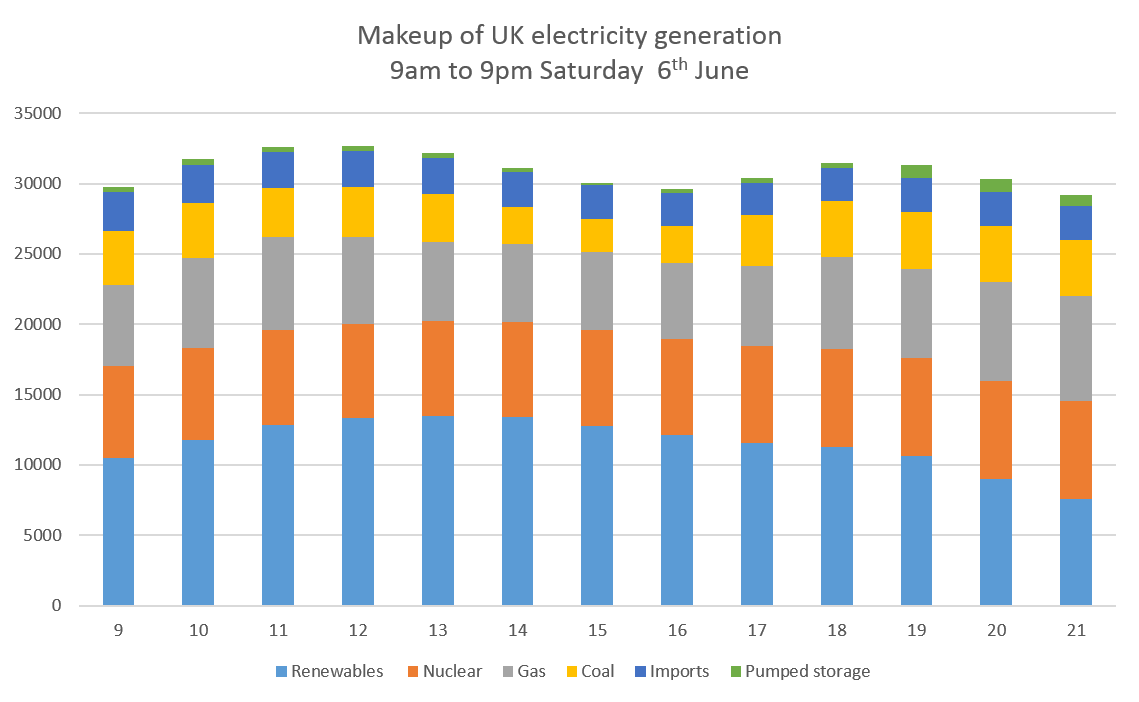
Renewable energy provided 13.4 GW, or 43%, of British electricity at 2pm on Saturday 6th June 2015. I believe this is a new record.

A windy day, combined with strong sun and low weekend levels of demand meant that fossil fuels delivered only 26% of total supply in the early afternoon. The remainder was delivered by nuclear, imports and power from the UK’s storage reservoirs in North Wales and Scotland.

The glut of wind and solar power almost pushed coal-fired stations out of the picture. At 3pm, coal was providing only 7% of British electricity, a total of just over 2.3 GW. I think this is also an unprecedented low and something to be actively celebrated. I don’t have the precise information but I believe only one coal-fired power station – Drax – was operating. If the country chooses to invest in wind, solar and other renewables, it can push coal-fired generation out of the generation mix completely.

Summer days that are both windy and sunny are rare. In no sense were the daylight hours of Saturday 6th June 2015 typical. But it did provide an inspiring moment that showed how renewables could eventually replace fossil fuels.

At the moment  I don't think anybody monitors the share of renewables in UK generation. In Germany, this information is provided every hour via the EEX power trading exchange and it would be sensible to do the same thing here. 

The chart below shows the makeup of supply from 9am to 9pm on Saturday. (Because of the really strange way that the UK monitors electricity output, I’ve had to list the main assumptions in the paragraph at the end of this note).

The left hand axis is Megawatts (MW). A GW is a thousand MW.

The left hand axis is Megawatts (MW). A GW is a thousand MW.

What share of total electricity output was provided by renewables during the day? My estimate is below.

Hours from 9.00 to 21.00 (9pm)

Hours from 9.00 to 21.00 (9pm)

Notes

1. The UK system doesn’t measure solar PV as a separate source of electricity.  It ‘sees’ PV as a reduction in demand for the conventional power stations and big wind farms. So I have added my estimate of PV output (generated at www.solarforecast.co.uk) to the measured UK figure. Similarly, I have added National Grid’s estimate of output from small scale wind farms that also aren’t directly measured. This might well be an inaccurate figure.

2.  I have assumed that Drax’s biomass units are the source of output described as ‘Other’ by National Grid. The figure is about 1 GW for most of Saturday, roughly equivalent to the capacity of the units at Drax.

3. Renewables include grid connected wind, embedded wind, PV of all sizes including domestic, biomass principally at Drax's 2 biomass units, and non-pumped storage hydro. 

Solar PV making a visible difference

The solar PV that the UK added between in the single year to March 2015 reduced overall UK power needs by 2.6% in spring this year. Over the daylight portion of the day the reduction was 4.3% between April/May 2014 and the same months a year later. In the early afternoon, when the sun is at its strongest, the reduction over the one year period was almost 7%.

PV is having a marked impact on UK electricity need. At 1.30pm, the typical April or May day saw a reduction of 2.6 GW in the total electricity supplied by the big generators. That’s after taking into account the higher winds this year and the overall fall in electricity demand.

This year compared to last year

I looked at the total amount of electricity being transported by the National Grid from big generators, including the large wind farms, coal stations, gas and nuclear.  This number excludes solar and smaller wind farms which are connected to local electricity networks and which aren’t metered in real-time by National Grid.  Electricity need is tending to fall across all parts of the year and was down about 1% in April and May compared to last year.

The wind blew a bit harder in spring this year. This matters because if small wind farms are producing lots of electricity the amount of power the big generators need to produce goes down. More power produced by local turbines further reduced the flow of electricity across the National Grid by about 0.7%, taking the reduction to 1.7%, before considering solar.

During the year from May 2014 to May 2015, the UK added slightly over 3 GW of solar PV. (For comparison, the UK’s biggest power station complex at Drax in Yorkshire has a maximum output of just under 4 GW). My estimate of the additional solar capacity isn’t firm. DECC produces estimates every month but I think it is falling to capture some of the new solar farms that were hastily installed across England in the weeks of February and March as developers raced to beat the end of the Renewable Obligation subsidy. I think the UK now has about 7.1 GW of solar, not the 6.5 GW that DECC says. (It’s only when the new farms finally get fully accredited at Ofgem that we’ll know who is right).

The other thing to mention was April and May were sunnier this year than last. The panels on my roof produced 27% more in April and 5% more in May than in 2014. When we look at the impact of PV on the electricity that the big fossil fuel generators needed to produce we have to remember that it was windier and sunnier and we had more turbines and a lot more PV.

Nevertheless, the results are impressive to look at.  The chart below shows the how April/May 2015 compared to the same days last year. The world of electricity divides the day  up into 48 half hour periods and in summer the peak output from solar is sometime just after 1pm BST. (Remember that most of the UK solar capacity sits slightly west of the Greenwich meridian and so the sun will be at its zenith after 1pm BST/noon GMT).

These figures contain an adjustment to ensure that both years have the same number of weekend and weekday days because weekends have lower demand.

These figures contain an adjustment to ensure that both years have the same number of weekend and weekday days because weekends have lower demand.


In the dark hours the UK’s big power plants were producing about 98% percent of what they did in 2014. As the sun rose, the difference increased. In early afternoon, the average demand on the Grid was a little over 91% of what it was in 2014. The dip was well over 2 GW for several hours and peaked at 2.6 GW. If the weather’s OK, June, July and August will be the same.

A dent in overall electricity generation need was already apparent in 2014. This year, it had become far more obvious with the need for conventional power now falling sharply after 9 am. The usual early evening peak has disappeared because the sun is still shining when people come home, turn the TV on and cook dinner.

The pattern in the chart above is perfectly explicable because of the sunnier days of 2015 and the larger base of installed capacity. Sadly, the PV rush is over. Unless things change, we’ll only see a small increase in solar output each year. But if anyone ever says PV is irrelevant in the cloudy UK, you can show them this chart. Or take a look at www.solarforecast.co.uk where I use meteorological data to estimate how much electricity the UK’s PV will produce for the next five days. On the best days, we’ll see about 6 GW pouring into the electricity distribution system, as much as 25% of the UK’s need on sunny weekend day. Saturday doesn’t look too bad, with over 5 GW expected by my forecast and that of National Grid’s.


These figures contain an adjustment to ensure that both years have the same number of weekend and weekday days because weekends have lower demand.

These figures contain an adjustment to ensure that both years have the same number of weekend and weekday days because weekends have lower demand.


Artificial photosynthesis - a difficult but necessary part of the energy revolution

Why we need to store energy  in liquids

May 28th. It’s a fairly typical early summer’s day in Germany. At noon, PV and wind are providing just over 50% of electricity supply. Solar output will fade sharply over the afternoon and cease completely by about 9.30pm. Although the wind will continue to blow, renewables won’t make much contribution to overnight electricity supply.

Despite this intermittency, we want solar to continue growing. In most parts of the world, though probably not Germany, its annualised costs are now no higher than electricity produced from fossil fuels. But however much we desire PV to succeed, it doesn’t deliver electricity for much of the day, it is unreliable in higher latitudes and it is still requires a huge capital investment to move from old and fully depreciated gas and coal plants to open fields of PV. Even those of us who think that solar is the world’s best hope need to acknowledge that it fits uncomfortably with the energy systems of advanced economies. However cheap solar gets, it doesn’t solve the problem of the need for seasonal storage.

The purpose of this post is to argue for a new focus on artificial photosynthesis and, in particular, investment in the development of low cost technologies to convert sunlight directly into carbon-bearing liquids. Put at its most simplistic, we need techniques that use photons of light to disassociate the hydrogen and oxygen in water and then use the hydrogen protons and electrons to provide the energy to mimic the natural photosynthetic reactions in plants - or, more probably, bacteria - that capture atmospheric CO2 and combine the gas with organic molecules to make sugars and more complex energy carrying chemicals. Artificial photosynthesis (AP) may (eventually) become cheap, be able to use non-potable water and require little land that could be otherwise used for agriculture. In other words, it avoids all the problems bedevilling today’s renewable energy technologies.

A tricky problem

But using solar energy directly to make fuels is an intensely difficult problem. One recent academic paper wrote

The scientific challenges for efficient and globally deployable AP are complex; requiring coupled breakthroughs in light harvesting, charge separation, catalysis, semiconductors, nanotechnology, modelling from synthetic biology and genetic engineering, photochemistry and photophysics, photoelectrochemistry, catalysis, reaction mechanisms and device engineering.

But the very next paragraph of this paper says

In favour of AP is the vast excess of available solar energy compared to present and projected human needs, its capacity to reduce the atmospheric concentration of greenhouse gases and address the problem of intermittent renewable energy (solar pv, wind and hydro) electricity supplies as well as the need for a zero-carbon source for transportation fuels.

 I’ve tried to write before about the importance of using surplus electricity for conversion into methane (natural gas) because gas can be stored easily within the existing infrastructure of pipes, gasometers and exhausted fossil gas fields. ‘Power to gas’ - the conversion of surplus electricity into hydrogen and possibly then on to methane – is an extraordinarily important technology in which the UK has no shown no interest whatsoever. It faces two obstacles in addition to policy neglect. First, neither the UK nor any other country has any significant investment in the infrastructure to store hydrogen. Second, hydrogen isn’t particularly good as an energy carrier, delivering relatively little power per unit weight or volume. But using the hydrogen  to make methane looks much more interesting, although this requires a dense source of CO2, such as flue gases.

In this article, I want to put forward the view that we should also be pushing for expansion of research into the direct capture of the photons of sunlight and their conversion not into gas, but into liquids. Liquids have high energy density (kWh per kilogramme and per litre) and are also easy to store within today’s economy. At this moment, for example, the UK has oil in store equivalent to about 80 days consumption. In other words, we have the pipes and tanks to take seasonal surpluses of electricity from PV and keep that energy in the form of energy-rich liquids.

Time to start sponsoring research

After decades of statis, recent progress in academic and commercial research in artificial photosynthesis is exciting. I guess we are about 15-20 years from cheap and easily deployable systems that be used everywhere around the world to provide abundant energy to supplement solar. I hear you immediately saying ‘but we don’t have 15-20 years’. Probably true, but we must not let that stop us engaging in urgent research. There is no conceivable alternative in high latitude countries if we want a modern economy and abundant and cheap energy available throughout the year. (I am disregarding nuclear power as an alternative because it is looking increasingly impossible in much of the world, even including the UK).

In European countries modern life requires the continuous supply of about 4 kilowatts of energy per person. (Not just electricity, which is less than half this, even including conversion losses turning fossil fuels into power). We can probably compress this by switching to electric cars (3 times as energy efficient as petrol) and possibly by using heat pumps (up to 3 times as much useful heat per unit of input electricity as a resistive heater). But we probably cannot get the total energy need much below 3 kilowatts a person in the near future. (That’s the equivalent of two electric kettle working continuously for each of us).

Provided we could store the surplus power when the sun is shining, we could get this electricity from installing about 30 kilowatts of PV per head. (The average British PV panel generates about 10% of its maximum capacity over the course of the year). The UK has currently about 0.12 kW per head, by the way, and Germany about 0.45 kW or between 0.4% and 1.5% of what is needed.

Batteries will be useful. But the size and cost will be enormous. Just to store the surplus power of a sunny day like today will require over 100 kWh of lithium ion battery per person. This is more than in the most powerful electric cars on the road today. Batteries like this have poor energy density, needing nearly a hundred times as much weight as petrol to store the same amount of energy and almost twenty times the space. The unfortunate truth is that batteries are fine for overnight electricity storage so that you can run the washing machine at 10pm from power harvested at noon that day. However they will never have any role, absent quite unexpected technological developments, in storing Britain’s summer photons for a dull December. That’s where power to gas and artificial photosynthesis come in.

Here’s brief details of three new developments in artificial photosynthesis, using contrasting approaches and with very different strengths and weaknesses.

Joule

The nearest entity to commercial production of fuel from sunlight is probably Joule Unlimited, a company headquartered near Boston and with production facilities in New Mexico. Joule’s technology uses transparent tubes of brackish water into which CO2 is flushed. The tubes are filled with genetically engineered microbes that take energy from sunlight to capture the CO2 and then excrete a liquid fuel.

The advantages of this approach include very high levels of productivity. The company claims it can produce 40,000 litres of ethanol per hectare a year. This implies a very high degree of photosynthetic efficiency – far greater than conventional green plants – and approaches the energy yield of the same area full of solar panels. The process is cheap and isn’t limited by having to use scarce water or minerals. Some openly doubt whether Joule’s technology will ever work but the company has just raised another $40m to add to the $120m already invested. This money will help build the first commercial plant. Rumours suggest that the recent fund-raising round included GE and other major international corporations, including Audi, an earlier backer.

The disadvantage of the Joule approach is that it needs a relatively dense source of CO2, such as the flue gas from a cement works or coal-fired power station. In other words, it can be argued that the technology requires the generation of CO2 in order to operate. Unless the CO2 from burning Joule’s ethanol is itself captured, unlike natural photosynthesis this process doesn’t reduce atmospheric carbon dioxide levels. But, if it works, Joule’s approach is inexpensive and effective.

Daniel Nocera at Harvard

Nocera and his colleagues published a paper in February 2015 that demonstrated a technique for using electricity – perhaps generated by solar panels – to split water into hydrogen and oxygen. A genetically modified bacterium uses the H2 to begin the conventional (and chemically complex) process of photosynthesis. Instead of producing biomass, as in conventional bacterial growth, the bacterium generates isopropanol, a potential carbon fuel.


Nocera’s team have made huge advances. The splitting of water is done using cheap electrodes and at a low voltage. Yields are still low, at least by comparison to the generation of electricity from PV, but already at least as good as in plant photosynthesis, which is usually no better than 1 or 2%. So, if this approach can be commercially exploited, more energy will be generated than could ever be generated by making biofuels from fermentation processes. The capital costs will be relatively low, but the disadvantage of this approach is that needs the delivery of electricity, rather than the direct use of sunlight, as well as a feed of concentrated CO2. Even if the Nocera process can be made 5% efficient at converting energy into carbon-bearing molecules, it will still require huge areas of solar panels to provide the fuel for each person’s energy needs.

Yang’s team at Berkeley

Professor Yang’s group published a paper last month that showed a mesh of interlocked microscopic nanowires made of silicon and titanium oxide which is populated by bacteria. (A different genus to Nocera’s bacterium). The nanowires absorb photons from sunlight and generate electrons. These  are captured by the bacteria and used to turn the CO2 being bubbled though the solution surrounding the mesh into more complex carbon-bearing elements.

The Yang team are excited by these results. One comment was ‘We believe our system is a revolutionary leap forward in the field of artificial photosynthesis’. The technology seems potentially inexpensive, robust and may have an energy yield that is as much as 10% of the energy initially provided by sunlight. But like the other two technologies, it needs sources of CO2 more concentrated than in the atmosphere.


There’s a long way to travel before artificial photosynthesis becomes an economically competitive means for storing surplus solar (or wind) energy. We eventually find it is better to focus on using surplus electricity in summer to turn into hydrogen and then into methane.

Power to gas, perhaps using the technology pioneered by Electrochaea may be able to convert more than 50% of the energy supplied as electricity into the chemical energy of methane. This is far better than the conversion efficiencies implied in the two academic results published this year.

Nevertheless, the arguments for spending research money on artificial photosynthesis remain strong. Without a means of energy storage for months at a time, the renewables revolution will stall. Most importantly, we need to be able to extract CO2 from air in order to reduce atmospheric concentrations.  Artificial photosynthesis is a hugely complicated problem to solve but the UK science base needs to get engaged in this vital area. At present, most of the research work is going on in the US (usually paid for by Federal money).It needs to be a similar priority here.

Fossil fuels currently as low as 40% of all UK generation

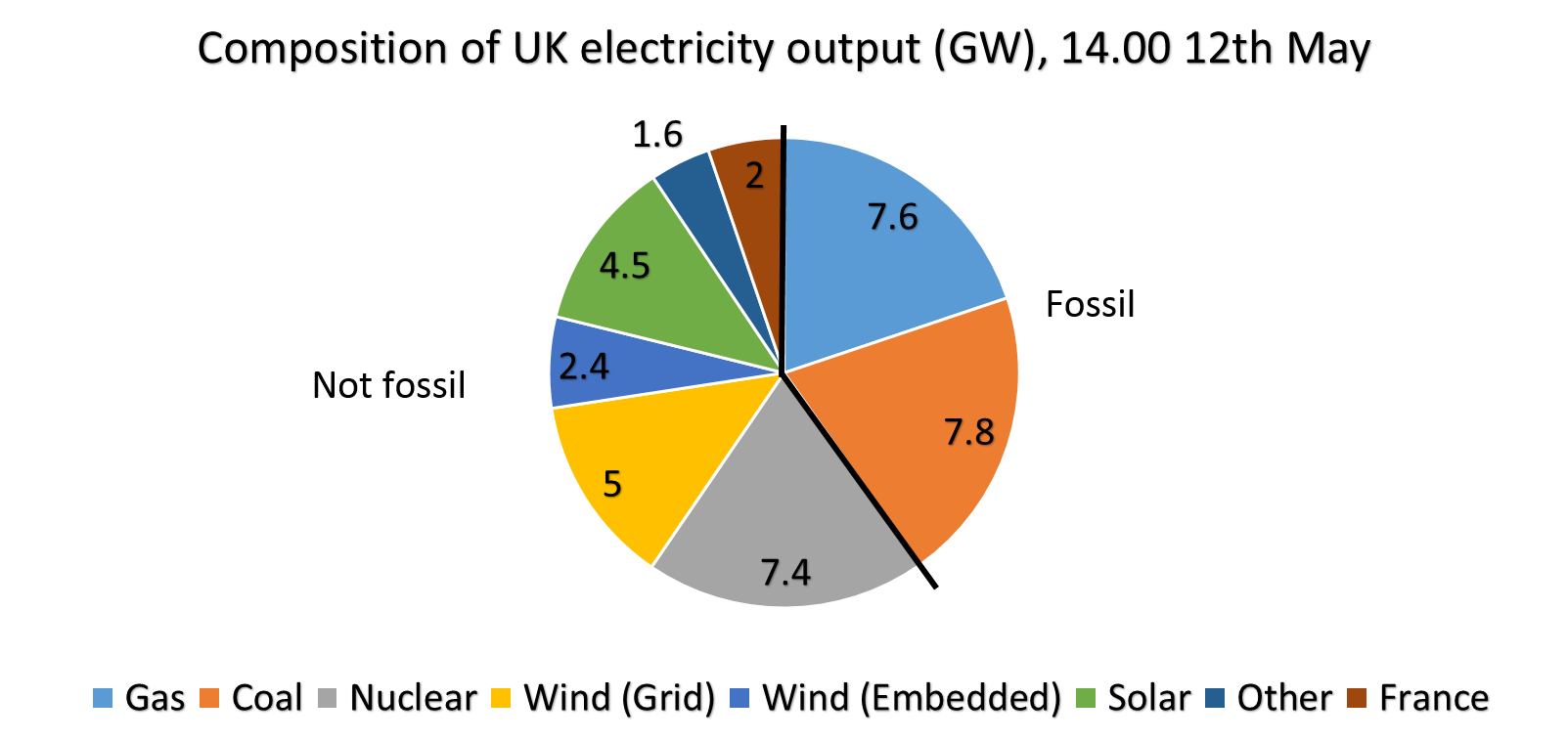
It’s a windy and quite sunny afternoon across the UK. At 14.00, this was the composition of electricity output. Fossil fuels are down at 40% of the total. This may be a record low for the daytime hours.

Wind is providing about 7.4 GW and solar about 4.5 GW. (Most wind output is directly measured, ‘embedded’ wind is not and is a National Grid estimate). Add in hydro and biomass and total renewables output is running at 13.5 GW, compared to 15.4 GW for fossil fuels. At this moment renewables are providing over 35% of UK electricity. Figures for PV are from Solar Forecast (www.solarforecast.co.uk).

Nuclear gives us 7.3 GW and the France interconnector about 2.0 GW. Assume that this power is all fossil free and 60% of UK electricity – for a few hours until the wind and sun fade – is low-carbon.

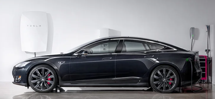
Tesla's home battery; a remarkable achievement that doesn't quite make financial sense

It’s getting closer, but it’s not quite there yet. Tesla’s home battery system is a major advance on competing offers though it still doesn’t make straightforward financial sense.

The company announced a 10 kWh battery at a price to installers of $3,500. It comes with a highly impressive 10 year guarantee and a maximum flow rate of 2 kW, enough to power the average UK home (except when the tumble drier and kettle are working together).

What would be the financial implications of purchase? The first thing to note is that the system is being sold as a storage system for surplus solar power. But actually in the UK the logical use for the unit is as a way of storing cheap overnight electricity and using it during the day. The Economy 7 pricing system offers very cheap energy between about midnight and 7am. The battery owner would take up power during the night and use the electricity during the day.

I looked at E.ON’s current tariff for Economy 7. It charges about 5.2p per kilowatt hour, compared to 13.8p per kWh on a standard tariff. To use the battery most cost effectively, the owner would buy 10 kWh overnight for 52p and use it during the day, not spending £1.38 as a result and therefore saving £0.84 a day or about £300 a year.

This maximum saving is only achieved when the house uses exactly the 10 kWh capacity of the battery each day. If it uses more the householder will have to stump up for more expensive daytime power. If it uses less the home won’t get the full saving.

When the Tesla unit becomes available in the UK, what will it cost? If the current price to installers in the US is $3,500, it’ll probably cost around $4,500 fitted in the home, if there’s already a AC/DC inverter such as comes with a PV installation. (It looks a simple job to put it on the garage wall next to the meter). In the UK, the cost will be burdened by VAT and import tariffs. I guess it will be available here for a minimum of £4,000 to solar panel owners with inverters.

So the offer to the UK householder will a ten year guarantee of making a maximum of £300 a year after handing over at least £4,000. The price will have to halve to make this a remotely reasonable financial deal.

Of course it is not all about yearly savings. The battery functions as a back-up power supply, meaning the house will still have electricity even in the event of grid failure. And many people have such a hatred of the electricity supply companies that they will pay a high price to reduce their bills. But for most people the Tesla battery is no more of a realistic proposition than the Tesla car.

That’s the bad news. The good news is the extraordinary rate of progress that this innovation represents. A few months ago the UK home battery maker Moixa started selling its Maslow system at a price of around £2,000 for 2 kWh or about two and a half times today’s Tesla cost per kilowatt hour. Sonnenbatterie, the European market leader, is charging about $10,000 in the US for a 4.5 kWh system, a five times multiple of the Tesla installed price. No wonder the German company  admits it makes little financial sense to buy a domestic battery, even when faced with high Californian electricity costs.

Tesla’s heady price will pull down battery costs across all size ranges. In a little-noticed part of the Tesla press release the company talked extensively of its partnerships with large electricity users such as Amazon data centres. The economics of these applications will be better because of the value of 1 MWh batteries to the local grid, the increasing importance of being able to complement local sources of renewable energy and the financial value of shaving peak demands. (Large users generally pay a substantial annual charge based on their maximum electricity use and batteries can reduce this).

Home electricity storage still doesn't  quite make financial sense; batteries installed at large electricity users or generators probably do. And, of course, a Tesla system installed in a country without an electricity grid will be a life-changer.

(Unrelated note: my forecasts for daily solar PV output in the UK, using weather forecasts and installation data for 98 geographic areas, are now available at www.solarforecast.co.uk. Any thoughts gratefully received at chrisATcarboncommentary.com.)


Launch of UK solar forecasting service

The March rush to complete solar farms combined with the advent of good weather gave us an unnoticed special event on Saturday. Was this the first time ever that electricity demand from the National Grid was lower in the middle of the day than it was at midnight? I think it might have been.

We saw the unsurprising consequence: negative prices for several hours in the market to balance electricity supply and demand. This highly unusual event may be a reason why your organisation should consider subscribing to a new service from Carbon Commentary which provides a PV output forecast for the whole of the UK for the next five days, updated hourly. Knowing how much PV electricity is going to flood the system will help make demand and price projections more accurate.

Daily  demand for solar forecast 13.04.15.png

On the sunny Saturday afternoon UK electricity production fell to just over 25 GW. In the chart above, I’ve also shown the curve for the same day (this time a Sunday) in 2010, just five years ago. 2015 was a full 8 GW lower, or nearly 25% below the earlier level in the early afternoon

Part of this reduction comes from the general fall in electricity use. In the hours of darkness, this is running at about 3 GW, or the output of four or five gas fired power stations. The gap widens sharply as the sun arrives, with the reduction peaking just after lunchtime. The reason for the additional reduction is quite simply solar PV, which isn’t directly measured but deducts from the demand made on the national grid. With the exception of a few eccentric homeowners, there wasn't any PV in April 2010.

The end of March this year saw a successful scramble to connect many large PV farms around the country. And it really was ‘around the country’. These power plants are now as far north as Anglesey and not just in Cornwall. This splurge was responsible for adding at least a quarter to the UK’s PV generating capacity

The numbers are still a little soft but we think about 6.5 GW of PV is now operating in the UK. Many of the panels are on houses and school roofs but most are on open ground. As more data comes in, this figure may rise to nearer 7 GW.

On a clear day at around 1.30pm in mid-April, this PV base will produce just less than 5 GW. It won’t be as high as 6.5 GW because of electrical losses and because the sun isn’t quite high enough to give maximum power yet. This 5 GW estimate almost exactly matches the actual reduction we saw on Saturday and gives us the confidence to launch a new service.

Carbon Commentary now has a model which estimates how much solar electricity will be produced for each of the next 120 hours, or a full five days. It works by taking sunshine forecasts from Europe’s leading meteorological agency for each hour across 98 postcode districts in the UK and combining this with a detailed database of where all the UK’s solar roofs and huge farms are. (Thanks in particular to Simon Mallett of www.renewables-map.co.uk for dividing the 550,000+ smaller installations into postcodes).

We can feed this to subscribers each hour, or any other interval you choose. And we can break the figures into postcode areas if this is useful. It will be supplied as an Excel sheet and simple charts and will also be available on a separate web site.

The screenshot below from the electricity market portal shows why you might want to purchase a subscription to this feed.

The industry didn’t predict the surplus of PV gushing onto the network on Saturday. As a result, system prices fell to substantially less than zero in early afternoon. For more than two hours, users would have been paid large sums to take electricity. If you had known that the UK was going to produce 5 GW of solar electricity, rather more than the figure predicted by the other forecaster currently available, that inversion wouldn’t have been such a surprise.

Please contact me, Chris Goodall, at chris@carboncommentary.com or +44 7767 386696 if you’d like a one month trial subscription of the beta version of our new 5 day forecast. ,


Batteries - where PV was five years ago

Batteries are improving fast. A new article in Nature Climate Change suggests that the cheapest lithium ion batteries (the sort that powers your phone and your Tesla) are now costing little more than $250 a kilowatt hour, down from at least three times this level five years ago. By the end of this year, some have recently suggested that the cost may be as low as $150/kWh, although this is not shown in the chart below. This would imply that a battery pack in a car with 200 miles range might cost as little as $8,000/£5,500.

 Source: Nykvist and Nillson, Nature Climate Change, March 25th 2015


Source: Nykvist and Nillson, Nature Climate Change, March 25th 2015

Even more significantly for the battery industry, this price would mean that electricity storage would fall in price to less than the cost of building rarely used ‘peaker’ power plants to meet occasional spikes in electricity demand. In other words batteries look as they will soon be the cheapest way of smoothing out the peaks and troughs in daily electricity markets.

Lithium ion batteries may be the right choice for use in cars and other applications where space needs and weight are important considerations. In other circumstances, different battery technologies may well dominate. The Californian company Imergy has just announced a deal to sell 1,000 30 kW/120 kWh systems for rural electrification projects in India in combination with SunEdison, a solar PV provider.

Imergy provides a vanadium flow cell battery which beats lithium ion on longevity, ease of use and safety. The company promises an almost infinite number of daily cycles of filling and emptying with electricity and very high levels of reliability. What about cost? Imergy has said it hopes to get to $300/kWh but the Indian deal is not yet at that price.

An Imergy 30 kW/120 kWh battery. About 6m long

An Imergy 30 kW/120 kWh battery. About 6m long

Like many other battery start-ups, Imergy’s cost improvements come from reductions in the cost of making the cells. Instead of using very expensive newly mined vanadium, Imergy is extracting the element from steel slag and other waste products. The company’s claim is that this reduces the cost of vanadium by 40%, making a substantial difference in the total cost of producing the battery.

Other young companies are promising equally striking costs. Eos Energy Storage caught attention by saying its containerised zinc hybrid cathode batteries are costing around $160/ kWh already. Eos says it reaches this extraordinarily low figure by using low cost chemicals and very simple manufacturing processes.

An illustration of the inside of an EOS 1 MWh containerised battery

An illustration of the inside of an EOS 1 MWh containerised battery

Sakti3 hasn’t been so free with its cost estimates but does promise a power density of over 1,000 watt hours per litre of battery capacity. This is over twice what Tesla is currently achieving and suggests that the company might have costs already below $200/kWh. The CEO recently claimed to Scientific American that her company would ‘eventually’ hit $100/kWh. At that price, electric vehicles would probably be as cheap as petrol engine cars to build. At that’s before including the lower cost of refuelling with electrons rather than oil. (Dyson recently invested in this company).

Alevo, a Swiss/US company claiming to have raised over $1bn in funding, has just launched a containerised battery system that will sit on the edge of electric grids, helping to stabilise the frequency of the alternating current. It recently announced sales of 200 MWh of capacity to a company providing support to grid operators across the US. Commentators talk of this company arriving at $100/kWh within a few years.

Several Alevo batteries in standard containers

Several Alevo batteries in standard containers

In time, we’ll see many of the claims from battery companies evaporate. The batteries may be more expensive, less easy to maintain and have shorter lives than their developers claim. But across the world the improvements in cost and performance in a wide variety of different companies suggest that battery costs, for both large scale containerised solutions and for electric cars, will continue to fall sharply.

The implications of this cannot be overestimated. In reliably sunny countries, it means that ‘solar+storage’ will become the lowest cost source of energy. National distribution grids may never be built. In countries with large numbers of personal cars, the switch to electric vehicles will speed up. Batteries will also provide much of the need for flexibility in adjusting supply of electricity to demand during the course of the day.

Cost reductions will encourage the growth of battery systems on domestic and factory premises, particularly in countries with big gaps between the price homeowners pay for electricity and what they get when they export power back into the grid. The need for ‘peaker’ power plants that work a few hundred hours a year will decline. The whole electricity grid will become more manageable.

How far are we away from large stationary batteries being financially viable in the UK? Let’s take the Imergy 30 kW/120 kWh hour system as a case study and assume it is priced at $300 a kWh. The unit therefore costs about £36,000 or £24,000.

In the UK’s recent capacity auction, an Imergy battery could have earned just under £600 a year for being ready to provide power at peak time. It could also be used to buy electricity at the daily minimum price of around 3p a kWh and sell it at the typical maximum of 7p or so. Assuming a round trip efficiency of 75%, that’s a profit of around £1,000 a year. In addition, if the battery was sited appropriately it could make money from grid frequency stabilisation payments and from reducing the payments for peak needs for large users. These numbers will all tend to get bigger as grid decarbonisation proceeds. There’s no goldmine here but returns of 10% a year look possible as long as Imergy’s promises of very low maintenance bills are delivered. Not exciting, but good money in a period of low to negative interest rates.

Even people in the energy industry in the UK still don’t understand how fast battery costs are falling and how quickly energy storage will become a new ‘asset class’ for return-hungry capital to invest in. We’re roughly where solar PV was five years ago just as the steepest decline in panel manufacturing costs started.

Batteries don’t solve the need for seasonal storage in high latitude countries – that requires a ‘power-to-gas’ solution – but within a decade they will have radically changed how the UK and other countries provide daily stability to the electricity  grid. In sunny countries, they will be life-changing for a billion people.


The effect of the eclipse on solar PV output

Bjorn Graabek kindly sent me the this chart of the effect of the eclipse on the output from his PV system near Wokingham. He indicates that it was cloudy this morning.

Bjorn Graabek 6 kW PV on 20th March, the day of the eclipse.

Bjorn Graabek 6 kW PV on 20th March, the day of the eclipse.

In North Wales it was very clear but I didn't  have the wit to record the output from our PV system minute by minute. However the 2.5 kW installation (SE facing) was producing about 1.2 kW at 8.45 and this fell to just over 100 watts at 9.30, a fall of over 90%. It then rapidly rose to about 1.4 kW at 10.15. 

Someone forgot to tell the National Grid about the solar eclipse

The UK will experience a sharp reduction in sunlight on Friday morning, 20th March as a result of the 80% solar eclipse. This will reduce the power coming into the electricity grid from solar PV by at least an equivalent percentage. However the forecasters at the UK National Grid don’t seem to have been reading the newspapers. The chart below shows the published forecast for solar PV output for the 19th, 20th and 21st March. (1)

Source: National Grid

Source: National Grid

At the time of the peak eclipse, about 9.30am, solar output is expected to be higher than the two adjoining days. There’s no sign of even the smallest dent as the nation goes into twilight for a couple of hours.

I hope someone has remembered to tell the people in the National Grid control room in Wokingham.

Contrast this with the forecast for solar in Germany in the chart below.

Germany has about 6 times as much PV as the UK. The challenges posed by the fall in PV output as the eclipse starts are regarded as tricky but manageable. At  peak – if it is sunny – the German electricity network would be losing 400 MW of PV-generated power every 60 seconds. To compensate for this means turning on a new 1GW power station every two and a half minutes over a period of a half hour or so. If Germany succeeds in dealing with the eclipse it will help show that variations in PV output - even extremely rapid changes - can be handled by a modern electricity network.


(1) http://www2.nationalgrid.com/UK/Industry-information/Electricity-transmission-operational-data/Data-explorer/. Look for DemandData_Update.

No need for panic this year over electricity supply

The UK passed through winter (defined as December to February) without coming close to running out of electricity. The nervousness of autumn 2014 turned out to be unjustified.

At 5.30pm on the chilly evening of January 19th electricity generation hit a peak of 53.3 GW. National Grid had forecast peak generation during a cold spell as likely to hit 55.0 GW. So, as is now increasingly normal, electricity demand was running one or two gigawatts below expected levels. And there was probably another four or so gigawatts of supply available even if demand had reached the figure National Grid had predicted.

How was peak demand actually met in the early evening of January 19th? The tables below give the details. In the first, I’ve written down the amount of generating capacity that the National Grid thought would be operating during the winter, plus its estimate of the percentage that would actually be available at the moment of peak need. (The remainder would be out of action for maintenance and repair).

Table 1

Source: National Grid Winter Outlook

These numbers suggest an expected peak availability of 57.1 GW, plus whatever the wind was providing and also what could be purchased from France and the Netherlands via the interconnector cables. The total - excluding wind - was about 59.6 GW if the estimates of availability were correct and both two international connections were delivering their full capacity. (As it turns out, at the point of peak demand, wind was barely turning the UK’s turbines).

The distribution of supply at the moment of peak need was as follows. 

Table 2

Source: National Grid Winter Outlook, BM Reports

Source: National Grid Winter Outlook, BM Reports

Nuclear was slightly over-providing compared to the projected availability of supply. (This was very unusual; most of the winter nuclear has under-performed as a result of minor outages at many of the stations and, on average, nuclear has produced much less than expected). Gas and coal stations were generating about  91% of the National Grid had projected as being available at the moment of peak demand. 

The most obvious indicator that peak demand was easy to meet was the low utilisation of open cycle gas turbines (in effect, jet engines used only to provide peak power) and oil-fired power stations (expensive to run so generally also only turned on at moments of maximum demand). Oil-fired capacity was barely being used and there was half a gigawatt of spare capacity at the OCGT plants. Pumped storage might have provided an extra half a gigawatt of supply if it had been necessary.

The position will get tighter in future years as fossil fuel power stations close. Longannet, the UK’s second most polluting electricity generator, is said to be considering shutting within a year as a result of high charges to connect to the National Grid. But the slow fall in electricity demand, and the increased emphasis on ensuring that demand can be reduced at peak times means that the years to 2020 might well be survivable without blackouts.


Will the Californian Duck make it to Britain in summer 2015?

Electricity generation in California in spring used to reach a small peak around 1pm and then remain fairly flat until late afternoon. Then it rose to its early evening peak.  The growth of solar PV has changed this; demand stops rising about 11am and then falls sharply as solar kicks in, reducing the need for conventional generation. The shape of the electricity demand curve now resembles a bird seen sideways. Unlikely humourists at the state Grid called this the ‘Californian Duck’. In the chart below the projected total generation demand in 2020 rises from 12 GW at 3pm to over twice this amount within a few hours. Not easy for a grid operator to manage.

Source: CaISO

Part of the reason for the Duck is the relative lack of export capacity from the Californian grid. In Germany, the Duck is not as obvious because electricity markets dump the surplus PV power into adjoining markets. Britain is, like California, poorly connected to other countries. As solar grows in the UK, will we see Ducks here?

The analysis

Part 1: how has PV grown in the UK?

I looked at the reports that give the data on how much PV is installed in the UK. This shows that the total capacity at the end of June 2014 was about 4.2 GW, up from 2.5 GW a year earlier.

Source: DECC Solar Deployment report

Source: DECC Solar Deployment report

By the end of 2014, the UK had about 5.0 GW capacity. The rise is continuing as solar farms race to complete projects before the end of the current subsidy scheme. During the second half of 2014, about 2.6 GW of new large scale PV got planning permission but was not completed by the end of December. However most of this planned capacity will be built before the end of March.

I estimate that we’ll see about another 2 GW of solar farms and a continuing growth in smaller scale PV installed under Feed in Tariffs by mid-year. So by June I think we’ll have about 7.3 GW of PV on roofs and on the ground (about 20% of the German figure, by the way).

Part 2: did we see a Duck in summer 2014?

a.       Nobody measures the output of solar PV installations in the UK. Roofs and farms are all sited on branches of the main high voltage electricity grid and not on the trunk network. This means that electricity from PV is not  seen by the grid  as power generation but as a reduction in demand for electricity from the big power stations (and those big wind farms that are connected to the trunk network).

b.      Large amounts of PV capacity on the branches of the UK electricity distribution network will therefore result in lower measured electricity generation on sunny days in summer.

c.       By how much does PV reduce generation? I looked at the impact of one week of very sunny days in high summer 2014 and compared it to the same week in 2010, before the PV boom started. How did I work out which 2014 week to use? I looked at the daily outputs for a Newquay PV installation in Cornwall (1) and the publicly  available figures for Westmill solar farm in Oxfordshire (2). In both cases this week in mid-June was the sunniest of the summer so I selected this one.

Let your imagination range free and you can see the beginnings of a bird-like shape in the UK data. More of a Heron than a Duck, but the rapid growth of PV is clearly affecting mid-day electricity generation. The picture is complicated by the general fall in overall electricity use – which is typically down about 1 GW across the entire day, but one sunny  week in June 2014 saw fossil fuel generation typically fall by over 3.1 GW between 12 and 2pm compared to 2010. On the very sunniest days across the country it would actually have fallen more.

The first chart below is the actual generation required in 2010 and 2014 to meet demand. The 2014 line is lower across the day, partly because of solar and partly because UK demand for power is generally  falling.

Source: Elexon

Source: Elexon

The next chart adjusts 2010 to take 1.0 GW off demand during the whole 24 hours to reflect the fall in overall electricity demand. Now the effect of the PV in 2014 between early morning and late afternoon can be seen much more clearly. There’s a 2.1 GW gap between the lines at around midday.

Part 2: will we see Ducks with a clearer shape in 2015? And beyond?

By June 2015, PV will have grown about 75% compared to the figure a year earlier. And the increase actual in peak generation will be even greater. We know, of course, that all the new big farms turning on at the moment are south facing and in good(ish) locations whereas many domestic PV sites are not optimally aligned, are not always in southerly locations, are sometimes shaded and are often not wired as well as they might be. So the actual increase in real capacity may be 80% or more.

What will the Duck look like in June 2015 if the same amount of sun is recorded as in June 2014? (I’m assuming no further decline in underlying energy consumption although we know that this is still occurring). The chart below adjusts the amount of generation to reflect the higher PV installed capacity. The gap is now estimated at almost 4 GW at midday for the average sunny week in June. Some days it will be more than this.

We don’t know how fast PV will continue to grow. A new Conservative government is likely to severely restrain the growth of ground-mounted in large commercial farms but may continue to accept roof PV and smaller solar farms, particularly if community owned. Solar PV already makes decent financial sense if the owner is thereby reducing purchases of electricity and the advantages will get more obvious as technology improves.

Only about 3% of UK houses will have solar by mid 2015 and the scope for increasing this is obvious. Many local authorities and housing associations now seen the financial logic of putting PV on rented properties. For example, the city of Plymouth is currently raising money from local residents to install PV on its social housing and provided Feed in Tariffs continue, other municipalities will follow.

By 2020, I assume 13.5 GW of solar power, (just over a third of current German capacity). This is what the profile will look like then, assuming no further fall in overall energy consumption. It still looks more like a Heron carefully watching water (and fish) falling over a weir than a Duck. Nevertheless the midday plateau has gone, to be replaced by a steep dent during a typical sunny summer week.


(1) Fans of good data will really cherish and admire the Newquay site at  http://www.newquayweather.com/.

(2) Westmill makes its weekly output figures available at  http://www.westmillsolar.coop/projects.asp