15 things to do to improve your climate impact

(This piece was commissioned by the Guardian to run during its 24 hour climate change blitz on 19th January 2017).

1, Air travel is usually the largest component of the carbon footprint of frequent flyers. After including the complicated effects on the high atmosphere, a single return flight from London to New York contributes almost a quarter of the average person’s annual emissions. Going by train or simply not taking as many flights is the easiest way of making a big difference.

2, Eating less meat, with particular emphasis on minimising meals containing beef and lamb, is the second most important change. Cow and sheep emit large quantities of methane, a powerful global warming gas, as well as contributing to climate change in several other ways. A fully vegan diet might make as much as a 20% difference to your overall carbon impact but simply cutting out beef will deliver a significant benefit on its own.

3, Home heating is next. Poorly insulated housing requires large quantities of energy to heat. Now that many people in colder countries have properly insulated their lofts and many have filled the cavity wall, the most important action you can take is to properly draft-proof the house, something you can do yourself. Those with solid brick or stone walls will also benefit from adding insulation, but the financial benefits are unlikely to cover the costs of doing the work.

4, Old gas and oil boilers can be massively wasteful.  Even if your current boiler is working well it’s worth thinking about a replacement if it is more than fifteen years old. Your fuel use may fall by a third or more, repaying the cost in lower fuel bills. 

5, The distance you drive matters. Reducing the mileage of the average new car from 15,000 to 10,000 miles a year will save over a tonne of CO2, about 15% of the average person’s footprint. Or, if car travel is vital, think about leasing an electric vehicle when your existing car comes to the end of its life. Taking into account the lower fuel costs, a battery car will save you money, particularly if you drive tens of thousands of miles a year. Even though the electricity to charge your car will be partly generated in a gas or coal power station, electric vehicles are so much more efficient that total CO2 emissions fall.  

6, But also bear in mind that the manufacture of the car may produce more emissions than it ever produces in its lifetime. Rather than buying a new electric vehicle, it may be better to keep your old car on the road for a bit longer by maintaining it properly and using it sparingly. The same is true for many other desirable items; the energy needed to make a new computer or phone is many times the amount used to power it over its lifetime. Apple says 80% of the carbon footprint of a new laptop comes from manufacturing and distribution, not use in the home.

7, LEDs. Within the last couple of years, a new type of light bulb called an LED (light emitting diode) has become cheap and effective. If you have any energy-guzzling halogen lights in your house - and many people have them in kitchens and bathrooms today – it makes good financial and carbon sense to replace as many as possible with their LED equivalents. All the main DIY outlets now have excellent ranges. And they should last at least 10 years, meaning you avoid the hassle of buying new halogen bulbs every few months. Not will your CO2 footprint fall, but because LEDs are so efficient you will also help reduce the need for national grids to turn on the most expensive and polluting power stations at the times of peak demand on winter evenings.

8, Home appliances. Want to really make a difference to your electricity consumption? Frequent use of a tumble dryer will be adding to your bills to an extent that may surprise you. But when buying a new appliance, don’t always assume that you will benefit financially from buying the one with the lowest level of energy consumption. There’s often a surprising premium to really efficient fridges or washing machines. 

9, Simply buying less stuff is a good route to lower emissions. A new woollen man’s suit may have a carbon impact equivalent to your home’s electricity use for a month. Even a single T-shirt may have caused emissions equal to two or three days’ typical power consumption. Buying fewer and better things has an important role to play.

10, The CO2 impact of goods and services is often strikingly different from what you’d expect. Mike Berners-Lee’s book ‘How Bad are Bananas’ takes an entertaining and well-informed look at what really matters. Bananas, for example, are fine because they are shipped by sea. But organic asparagus flown in from Peru is much more of a problem.


11, Invest in your own sources of renewable energy. Putting solar panels on the roof still usually makes financial sense, even after most countries have ceased to subsidise installation. Or buy shares in new cooperatively-owned wind, solar or hydro-electric plants that are looking for finance. The financial returns won’t be huge – perhaps 5% a year in the UK, for example - but the income is far better than leaving your money in a bank. 

12, Buy from companies supporting the switch to a low-carbon future. An increasing number of businesses are committed to 100% renewable energy. Unilever, the global consumer goods business, says its operations will be better than carbon-neutral by 2030. One its main competitors, Procter and Gamble, has much less specific plans and at the time of writing its UK web site has taken down its policy statement on climate change. Those of us concerned about climate change should direct our purchases towards the businesses acting most aggressively to reduce their climate impact. 

13, For a decade, investors ignored the movement that advocated the divestment of holdings in fossil fuel companies. The large fuel companies and electricity generation businesses were able to raise the many billions of new finance they needed. Now, by contrast, money managers are increasingly wary of backing the investment plans of oil companies and switching to renewable projects. And universities and activist investors around the world are selling their holdings in fossil fuels, making it more difficult for these companies to raise new money. Vocal support for those backing out of oil, gas and coal helps keep up the pressure. 

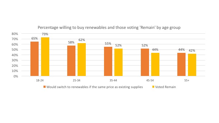
14, Politicians tend to do what their electorates want. The last major UK government survey showed that 82% of people supported the use of solar power, with only 4% opposed. A similar survey in the US showed an even larger percentage in favour. The levels of support for onshore wind aren’t much lower, either in the US or the UK. We need to actively communicate these high levels of approval to our representatives and point out that fossil fuel use is far less politically popular.

15, Buy gas and electricity from retailers who sell renewable power. This helps grow their businesses and improves their ability to provide cost-competitive fuels to us. Renewable natural gas is just coming on to the market in reasonable quantities in many countries and fossil-free electricity is widely available. Think about switching to a supplier that is working to provide 100% clean energy.

 

The first 'time of use' tariff in the UK. Will it save users money?

Any economist will tell you that prices will eventually align with underlying costs of a product or service. This is as true for electricity as it is for cars or nursing home care. But for domestic consumers today in most countries of the world, electricity is priced at levels removed from the underlying cost to provide it.

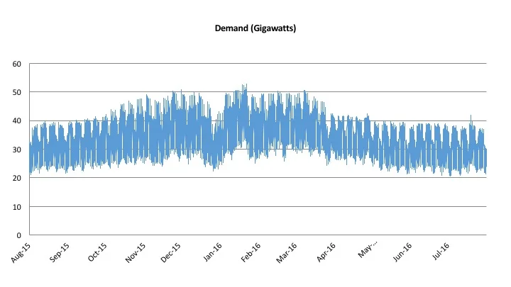
The most obvious example is the failure of domestic tariffs to rise in periods of peak demand. In an economically rational world, power prices should be highest in cold, dark countries in the early evening in winter. In hot places, by contrast, they might be highest at the same time in summer as air-conditioning is working its hardest. But electricity prices generally stay the same across the day.

Very gradually, new technologies such as smart meters are making it possible for electricity retailers to introduce ‘time of use’ (ToU) pricing for homes and small businesses, helping to bring prices closer to costs. (ToU often exists already for big users, albeit in a somewhat opaque form). In places such as Hawai’i and California time of use charges are well established. The UK’s first nationwide offer was launched last week, giving customers a 5p (6 US cents) per kWh tariff for seven overnight hours and a 25p (30 US cents) figure for 16.00 to 19.00 on weekdays. Intermediate times are priced at 12p.

For the average user, the new Green Energy UK pricing structure will probably save a little money compared to the cheapest tariffs from large electricity providers, even before the household adjusts its power consumption to move it out of peak use.[1] I worked this conclusion out using the invaluable data from Cambridge Architectural Research on hourly patterns of electricity use in British homes.

CAR’s data comes from live observations of real houses several years ago. Power use, particularly for lighting, has fallen since but I have nevertheless used their numbers without any decrease. This means that my calculations are about now about right for a house that uses about 20% more electricity than average.

Average UK household electricity consumption over the course of a day

Source: Cambridge Architectural Research, published at https://www.gov.uk/government/collections/household-electricity-survey, 2014

Source: Cambridge Architectural Research, published at https://www.gov.uk/government/collections/household-electricity-survey, 2014

Very roughly, a typical household taking the new Green Energy package will pay about £570 for electricity compared to about £580 for the Scottish Power tariff, the cheapest mainstream supplier at the moment. The difference is therefore small but the gap is widened if the household takes deliberate action to move its energy use out of the penal 3 hour weekday tariff between 16.00 and 19.00.

The CAR research suggests that the average home is using about 670 watts during peak time across the year. Cooking is the largest single element across the week at 121 watts, with audiovisual kit next at 92 watts.  Cold appliance and washing and drying machines follow at between 60 and 70 watt each. These power uses could clearly be pushed into adjoining time periods. Fridges, for example, can be automatically turned off for three hours with no impact on food quality. It should be easy to reduce typical demand by 150 watts in the peak period and this would increase the saving to around £25, making the Green Energy tariff probably the cheapest in the UK at the moment.

But, you may say, does it really make sense to save a little money in return for the hassle of having to manage the timing of electricity use? Probably not. But, in the longer term, ToU tariffs will also appeal to two categories of domestic households.

First, electric car owners are being offered a chance to do all their charging at just 5p a kilowatt hour at night. This compares to about 6p for other suppliers offering ‘Economy 7’ tariffs which offer low prices at night but higher prices at other times of day. Electric car users will almost certainly be better off using the new Green Energy rate.

The low night rate may also encourage the installation of domestic battery systems although payback times are still very long indeed. Power will be imported at night and then used during the day, including at peak time. This will save up to £300 a year for the typical medium-to-high user and more for a large house. To fully avoid daytime charges (either the standard rate or the peak fee), the battery system will need to store at least 12 kWh. This about matches the capacity of the Tesla Powerwall 2 (nominal 14 kWh, actual about 13 kWh) which has installed costs, including a separate inverter, of around £5,500-£6,000. It will be twenty years – longer than the likely life of the battery – before this cost is recouped.

A much smaller battery, sized simply to avoid all Green Energy’s peak charges between 16.00 and 19.00 on weekdays, is probably only a little better. A 2 kWh battery, such as the Maslow or an Aquion, might cost around £3,000 installed with an inverter and with timers to charge it during the night and discharge it at peak. The maximum saving here might be around £200 a year, implying a 15 year payback. As battery prices come down, the economics will improve.

What about the impact of a ToU tariff on households with solar panels? Perhaps 90% of the output of an array is likely to be in the period of intermediate prices in the Green Energy tariff. So the money saved by having PV is unlikely to be substantially greater than for households without solar.

Lastly, there is one thing that the wily customer should definitely do. Subscribe to the new Green Energy tariff for the summer months (when household peak usage is lower than in winter and therefore the impact of the penal 16.00 to 19.00 rates is less) and then switch back to conventional suppliers for the October to March period when peak needs are higher. Unfortunately, if too many people do this, the supplier will struggle to be profitable with its current prices. Let’s hope this doesn’t happen because in the long term it is in society’s interest that all electricity prices are tied to time of use. (To make the obvious point the reason for this is that ToU tariffs will help minimise the early evening peak in electricity demand and thus reduce the need for expensive and high carbon ‘peaker’ electricity generating plants).

[1] I compared the Green Energy tariffs with the lowest tariff I could find on a price comparison web site from a big supplier. This was Scottish Power’s March 2018 price.

BP – electric cars are coming but won’t impact our business.

BP’s chief economist, Spencer Dale, gave a speech earlier this month about the impact of electric cars on the demand for oil.[1] He suggested that BP’s forecasts for EV sales to 2035 implied that the demand for petrol will be largely unaffected. Very roughly, today’s passenger cars use about 19 million barrels a day of oil. This will rise sharply, says BP, on the back of increasing world car sales. The number of EVs on the road by 2035 will only cut the need for oil by 0.7 million barrels daily, or less than 4% of current demand. The impact of electric cars will be dwarfed by the increasing numbers of petrol and diesel cars.

As usual with Mr Dale, the logic is clear and persuasively stated. But look beneath the surface of BP’s bullishness about the resilience of oil demand, and some of its strange assumptions about EV become clearer. The internal inconsistencies and omissions should make us concerned that BP simply isn’t facing up to a somewhat uncomfortable reality.

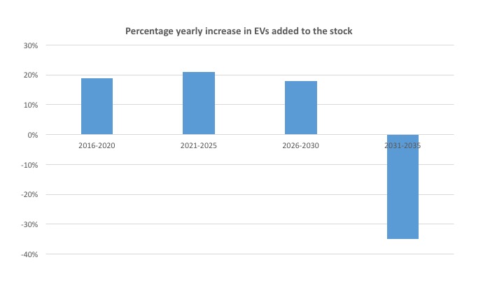
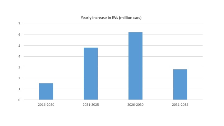
Two immediate examples from the article that follows below: BP forecasts EV sales volumes rising to 6.2 million a year between 2025 and 2030 but then falling to less than half this level - 2.8m per annum - between 2030 and 2035. This may be what BP hopes will happen, but what can possible be the logic behind this collapse in EV sales over a five year period? We are left in the dark as to why BP thinks this is a reasonable view.

Briefly, a second point. Spencer Dale’s speech omits any mention of China whatsoever.[2] But this year China is responsible for half the world’s sales of EVs as the government starts to try to deal with its awful air pollution. Any proper forecast would include at least a view on the car market that is now easily the world’s largest. Not a word in his speech.

BP's forecasts for electric car sales

Let’s dissect a little of what Spencer says in more detail.

1.     BP says that the total number of EVs on the road today is about 1.2m. Actually, that number was reached at the end of last year. This year’s sales will be about 800,000, taking the total to around 2.0m (+- 0.1m).[3] As of today, therefore, Spencer underestimates the stock of global EVs by 40%. Frankly, this is not a good start for a forecast by a major international company.

2.     Sales in 2016 around the world are running at about 50-55% above 2015 figures after about 40-45% growth in 2015. Nowhere in Mr Dale’s speech does he mention this, or any other numbers suggesting the strong buoyancy – to say the least – of current production growth.

3.     BP forecasts 7 million electric cars on the road by 2020. That’s consistent with a 19% annual growth in sales volume over the next four years, a substantial fall from recent rates. Nowhere is this discussed. An impartial observer might query why sales growth will diminish sharply just as manufacturers reduce EV costs to around petrol equivalents.[4]

4.     It gets stranger. Between 2020 and 2025, sales growth speeds up again. It rises to 21% annually. And then it falls to 18% growth a year in the next five year period.

5.     And then the market starts to shrink. Having been over 6m cars a year, it falls to less than half, or 2.8 m units. No explanation, no comment, no analysis. Mr Dale needs to go back to his forecasting team and ask why a maturing product, with purchase costs probably below the equivalent petrol car, should see sales more than halve over a five year period. To put this in context, electric car sales in the BP world will capture about 1.5% of car sales in 2030-35, up from around 1% today. Really? What is the logic here?

Source; BP

Source; BP

Source: BP(There is a small inaccuracy here on my part.  Most of the cars sold in the next few years will disappear from the fleet by 2035. So this figure slightly underestimates sale because it excludes replacements).

Source: BP

(There is a small inaccuracy here on my part.  Most of the cars sold in the next few years will disappear from the fleet by 2035. So this figure slightly underestimates sale because it excludes replacements).

What doesn’t he say?

‘Economists don’t do cool’, says Spencer Dale as he admits that he cannot predict how consumer tastes will evolve over the next twenty years. This is a defensive statement, attempting to deflect some of the critical attention his speech will generate. I agree: economists are terrible at predicting how markets with a substantial cultural, technological or fashion element will evolve. (I partly know this because of my own early training in the dismal science). But this is no excuse for not at least mentioning some of the vital trends that are apparent even to us blinkered economists.

1.     Spencer Dale’s speech makes no mention whatsoever of the legislative plans around the world to block the sale of new internal combustion engine cars. Some of these plans may well not come to fruition. But Norway (2025), the Netherlands (also 2025), Germany (2030) are three examples of countries that state that they will ban non-electric car sales. Immeasurably more importantly, India is also contemplating a sales block, possibly as early as 2030 or before.[5] China may make a similar decision, not least because its manufacturers are now clearly the lowest cost producers and a large domestic market will provide a springboard for export sales.

2.     BP completely ignores the growing evidence of rapid EV development in light vans and buses. Spencer Dale says that only cars can be easily electrified at the moment. But, to give the most obvious example, La Poste in France and Deutsche Post in Germany are both making a transition to near-100% electric fleets for local deliveries. This is logical. Post vans have relatively short daily runs and usually return to a depot. The same argument holds for urban taxis and delivery vehicles. Buses are also moving to battery power as urban pollution becomes a central political issue. London is a good example as it moves to buy more electric buses. Purchase costs are sharply down and will cross diesel vehicle prices within a few years. Fuel costs are, of course, much lower and this is a more substantial element of bus running costs than a car.

3.     Mr Dale does admit that urban pollution issues may cause increased sales of EVs. But he then ducks any estimate of what the impact might be, saying that he will stick with the narrow focus on carbon emissions. London? Delhi? Shanghai? Are these cities really not going to do as much as they can to reduce mortality-inducing particulate pollution?

4.     EVs are particularly important because their battery capacity will be increasingly used to provide back-up power in a world of intermittent renewables. ‘Vehicle to grid’ charging – only just being rolled out by Nissan and others – is likely to become a crucial part of the grid stability armoury. A million 200 mile range cars (3% of the UK vehicle total) will provide about 7% of total daily demand in the UK if necessary. Of course we don’t know when this will happen, but there is strong economic logic to V2G and it deserves mention. Nothing at all from Mr Dale on the value of batteries.

5.     Nothing also about the likely evolution of electric car costs and battery prices. No excuse here, Mr Dale. Even geeky economists like us can do forecasts of what is likely to happen to vehicle costs as learning curve effects drive down prices. In a 20 page speech there really ought to be something about how costs are going to change. How can an international company like BP make a forecast for electric car sales without at least a superficial attempt to estimate how prices are going to change in relation to petrol vehicles?

6.     Spencer Dale admits that car sharing and autonomous vehicles may increase the speed of the transition to electric vehicles. But he ducks any estimate of the impact, essentially saying this is beyond his capacity. Instead, he uses the International Energy Agency high growth scenario for cars and posits this as the highest possible estimate for EV sales. Actually, those of us following the growth of renewables over the years know that the IEA is almost as slow as the oil companies in adjusting to the evolving reality. You only have to look at its consistent underestimate of the growth of solar PV to see this. (I cannot be sure but I also think there is an arithmetic mistake in how the impact on oil demand is calculated by BP).

7.     Even more obviously, what about battery costs? When battery costs fall to $150 / kWh (probably less than three years away, I guess) the initial costs of buying an EV will be less than a petrol car for a 200 mile range machine. At the point, therefore, not only only the sticker price will be lower, but maintenance costs will be better, insurance costs will be cheaper and, of course, fuel will be less.[6] Why would any sensible person not buy an electric car by this point? Mr Dale seems to recognise that EVs will eventually dominate, but refuses to examine the forces that will drive an increasing speed to any transition.


If you work in an oil company, you will usually be surrounded by people saying that the low carbon revolution will indeed happen, but not quite yet. Your forecasts therefore show an eventual takeover off fossil fuel markets by electricity in a couple of generations. But the slope of the downwards curve for fossil demand is slight, putting far into the future any real need to address the need to adjust your own company’s portfolio of activities.

As Mark Carney and Michael Bloomberg have said today in London, this may convince investors and lenders today but at some near point in the future these illusions will be sharply stripped away. Mr Dale’s speech is a perfect example of how BP and others are avoiding facing up to the risks of rapid and destructive change in their business. 

[1] http://www.bp.com/content/dam/bp/pdf/speeches/2016/back-to-the-future-electric-vehicles-and-oil-demand.pdf

[2] Except in one footnote like this.

[3] I believe that Jose Pontes, whose work is also widely published on cleantech websites such as CleanTechnica, is one of the best analysts of EV sales. http://www.ev-volumes.com/country/total-world-plug-in-vehicle-volumes/.

[4] VW is reported today as saying that its long range electric cars will be price competitive with diesel by 2020. https://chargedevs.com/newswire/volkswagen-says-it-will-offer-a-373-mile-ev-in-2020-at-the-price-of-a-diesel-golf/

[5] http://www.financialexpress.com/auto/news/govt-aims-to-make-india-a-100-electric-vehicle-nation-by-2030-heres-how/273629/

[6] In the spirit of curiosity, rather than a crude lusting after a desirable object, I visited the local BMW garage yesterday. I asked the EV salesperson about comparative costs. He gave me hard figures for annual servicing which were a fraction of petrol car servicing prices. And said that insurance costs are far lower because insurers recognise that EV drivers moderate their acceleration in order to maintain charge, thus reducing risks. He told me he had sold 120 cars this year, up from 60 EVs in 2015. He had only ever heard one complaint, and that was by a customer who bought a car with a defective battery in early 2015. Whatever the opposite is of a 'lemon', the BMW i3 appears to it. Mr Dale might also visit a BMW dealership to good effect. 6% of BMW's current US sales are electric. 


Solar panels now pay back the energy used to make them in little more than a year

How much electricity do we get back from the large amounts of energy invested in making solar panels? An impressively detailed paper from researchers at the University of Utrecht provides some answers to this crucial question. In short, conventional PV modules made next year will achieve ‘energy payback’ in not much more than a year.

Some of the press commentary on the new article in Nature Communications focuses on this benign impact of solar and the scope for continuing improvements in energy use. Other writers took a very different tack. Instead of focusing on the rapid payback on the energy invested in the manufacturing processes of today, the journalists chose to concentrate on the much higher inputs in the past. This makes solar look less good. The headline on Ben Webster’s article in the London Times was ‘Solar panels less green than you think, say experts’. An anti-renewables US website’s headline was ‘Solar power actually made global warming worse, says new study’.

One of the aims of the Utrecht paper was to give us an estimate of when the annual global expenditure of energy on making panels fell below the amount of electricity produced by all the solar PV ever previously made. This calculation showed that the extremely rapid growth rate of solar, combined with the previously huge energy costs of making PV, meant that it wasn’t until about 2011 that solar PV ceased to be in overall yearly energy and carbon debt. The Times article got very confused about this point, implying that this meant that an individual panel made early than this date didn’t typically generate enough electricity to pay back the energy invested in making it. No, the Utrecht conclusion was that in any individual year until about 2011 the manufacturing energy use of the whole PV industry was greater than the electricity output of panels already on roofs and in fields. This is a very different point.

 The ‘energy return on energy invested’ debate for PV continues to rage. Those, like me, who believe solar will become the dominant world energy source at some not-to-distant point tend to believe panels to pay back their energy reasonably quickly. If, at the other extreme, you are deeply sceptical of renewables and want fossil fuels such as coal to provide most power, then proving solar PV is energy efficient assumes great importance. UK journalists such as Matt Ridley sit firmly in the camp of fossil fuel advocacy and voice the view that panels installed in the UK, for example, never pay back their embodied energy.

Mr Ridley can call on just one recent academic paper to support his view. This particular piece of research suggested a very long payback time indeed for panels installed in high latitudes. One of the reasons that the Utrecht work is so important is that it summarises all the research on energy payback, including 40 separate assessments of the energy payback on solar manufacturing. 39 of these assessments show very different figures indeed to those supported by Matt Ridley.

Q+A

More generally, I wanted to get the some of the many additional Utrecht conclusions into the public arena. So I wrote to the lead authors Atse Louwen and Professor Wilfried van Sark to ask five specific questions on issues not directly reported in the study but which can inferred from their work.

The full Q+A follows. It is unamended by me (except to add a brief explanation of some technical terms). Many thanks indeed to Atse and Wilfried for the extraordinarily rapid and full response. (By the way, I think they are being very cautious in their assessment of how much electricity that the average solar panel generates in the course of year. This makes their assessment conservative.  Payback is probably faster than they say). 

1.       Please would you tell me approximately how much energy it typically takes to make 1 megawatt (peak) of solar modules today? And roughly how much did it take 5 and 10 years ago? 

Today, according to the experience curve we used, it would take for production of 1 megawatt-peak of average (~40% mono, ~60% poly) solar PV systems (so modules and inverters, installation, mounting structure) roughly 18.4 TJ of primary energy. Considering the locations of this installed capacity the average yield of 1 MW globally would be conservatively estimated to be 1200 kWh/kWp. This would correspond to an energy payback time of ~1.4 years. 5 years ago the figures would have been 25.9 TJ/MW (EPBT of ~2.0 years).10 years ago this would have been 36.9 TJ/MW (EPBT of ~2.8 years)

(My note: EPBPT is ‘energy payback time’, TJ is ‘terajoule’. 1 TJ is equal to about 278 megawatt hours).

2.       How long will it typically take a polycrystalline panel made on 1st January 2017 (and installed on the same date) to generate enough electricity to repay the energy used in its manufacture?

A complete PV system based on polycrystalline panels, made in 2017, would need 15.8 MJ of primary energy per watt-peak. This corresponds to an EPBT of roughly 1.2 years (for global average yield)

3, Solar PV production has historically grown at 45% a year over the last decades, according to your estimates. If growth were to continue at this rate, and the reductions in the energy required in manufacture of silicon panels also falls at the same pace as they have done historically, when would a panel made on 1st January 2020 reach ‘energy payback’? Perhaps 45% is too high a figure to use for future growth rates; when would the energy payback be on a panel made on 1st January 2020 be if future growth runs at just 20% a year?

Indeed over the period 1975-2015 the average annual growth rate (or CAGR, compound annual growth rate) was indeed 45%, but the last years this figure has already been a little bit lower, slightly below 30%. Forecasts are again a bit lower, we guess 20% would be a decent estimate. In our study we use projections for future development of capacity that are around 20% (slightly lower). With this in mind, an average PV system in 2020, in our model, would have an energy demand of 16.7 MJ per watt-peak, corresponding to an EPBT of about 1.3 years. Note this is higher than for a poly panel in 2017, as the share of mono systems is increasing and these have a slightly higher energy demand for production.

 4.       In their comments on your research, some journalists have focused on one aspect of your work. They quote your conclusion that in the ‘Increasing PR (performance ratio) scenario, (energy) debt was likely already repaid in 2011 for both CED (energy) and GHG emissions’ In other words, they say, until 2011 solar panels had a net adverse effect on carbon in the atmosphere. Your conclusion seems to arise because solar PV has been growing so rapidly that in any single year energy use in module manufacturing would have exceeded the total electricity generation of all previously produced modules. Are you able to confirm that if, say, PV had only grown at 20% per annum, then net energy debt would have been repaid earlier than 2011? In other words that it is precisely the very high rate of growth in PV that means energy debt increased until 2011?

This probably true indeed, but if solar growth would have been lower, then the reduction in EPBT would also have been lower, as it is a result of experience during production and as such is a function of the cumulative production of PV capacity. However, generally speaking, net energy is consumed when growth rates are larger than (1/PBT). As growth rates were in the past on average 45%, sometimes higher, and EPBT has dropped below (1/0.45 = 2.2 years) only recently, it is likely that if growth rates were constrained to 20% the break-even point would have occurred sooner. 

However, in terms of experience curves, the investments you need to make (in this case in terms of energy and GHG emissions) to bring the technology down to a certain environmental “cost” level, are always more or less the same, whether you take 20 or 40 years to make these investments. So the faster growth and temporary adverse effects now result in a faster increase of the positive effect, so to say. 

5.       Lastly, on the basis of the literature search you carried out during the research for your article, what do think is the current ‘Energy Return on Energy Invested’ (ERoEI) of a polycrystalline panel?

The ERoEI of a global average polycrystalline based system would according to our figures be about 19.8. For NW Europe, taking our home town Utrecht as an example with an estimated annual yield of 875 kWh/kWp (which is an average, actual yield for the Netherlands that my colleagues measured using data from thousands of PV systems), this would be 15.2. 

This ERoEI has been debated, also recently, even to the point were critics state that the ERoEI of systems in N Europe is smaller than 1.0. According to everything we have seen in literature and in our own research, this is just not true. A recent example of a study that states this ERoEI to be smaller than 1 is that by Ferroni and Hopkirk in Energy Policy  but upon review of this study we, and many researchers in the field, found that the authors severely overestimate the energy required to produce PV systems, and underestimate their electricity yield, among other issues with this paper. A rebuttal paper written by a large number of colleagues (not us) in the field has already been submitted to the journal, which we hope will be published soon. 

(My note: The Ferroni and Hopkirk paper is the one always cited by anti-renewables commentators).

Several readers have pointed out that the Utrecht paper uses estimates of production energy that suggest a much longer energy payback than the authors propose. My reasoning as to why I think the Utrecht paper is nevertheless correct is appended as responses to these comments below. Thank you to the commenters for raising this issue, which I should have spotted myself.

The time needed for Energy Transitions

Summary

The standard view is that the switch to an energy system based on renewables will take at least half a century.

This opinion is largely derived from Professor Vaclav Smil's work on previous transitions from one fuel to another. We have all gone on to assume that the future will be like the past.

In contrast, I argue that the growth of solar PV, in particular, will not be restrained by the forces that held back new fuels in the past. Of course, nobody actually knows how rapid the growth of renewables will be but my purpose in this note is to suggest that Smil's view may be incomplete and that solar and wind will continue to grow at far faster rates than he suggests are possible.

The time needed for energy transitions

Energy transitions from one fuel to another are thought to be inevitably slow. As a result, everybody - but particularly those in the fossil fuel industry - says that the move to near-100% renewables is going to take at least a couple of generations. If true, the world is heading for more than 4 degrees of warming.

Can we make the transition happen faster? In this paper I try to make the case that the conventional wisdom may be wrong and the switch could take place far faster than the previous moves from wood to coal, coal to oil or oil to gas.

Readers of my book, The Switchhave written expressing surprise at my optimism. This long note is attempt to respond to these criticisms. I apologise for the length.

The widespread view that the transfer between one fuel and another takes over 50 years is almost exclusively derived from the one work of one man: Vaclav Smil, now a retired university professor from Manitoba, Canada. Smil is the doyen of energy historians, a very small group of people who have looked carefully at how the source of our fuels has changed over the centuries.

Professor Vaclav Smil, www.vaclavsmil.org

Professor Vaclav Smil, www.vaclavsmil.org


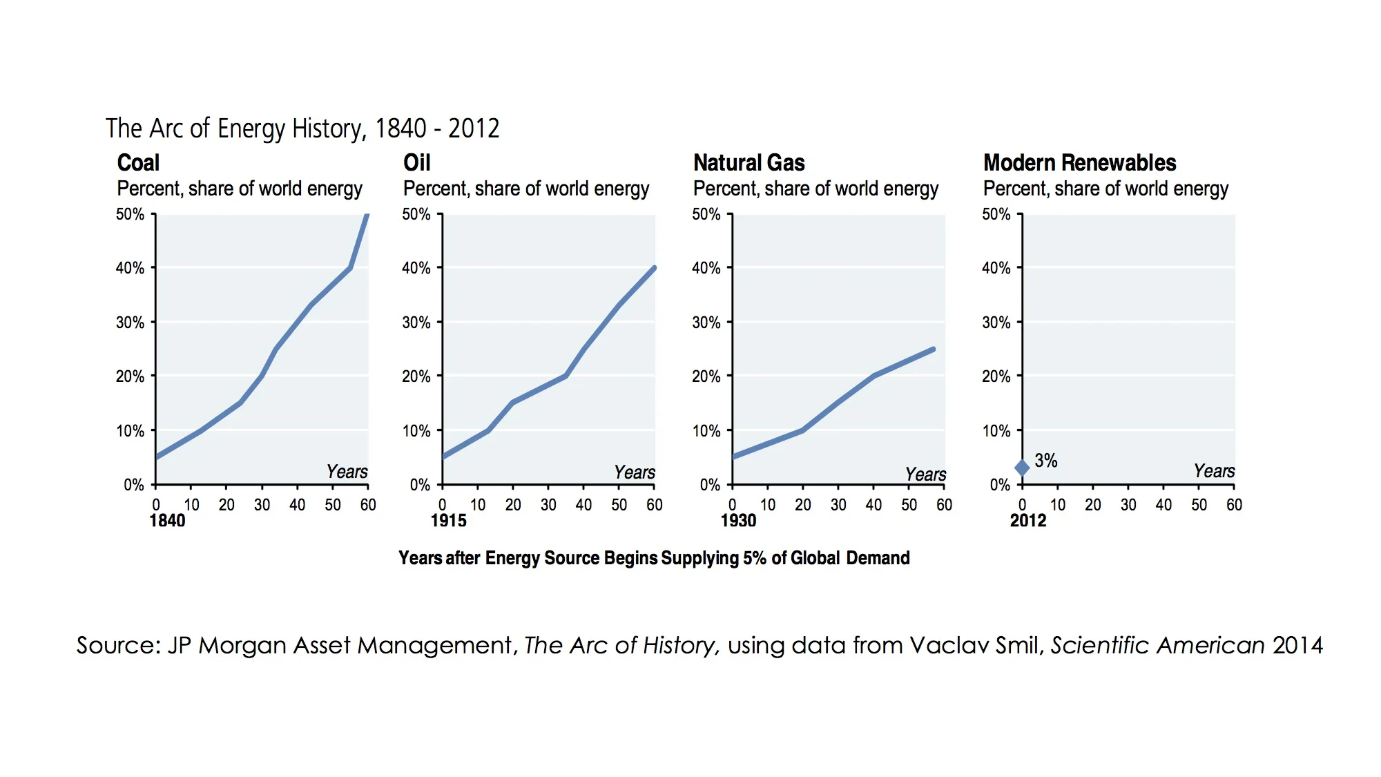
His well-researched and simple charts show how coal replaced wood, then oil pushed out coal and finally gas rises to importance. These graphs merge data from all the countries around the world to show how global shifts took a very long time. [1]

Smil’s work - academically rigorous and highly researched – is very rarely challenged. His view has become almost untouchable, perhaps partly because Bill Gates refers to it frequently and with obvious reverence. And over the years Smil's work has been aided by his attacks on some very easy targets: the renewables enthusiasts who have hailed the dawn of a fully low carbon era some decades too soon. Their premature announcements of the end of the fossil fuel era have made Smil's scepticism seem very sensible. I suspect another reason may also be that many powerful companies and institutions need Smil to be correct about the time taken for transitions. As the eventual inevitability of a 100% low carbon world becomes more and more obvious, those with an interest in prolonging the fossil fuel era hold on to the Smil hypothesis, much as a toddler keeps a comfort blanket by his side.

Today, even oil companies admit that the future will eventually be dominated by solar (for example, Ben van Beurden, the CEO of Shell during autumn 2015) but also say that the transition will take many decades.[2] Fund managers heavily reliant on the dividend stream from fossil fuel businesses similarly secretly wish for a slow shift. Indeed, many of us have a tendency to reject the possibility that the transition to renewables will be quicker, more disruptive and painful than the smooth and continuous - but nevertheless slow - growth shown in Smil’s unthreatening charts. Smil himself is openly sceptical about the rate of future growth of renewables and his many followers often quote his words.[3]

…’even a greatly accelerated shift towards renewables would not be able to relegate fossil fuels to minority contributors to the global energy supply anytime soon, certainly not by 2050’

Put at its simplest, the Smil view is that the maximum rate of global growth over the longer term of a newly arrived energy source is about 9% a year. In the world of the 20th century - in which energy demand was rising an average of 3% annually - this takes a fuel’s share from 5% to 40% in fifty years. The conventional wisdom is that solar, wind and other renewables are inevitably bound by the same rule. Growth is capped at 9% per year by the same forces that held down coal, oil and gas increases.

In the past half century, the growth rate of solar PV has averaged about 40% per year. If yearly increases stay at the same rate, PV alone would take its share of global energy supply from about 0.3% today to 50% in about 16 years. This is the wonderful effect of rapid compound interest. Wind has also grown rapidly, and together with PV possesses the capacity to push global energy to be predominantly renewable in little more than a decade.

Very few people believe this will happen. And the majority opinion may well be right about the need for at least a half century to pass for a new energy source to become dominant. Nevertheless, I want to test the case; is the evidence against the possibility of a more rapid renewables transition quite as clear as Smil and his followers suggest?

We have three main lines of attack against the prevailing pessimism.

1)    Smil’s numbers refer to the world as a whole. He tracks, for example, oil’s share of global fuel use and says that it rose from 5% in 1915 to about 23% in 1965. But fossil fuels are unequally geographically distributed and supply took time to diffuse across the globe. If we look at changes in individual countries, the pattern is very different. Growth in the use of particular fuels has often been strikingly fast and far quicker than Smil asserts is possible. The growth of renewables can be far more geographically coordinated because both PV and wind are available in far more countries than oil, coal or gas. In fact they are almost universal. No other fuel is.

2)    In the past, energy switches happened slowly because industries had to build new infrastructures and invest in large amounts of extra capital equipment to enable the new energy source to be useful. The rapid growth of oil, for example, only happened when mankind had developed the internal combustion engine and set up businesses as diverse as car assembly and tyre production. The requirement to change the whole system in order to exploit a new source of energy inevitably slows the transition down. Will the world need to invest similarly in huge and expensive supporting infrastructure to exploit renewables?

3)    The growth of fossil energy sources may have been held back because of high costs. Renewables have certainly been more expensive in most parts of the world until the last few years. Will the continued downward shift in solar and wind costs enhance the rate of transition, simply because renewables are cheaper than the alternatives, either now or imminently?

Line of attack against lethargic transitions 1.

Might the growth of energy technologies be quicker than the conventional view says is possible?

Coal was the dominant source of energy in the UK as early as 1700.[4] That is, even before the beginning of the industrial revolution it produced more kilowatt hours of energy than wood, wind, draught animals and human food taken together. Put at its simplest, it was picked off the beaches near Newcastle (north-east England), shipped to cities such as London for heating homes and, soon after, to Cornwall to feed the steam engines used to pump water from mines. Most other places around the world didn’t have abundant near-surface coal and were far more reliant on wood. It took the development of underground mines, canals and railways to spread the use of coal as an energy source around the world.

As the Smil charts show above, it wasn’t until 1840 that coal was 5% of global energy supply (and a large fraction of that 5% was actually consumed in the UK, then the only fully industrial country in the world).  By that time, coal was already just under 90% of total energy supply in the UK, and its scope for further growth in its share was inevitably minimal. Simply as a matter of arithmetic, this slowed down the measured rate of increase in coal’s global penetration. So it is unsurprising that Smil’s global coal transition came much less rapidly than it actually occurred in individual countries.

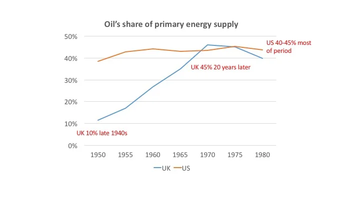
A similar process can be seen in the case of oil. The chart below shows the share of oil in the energy mix of the US and the UK between 1950 and 1980.[5] The US percentage barely changes in the period at around 40-45%. Oil was produced in large volumes in the US and it was already relatively cheap. In 1950 the UK was short of foreign exchange and only about 10% of its energy need came from imported oil.

As the economic circumstances improved, the share of oil rose very rapidly, reaching a higher share than the US by 1970, only twenty years later. (North Sea oil was not discovered until 1969). The UK’s transition to oil was far faster than suggested by the Smil hypothesis and it pushed coal from 85% of the energy mix down to less than 50% by 1970. What Smil says took 60 years globally (5-40% in the case of oil) took 20 years (11-45%) in the UK.

To make the point in a slightly different way, the transitions to both coal and to oil occurred in one or two large countries much earlier than the rest of the world. The share of oil or coal in these markets was already high by the time the wider upsurge in fuel use began, largely because these countries were endowed with easily extractable oil and gas. That means that the share was already so high that it couldn’t rise much further. This – purely as a result of arithmetic – will always depress the apparent global rate of growth.

Let’s briefly look at another example of the distorting impact of looking at the world as a whole rather than studying individual countries or regions. World coal use rose about 2.5% a year between 1980 and 2012, approximately the same as global GDP growth. Coal’s share of world energy use remained roughly constant. However that stability disguised a divergence between a virtually static market for coal in OECD countries and 4% annual growth in non-OECD economies. More specifically, China’s coal use almost tripled between 2000 and 2013, growing almost 10% a year. The country now burns half the tonnage mined worldwide and almost two thirds of its primary energy comes from coal.[7]

Natural gas provides more examples. Before large scale liquefied gas transport started in the 1990’s, international trade was limited. Some pipelines ran from Russia to European and to near-Eastern countries but most natural gas was consumed in the country where it was produced. Those places without gas tended to see a small proportion of their energy needs met by this fuel. This is a large part of the reason why gas took 40 years to move from 5% of global energy supply in 1930 to 20% in 1970.

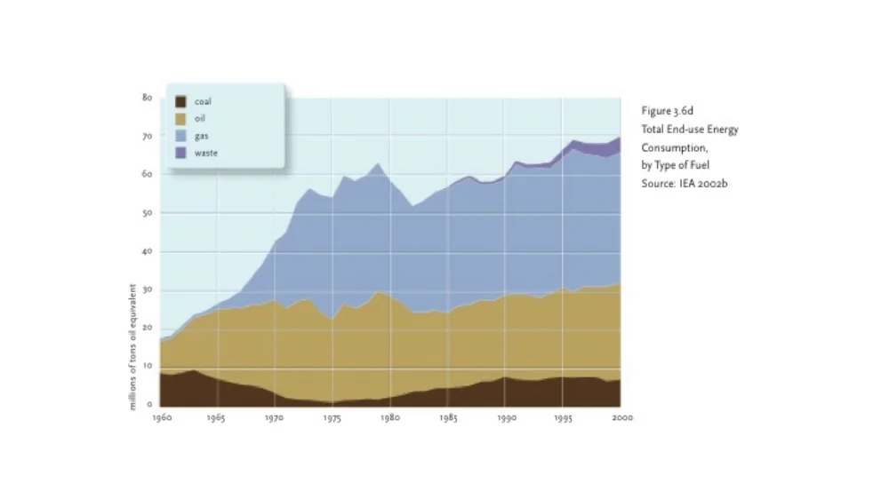
But the pattern in individual countries that did have easy access to natural gas is often very different. The chart below is extracted from a book about the growth of natural gas in the Netherlands. In 1959, the Dutch discovered a huge gas field in the north of the country, near Groningen.[8] It produced large volumes of gas at a low cost. Use of the fuel was limited until about 1965 but within 10 years gas was responsible for over 50% of the total Netherlands energy supply.

                                   Composition of Netherlands energy supply 1960 to 2000

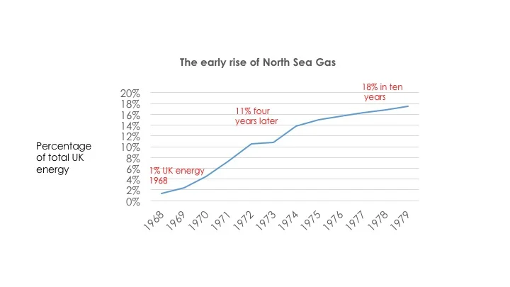
In the UK, the arrival of North Sea gas in the late 1960’s also produced a rapid rise in the share taken by this fuel. From 1% of total energy use in 1969, the UK moved to 18% derived from gas only 10 years later. This wasn’t a full ‘energy transition’ but it was far faster than the conventional view says is possible.

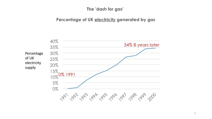
Those figures are energy as a whole, covering the decade of the 1970s. Gas saw another burst of growth two decades later as power generation was swiftly switched from coal in what was known as ‘the dash for gas’. This took the fuel’s share of electricity production from nothing in 1991 to 38% ten years later and, coincidentally, meant that gas also provided 38% of all energy use by the turn of the millennium. This was the full transition – gas moved from insignificance in 1970 to well over a third of all fuel use thirty years later. The UK is a large country and shifted far more rapidly to a new source of energy than now seems to be thought possible.

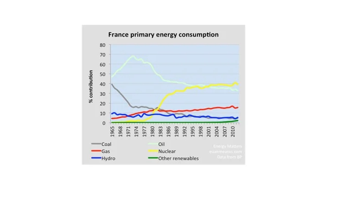
France saw a similarly rapid switch as it brought nuclear power into play around 1980. Less than fifteen years later, nuclear electricity represented over 35% of total national energy demand.[9] This had, of course, required huge capital investment in building reactors around France.

Line of attack against lethargic transitions 2

The clean energy transition will not be held back by the need to build new infrastructure

I am going to assert two things. First, that previous energy transitions were slow in part because each fuel only became fully valuable after a network of infrastructure and machines was developed to exploit the energy it contained. Second, by contrast, the clean energy revolution does not require much additional complementary investment. Solar PV and wind supply electricity, and the capital investment to use this energy source is already in place in the form of transmission and distribution line. Similarly, batteries can be simply plugged in to the electricity system. Long-term storage - which will be needed in huge amounts in high latitude countries - can be provided by ‘green’ natural gas and liquid fuels, which will be created using renewable energy. This energy can be stored in the existing gas and oil infrastructures.

How did the unavailability of complementary infrastructure slow previous transitions? Countries, continents and the world swing from one fuel to another because the rising energy source is either cheaper or more convenient, or both. But the switch isn’t instantaneous because the new fuel usually requires huge investment in finding and extraction. Then a further prolonged burst of capital spending is required to provide the machines to use the new source of power and build the support infrastructure, such as pipelines and storage tanks, to use that energy.

The best known early example, of course, is the transportation of coal in the United Kingdom. Before the advent of canals, the price of coal in cities was pushed up by high transport costs. In the classic anecdote of the Industrial Revolution, the opening of the Bridgewater canal in 1764 halved the price of coal in Manchester within months (although I have to admit that my attempts to find hard information to support this story have failed). Without transport links, energy transportation of fuels is expensive and this has delayed the growth of all alternative energy sources since the beginning of the coal transition.

It is also important that machines are available to productively utilise the new fuel. For coal to be useful to industry, engineers also had to develop machines which turned energy into motion. Newcomen’s steam engines of the 1720s began the process but it wasn’t until the work of James Watt sixty years later that coal began to be turned into useful power with reasonable efficiency.

Similarly, oil needed to be refined before it could be used as a transport fuel, which eventually replaced kerosene for lamps and heat as its dominant end use. It also required vehicles to use the gasoline produced. The internal combustion engine can be said to have been developed (in France) about the same time as the first wells were drilled in the US in the early 1870s. But in 1900, forty years later, there were said to be only about 8,000 cars in the US, and more of these were battery-powered than used internal combustion engines.[10] The relatively slow diffusion of cars held up the transition to oil. They were expensive and unreliable. Mrs Ford continued to drive her favourite electric car even after her husband had started producing the Model T in 1908. In the decade from 1900, car sales grew sharply and by 1910, there were about half a million on US roads. Four years later there were 1.7 million.[11] Unsurprisingly, US oil production quadrupled in the period.

So even in the US, blessed in the early years by easy-to-extract crude oil, took time to fully use the resource because the machines to combust the fuel took time to develop. In fact it wasn’t until 1950 that oil overtook coal as the single most important fuel source in the US, eighty years after the first well was drilled.[12]

Oil’s rise around the world was held back by the need to invest in refineries to produce motor fuel, large farms of oil tanks to store the petrol and diesel, garages to sell cars and retail the fuels and, of course, cars to use the fuel. It is no wonder that the transition took decades across the globe.

Countries which discovered big gas fields sometimes exploited the new source very rapidly. The Groningen field mentioned above enabled The Netherlands to get natural gas out to the bulk of the population remarkably quickly. Even still, this was not a simple process. Most urban areas had a gas works that made ‘town gas’ from coal and pipes that carried the fuel to homes. So it might be thought that all the suppliers had to do was to switch from the coal gas, made in town gas works, to the new source. In actual fact, a new long distance grid had to be built and every single cooking stove, hot water boiler and heating appliance was adjusted or replaced. (I am not quite sure of the reason for this but I suspect it was to do with the low calorific value of Groningen gas, which contained large amounts of nitrogen).

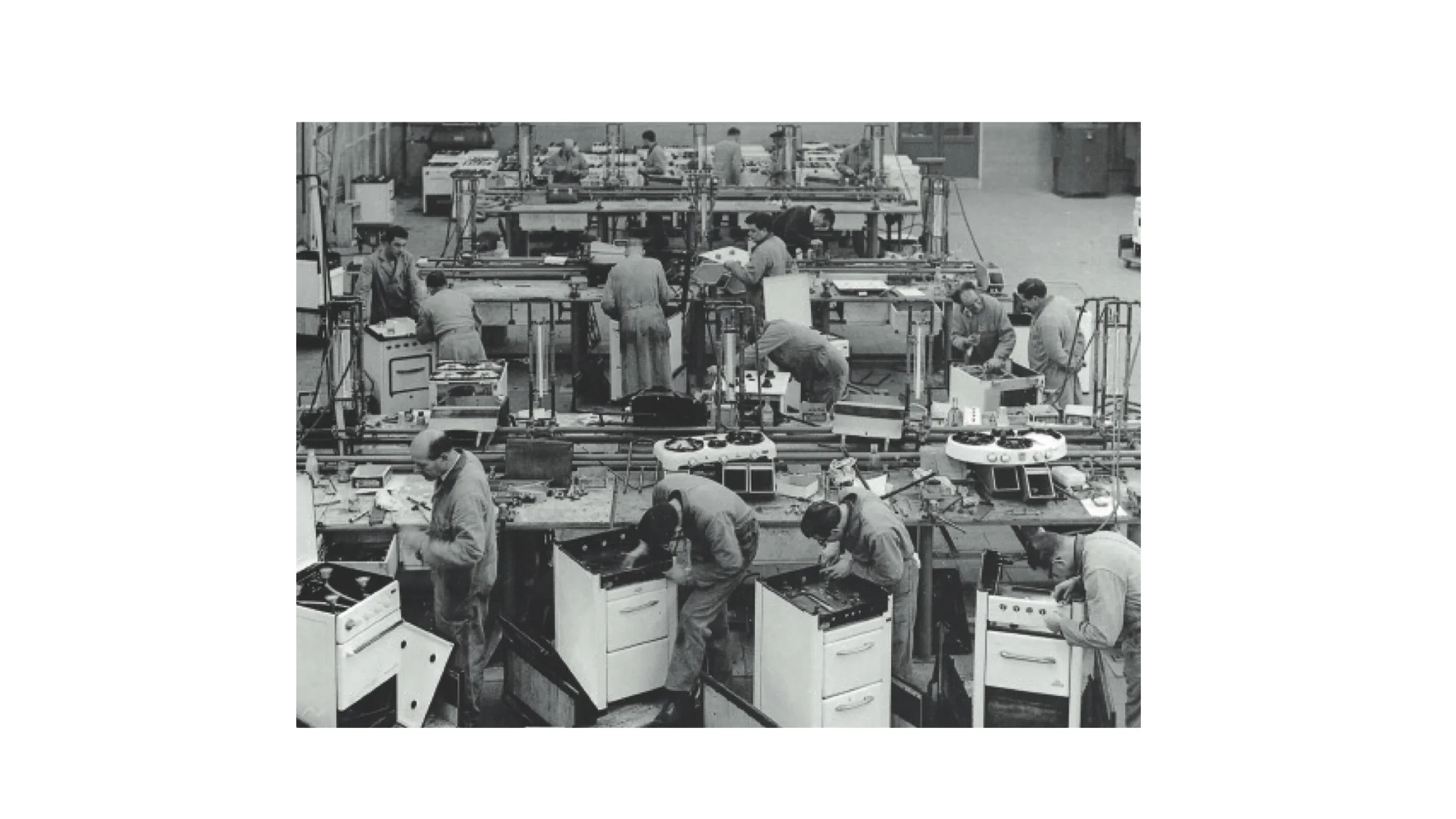
The photograph below shows the conversion workshop at the Feijenoord Municipal Gas plant. Fitters are replacing components of domestic cooking stoves. This was not a simple transition but it still occurred remarkably quickly.

                                          Fitters at a gas plant in the Netherlands in about 1960

The economic benefit of natural gas in the Netherlands was substantial and the resource was exploited very rapidly indeed, providing 50% of the country’s energy within 10 years. This was achieved even though the transition was complex and involved real costs and dislocations. For example, people lost their kitchen cooker for a few days while the burners were replaced. No similar obstruction stops solar and wind energy replacing coal and gas as the source of electricity.

Smil himself notes the extraordinarily fast transition to natural gas in the Netherlands. However also he wrote that ‘only small economies endowed with suitable resources can undergo very rapid resource transitions’.[13] He appears to be admitting that the Groningen field was so large that it made possible a switch for the entire economy. It’s worth mentioning that the sun is delivering 6000 times as much free energy at this moment as the world needs. Everywhere with decent sunshine – and that means at the very least 80% of the world’s population - has the ‘suitable resources’ that Smil says are the precondition for a fast transition.

Even Professor Smil would not argue that the UK is a ‘small economy’. In the latter part of the 20th century, it was responsible for between two and three percent of the world economy. But the rise of North Sea gas in the decade after 1969 from 1% to 18% of total energy use occurred despite the large changes to infrastructure that were needed. As in the Netherlands, the discovery of accessible fields brought about the rapid development of a long distance pipeline network and a similar adjustment to each and every gas appliance in the country, in this case carried out gas fitters employed by the nationalised gas supplier in the home. (One of my earliest memories is standing in the doorway of my grandfather’s kitchen watching a couple of rather oil-stained individuals remove parts of his cooker, replacing them carefully a few minutes later).

The point is this: past transitions were made complicated by the need to develop distribution systems and invest billions in the machines and appliances that used the fuel. This isn’t the case with solar and wind. They tap into an existing architecture of distribution and the purchasers of electricity need no new appliances to cope with solar-generated power. This makes a faster global transition far easier to accomplish than the rise of coal, oil or gas.

Of course solar and wind electricity do have different characteristics to electricity from gas. As sources of energy they are unreliable and highly variable. The electricity system therefore needs to put capital into devices that help us deal with the intermittency of renewable power. This both means storage batteries and, as importantly, computer-based technology that manages energy demand so that it aligns with available supply (usually now called ‘demand response’). But the investment required is a fraction of what the UK and the Netherlands needed to bring gas to the bulk of the population within a few years.

Although most transport and domestic heat supply will be fully electrified, the UK and other high-latitude countries also need to provide renewable gas and oil. These ‘green’ fuels will be manufactured by upgrading carbon dioxide to gases and liquid fuels using large amounts of energy, almost certainly in the form of renewable electricity. We will need chemical industry infrastructure to carry out the transformations from simple to more complex and energy-rich molecules but the cost of this will be a small fraction of the capital requirements for generating the electricity in the first place.

Line of attack against lethargic transitions 3

The price of low carbon energy

The UK – with poor sun but good wind – has just published estimates of the current cost of renewables compared with electricity generated by natural gas. Perhaps surprisingly, the government thinks that the costs are broadly comparable, even at the currently low wholesale price of gas. (However, the gas costs do include a figure for the price of carbon).

For projects completing in 2020, electricity generated by gas is seen by the UK as costing £66 per megawatt hour. (This includes £19 of carbon costs but also assumes an extremely optimistic 93% utilisation rate. The real utilisation rate is unlikely to be more than 80% for mid-ranking plants). Large scale PV is put at £67 and wind at £63.  At a 3.5% real interest rate (probably about today’s actual cost of capital), the figure falls to £53 for PV and £49 for onshore wind.

The UK is a relatively cheap place to generate electricity from gas and expensive for solar, because of poor insolation levels. It ought to be inexpensive to construct and operate wind turbines here but restrictions on size, planning constraints and grid connection costs have raised the price to well above other countries.

Nevertheless, UK renewables are now no longer more expensive than gas-powered electricity for projects now in early planning.

In other countries, usually with more expensive gas (with the exception of the US) and better solar radiation, PV is often already significantly cheaper. Some recent auction prices have seen PV at less than 3 US cents per kilowatt hour, or $30 per megawatt hour. These prices are lower than the fuel cost alone for the gas burnt in a combined cycle gas turbine (CCGT). Solar PV is already the low-cost way of generating electricity in large parts of the world, both in the form of large fields of panels and in tiny installations in towns and villages without electricity.

PV continues to fall in price, with no end in sight. Benefiting from a steep learning curve, PV will the lowest cost way of generating electricity almost everywhere around the world within a decade. Wind is also getting cheaper by the month, although the rate of decline is not as great as solar.

The argument that the energy transition to non-fossil fuel sources will inevitably be a half century long because there is no financial benefit to the use of renewables is wrong.

Conclusion

The conventional wisdom remains that the next energy transition will take as long as previous shifts. Even though many countries have committed to deep and rapid decarbonisation, no-one quite believes their plans. The comfortable view that PV (and wind) will copy the slow rate of growth of gas and oil continues to be dominant.

I’ve tried to suggest that the standard view of the slow transition may be flawed. Switches in individual countries have been far faster in the past than the simple global numbers would suggest. These rapid transitions have often been fuelled by low cost local sources of energy. Solar energy is global and so provides the raw fuel for a swift move to a new dominant energy source.

Solar, wind and other renewables require no new infrastructure. They simply supply into the existing electricity network. However, the need for storage, or ‘dispatchable’ alternatives to wind and PV, does increase capital requirements for the transition.

Wind and, particularly, solar are now as cheap, or cheaper, than the fossil alternatives. There is therefore a strong financial incentive to roll out more PV in many parts of the world. This incentive will not reduce at any point in the future. Wind and PV are getting cheaper month by month while fossil fuels are tending to get more expensive to extract.

No-one knows how the changes to the energy system will unfold. But the notion that transitions from one fuel to another inevitably take a half century or so is likely to be wrong. As Paul Dodds, an academic at University College, London, says [14]

Technological revolutions can be implemented very quickly when there is a clear business case and benefit – publically and privately. Transitions are very slow when there isn’t.

Even in as tiny an academic discipline as energy history, there are people who dispute Smil’s confident but pessimistic assertions. Paul Warde, a Cambridge historian, is a younger upstart questioning the prevailing view that transitions have a predictable and almost mechanically determined path. In a recent oral presentation on Vimeo he goes on to suggest that the dead hand of conventional wisdom on changes in energy supply may be reinforced by the reluctance of people in the energy industry to change their public positions on the future of supply and demand. [15]

Did people get things right? Unfortunately, the fact is that most of the long-term energy predictions that we have ever made are wrong, and frequently they’re quite badly wrong.

…Either as people or institutions, people tend to get wedded to a particular model of prediction…There are big career implications from abandoning a position that you have strongly taken.

It may be time to start more actively questioning the prevailing wisdom on energy supply and, as Warde suggests, allow a little more intellectual flexibility into our thinking. The growth of all new products, energy or otherwise, is faster than a century ago as diffusion becomes easier and cheaper.

How long did it take to get the mobile phone to almost universality in the world? In 2000, there were about 740 million phones in the world, or one for every nine people.[16] Now there are more than 10 times as many. Global internet penetration grew from 6% to 43% in the same period. And these are not insignificant industries. The mobile phone market is now almost as big as the world’s energy business at over 4% of the global economy.

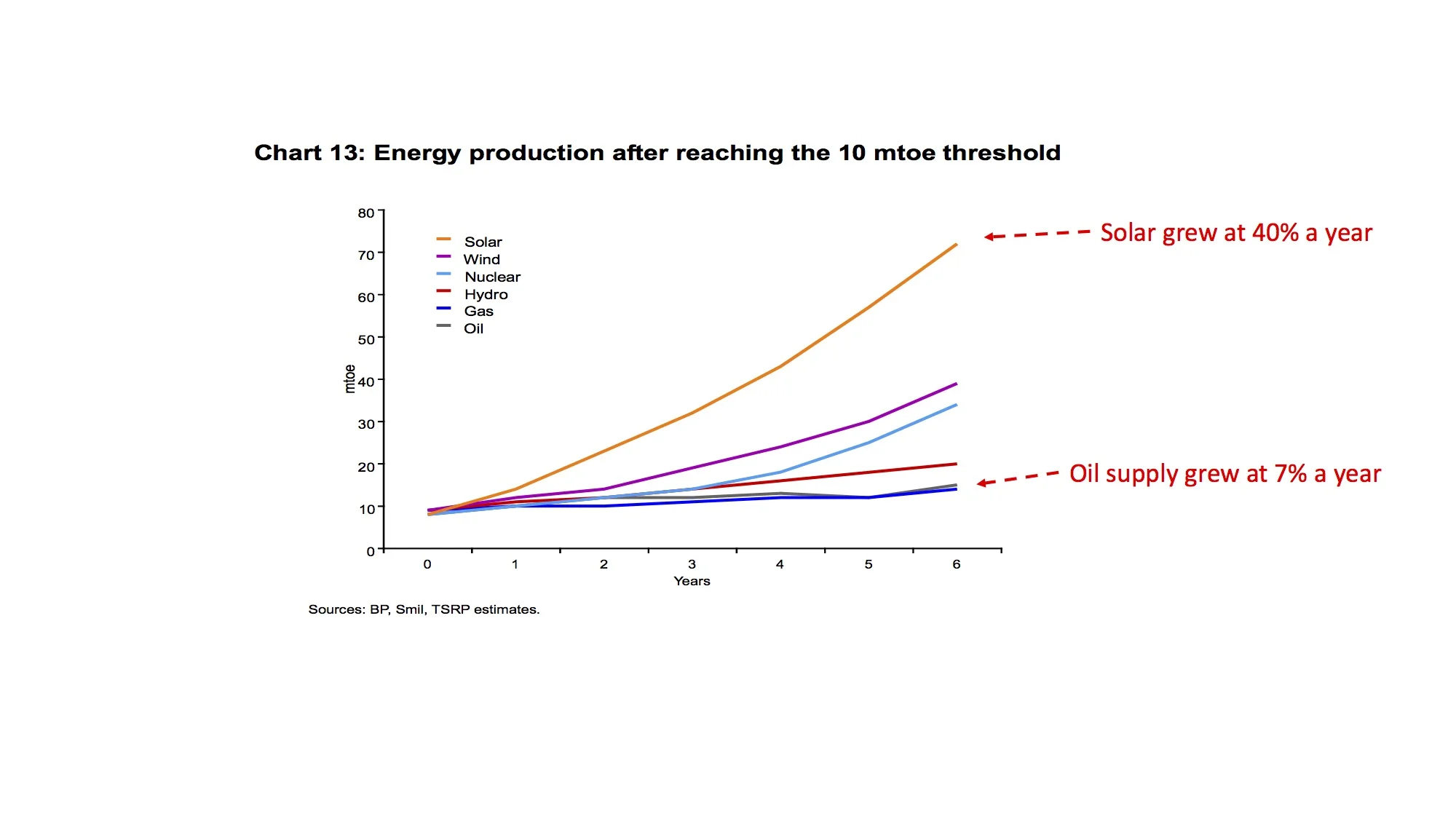
As the analyst Kingsmill Bond has shown in a recent paper, renewable sources have been growing several times as fast as other fuels at the same stage in their development cycle. 

                            Growth after a fuel reached 10 mtoe (million tonnes of oil equivalent) 

Perhaps we need to ask whether the fossil fuel industries are telling us that the transition will be slow simply because they want to stay longer in their current business, rather than facing the pain of building a new strategy in a world of zero carbon fuels.


[1] JP Morgan Asset Management, The Arc of History, using data from Vaclav Smil, Scientific American 2014: https://www.scientificamerican.com/article/a-global-transition-to-renewable-energy-will-take-many-decades/

[2] http://www.bbc.co.uk/news/business-34274352

[3] Vaclav Smil quoted in Daniel Yergin’s short paper from IHS Do Investments in Oil and Gas constitute systematic risk?’, October 2016


[4] The information on the early dominance of coal in the UK is taken from Dr Paul Warde’s masterly analysis of British energy history in his long paper entitled Energy Consumption in England and Wales 1560-2000 (Naples: CNR, 2007).

[5] http://www.eia.gov/totalenergy/data/monthly/pdf/sec1_7.pdf. The data on the UK’s use of oil is taken from Warde op. cit.

[6]

[7] https://www.ief.org/_resources/files/snippets/chinese-academy-of-social-sciences-cass/world-energy-china-outlook-interim-report.pdf

[8] Natural Gas in the Netherlands: From Cooperation to Competition, Aad Correljé et al, Orange-Nassau Group, Amsterdam, 2003

[9] http://euanmearns.com/energiewende-germany-uk-france-and-spain/ Figure 11

[10] http://news.thomasnet.com/imt/2003/01/17/how_oil_refinin

[11] http://www.carhistory4u.com/the-last-100-years/car-production

[12] http://www.eia.gov/todayinenergy/detail.php?id=10

[13] http://www.vaclavsmil.com/wp-content/uploads/WEF_EN_IndustryVision-12.pdf?emailid=5655d14ccb56e60fc6447e23&segmentId=7e94968a-a618-c46d-4d8b-6e2655e68320

[14] https://www.bartlett.ucl.ac.uk/energy/docs/dodds-presentation-slides

[15] . (https://vimeo.com/185466482) I may have mistranscribed some individual words

[16] https://www.itu.int/en/ITU-D/Statistics/Documents/facts/ICTFactsFigures2015.pdf

[17] http://www.gsma.com/mobileeconomy/

Wind and PV comparable in cost to gas generation in the UK

The government says that onshore wind is already the cheapest electricity generation technology in the UK. Towards the end of a long and impressively transparent report on the costs of generating power, BEIS says that wind came in at £62 per megawatt hour in 2015 compared to £66 for gas-fired generation. Solar wasn’t much higher at around £80.

The commercial viability of renewables will get improve while the cost of fossil fuel electricity will tend to rise, says BEIS. By 2020, large scale solar will be at £67 per MWh, almost the same as gas. Onshore wind (very surprisingly) is said to cost slightly more than 2015 at £63 per MWh. In 2025, a new gas plant will produce power at £82 a MWh, including a substantial carbon charge, while PV and wind have fallen to little more than £60. Even ignoring the cost ascribed to CO2 emissions in the calculations, gas and its two low-carbon competitors are almost evenly matched by 2025. Even in straight cash terms, solar and wind on particularly good sites will beat gas within a few years.

Perhaps as importantly as the figures for utility scale solar farms exporting into the grid, BEIS shows that large rooftop installations on warehouses and factories produce power by 2020 at £73/MWh, much less than most businesses are paying for grid electricity today. This is, I think, the first statement that PV will soon reach ‘grid parity’ for large arrays on commercial buildings, and may be at this point already.

The reasons for BEIS’s conversion to the fundamentally attractive economics of UK renewables are two-fold. First, the Department has moved to more reasonable assessments of the underlying capital costs of PV and wind. It should be complimented on the openness with which it discusses past failures to keep up with the decline in the PV prices. Every single government and supra-national body around the world has made the same mistake but BEIS has now been more transparent than all its peers.

The second point is that BEIS is at long last acknowledging one of the key advantages of PV and wind: they require far lower rates of return than other technologies. Investors are happy with the low risk of generating assets that cost nothing to operate and the returns they now demand reflect this preference for wind and solar over gas and other plants.

Nevertheless, it can still be very strongly argued that BEIS’s assumptions are biased against wind and, particularly, solar.

·      Commercial large scale PV sites in the UK do not have 11% capacity factors. These farms are generally capable of generating at least 10% more than this. (A colleague sent me data today suggesting his portfolio of Cornish solar farms actually manage more than 13%). A 10% underestimate of yield means a 10% overestimate of the cost of producing power from solar.

·      BEIS assumes that solar farms in 2020 will be paying capital costs of £1,000 per kilowatt. This is a mistake. The actual cost today is no more than about £800 in most locations. It will be less by 2020. Because a solar farm is, in effect, cost free to operate, the implicit price for generating electricity is entirely geared to capital costs. We can make another near-£20 reduction here.

·      The final unfavourable assumption is the cost of capital for PV developments. BEIS says this is 6.5% before inflation for PV, the lowest of all generation technologies and 8.5% after assumed inflation of 2%. This seems slightly high. A large farm built by a solid developer will be able to attract debt finance at little more than 3% real and I doubt that the returns to shareholders need to be more than 7% nominal. Weighting these two suggests a figure of about 5-5.5% real is a perfectly reasonable assumption today. Once again this change would significantly reduce PV’s implicit costs.

·      On the other side, the costs of CCGT generation are understated. A plant built in 2020 will not work 93% of the hours in the year (excluding outages). On a sunny, and windy summer day in 2020 even a new CCGT that is cheapest to operate will not be working.  Turbines, nuclear and PV will provide all the power that is needed. A better estimate might 75% or so. (Older and less efficient plants will work far less than this). This means that the capital cost and the running expenditures of the power station will need to be spread over a lower level of output, raising the implicit cost of production.


All new substantial generating capacity now needs some form of subsidy or price support to operate. Today’s wholesale prices come nowhere close to covering the underlying costs of new generating capacity. These figures from BEIS make an unshakeable case that a fair and balanced subsidy scheme should mean that large amounts of new onshore wind and PV are encouraged onto the UK grid. Even if a GW of gas turbines have to be build to support each GW of renewables, low-carbon sources are now close to, or at, grid parity.


Matt Ridley on solar and batteries (2)

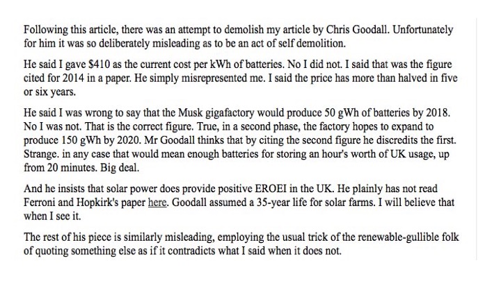
Matt Ridley responded via Twitter to the last article on this web site in which I tried to correct some of the errors in his Times (London) piece of 24th October. His rebuttal is appended below.

I won’t ask why he used 2014 - rather than 2016 - battery prices when he himself has said costs are declining very rapidly. Nor why he chose to illustrate his points about the Musk Gigafactory by quoting the capacity that will be available when its first phase is finished rather than when the project is complete.

He also suggests that typical 35 year lives for solar panels are very unlikely. He may not know that the world’s biggest manufacturer, Trina, now offers an insurance-based 30 year warranty.

A couple of further things are worth noting. First, the yearly output of the Gigafactory would actually supply about 5 hours of UK electricity on a typical day, not the 60 minutes he suggests. His figure is wrong by a factor of five.

Solar EROEI

Very much more importantly, I think the pernicious nonsense that solar PV does not pay back the energy used in making modules needs to be rebutted.

The academic paper to which Matt Ridley refers is one of many that have been written on the ‘energy return on energy invested’ for solar PV. The researchers are - I think - alone in now thinking that more energy goes in than ever comes out. The dozens of other people working in this field have produced results wholly in conflict with the result he chooses to pick. As with many other things Mr Ridley writes about climate matters, it would be good to see a properly academic approach to the use of external data.

I’m going to do a bit of arithmetic to try to show why Mr Ridley is vanishingly unlikely to be right that the EROEI of PV is negative. I am going to use the example of the UK. Of course in sunnier regions the numbers would be even clearer.

1, Most solar panels are made in China. Indian wholesale prices for PV are the cheapest in the world at just under 40 US cents a watt. (A watt refers to the peak output of the cell when in full sun). Let’s assume that this is the full underlying cost of the panel. No margin for the manufacturer, or the wholesaler, no transport costs or import duties.

2, A large industrial user in China, such as an integrated PV manufacturer, pays about 6 US cents per kilowatt hour for electricity. Perhaps there are some further hidden subsidies so let’s take that number down to 5 US cents. (That’s about half today’s industrial electricity price in the UK).

3, Let’s make another assumption that the entire cost of a solar panel is used to pay for electricity. This is obviously an almost absurdly conservative assumption. If each kilowatt hour costs 5 US cents, then the sales price of the panel equates to 8 kilowatt hours of electricity. (40 cents divided by 5 cents). That is the ‘energy invested’ the EROEI calculation.

4, In a reasonably good location in the UK a watt of PV produces about 1 kilowatt hour of electricity a year. If the panel last 30 years (the length of the Trina guarantee), it will produce 30 kWhs per watt of capacity. That is the ‘energy return’ of the calculation.

5, Making a series of assumptions that are clearly as favourable as possible to the case Ridley wishes to make, even in the UK the EROEI for PV is 3.75 (30 kWh/8 kWh). He is wrong to suggest PV does not make sense in energy terms.

6, And scientific progress is a wonderful thing, as Mr Ridley so eloquently shows in his writing on all non-climate matters. The energy efficiency of making PV is rising rapidly because less silicon is wasted, the cell is thinner, new materials for photon collection (such as perovskites and oligomers) are arriving and electricity efficiency is rising because of advances such as solar tracking. 


Matt Ridley's response on Twitter (28th October 2016)


Another depressingly inaccurate article from Matt Ridley

Matt Ridley wrote an article in The Times (London) on 24th October, suggesting that using batteries for long-term energy storage is both expensive and impractical. Several people wrote to me about this, asking about its accuracy. The Times never publishes factual corrections so I thought I would quickly write down some of the mistakes in the piece.

a)    Batteries don’t currently cost $410 per kilowatt hour. When GM announced its Chevy Bolt electric car in autumn of 2015 it said that the battery cells it would employ were costing $145 a kilowatt hour. This is about a third of the number Matt Ridley used, although the GM figures excludes the cost of combining the cells into full battery packs. However the cost of batteries is continuing to fall sharply and the largest suppliers are suggesting that a figure of $100 a kilowatt hour is within sight, perhaps within a couple of years. Mr Ridley is several years out of date.

b)    Matt Ridley says that batteries are more expensive than 'pumped storage' for storing electricity. (He also writes that 'piles of coal' would be better). The most developed proposed new scheme in the UK is at Glyn Rhonwy in Snowdonia. The latest costing for this 500 MWh site is £160m, or about £310 a kilowatt hour. This is about twice the price of electric vehicle batteries today. Matt Ridley also writes that pumped storage ‘wastes’ less than batteries. I presume he means that the energy losses are smaller when charging and discharging. But Glyn Rhonwy will have a net energy conversion of ‘more than 75%’.[1] The batteries in a Tesla Powerwall have 92.5% efficiency. Mr Ridley is therefore wrong.[2]

c)     Matt Ridley refers to Professor David MacKay’s estimates of the UK’s need for storage to cope with wind variability. He suggests that the country would need to spend £130 billion to cope with the erratic power produced by turbines. What MacKay said was actually ‘There is thus a beautiful match between wind power and electric vehicles. If we ramp up electric vehicles at the same time as ramping up windpower, roughly 3000 new vehicles for every 3 MW wind turbine, and if we ensure that the charging systems for the vehicles are smart, this synergy would go a long way to solving the problem of wind fluctuations’.[3] The key point is that a large number of electric vehicles will help us stabilize the grid without any need for dedicated batteries. (And even if we did need batteries, the cost would be far lower than Ridley says because the cost has come down so much in recent months and years).

d)    Energy return on energy invested. Ridley makes the point that renewable electricity sources such as wind turbines and solar panels require energy to make. If this energy cost is greater than the energy they generate, there is no point in building them. We are all agreed on this. But he then goes on to assert that solar panels never pay back the energy used in manufacture. This particular story resurfaces depressingly often and is complete nonsense. The typical solar panel, even if it spends its 35 year life in dull old UK, creates far more electricity than is used to make it. Energy payback times for PV are falling all the time but even conservative estimates suggest a 10 times payback.[4] As silicon gets thinner and more efficient this number is rising rapidly.

e)    Elon Musk’s Gigafactory. Matt Ridley mentions Musk’s new battery factory in Nevada. This will make more batteries in 2020 in a single location than were made in the entire world in 2013. Ridley’s figure for the output of the factory is wrong by a factor of 3. By 2020, the Gigafactory will be producing 150 gigawatt hours a year of batteries for cars and for energy storage, not the 50 gigawatt hours he claims. I won’t comment on his suggestion that Elon Musk is operating some sort of pyramid scheme to draw subsidy out of the US government. If the world had more entrepreneurs like Musk the problems of climate change would be a lot more manageable.

f)     Ridley says that the cost of electric cars is ‘huge’, although he agrees they are quiet and non-polluting. The current price of EVs is indeed higher than equivalent petrol cars, but the difference is far less than the annual difference in fuel costs over the typical 15 year life of a vehicle. The BMW i3 offers nearly 200 miles of range for less than £28,000. Compared to petrol models, this price cannot be called ‘huge’.

g)    He also slams electric cars for taking a long time to charge. However the BMW referred to in f) will fill from empty to full in less than 40 minutes at a fast charging point in the UK.

h)    And, lastly, he tries to suggest that an electric car is likely to set itself on fire if it charges quickly. (He uses the recent history of new Samsung phones as justification for this assertion about electric cars). While it is true that a small number of Tesla vehicles have had fires, the chance is almost certainly less than for petrol cars.  Yes, batteries can malfunction but petrol is a far more dangerous fuel than electricity.

As far as I know, no-one other than Mr Ridley has ever actually suggested that batteries will be used to meet the need for long-term storage in high latitude countries such as the UK. The role of batteries here will be to help match supply and demand in the electricity system and to provide some overnight electricity. Britain will manage seasonal storage need in different ways, such as converting surplus electricity into methane in summer and at times of high winds.

Addendum 27th October. In another slighting remark about Elon Musk, Matt Ridley states that some analysts believe Tesla is 'burning through $1bn a quarter'. The company has today released its latest quarterly report. In q3 2016, showing a net positive free cash flow of $176m. Only about $1.2bn out Mr Ridley..

(This article was corrected at 11am on 26.10.16. I changed kilowatt to kilowatt hour when describing the cost of the Bolt's batteries).

(Further correction, 12 noon on 26.06.16. I changed 'smaller than' to 'greater than' in describing the energy return on energy invested calculation.)


[1] http://www.quarrybatterycompany.com/docs/QB_FACTSHEETS_ENGLISH.pdf

[2] https://www.tesla.com/powerwall

[3] Page 195 of the online edition of Sustainability – Without the Hot Air

[4] http://rameznaam.com/2015/06/04/whats-the-eroi-of-solar/


Why does age so clearly predict attitudes towards renewables (and Brexit)?

A person’s age is the best predictor of whether he or she thinks renewable sources of energy are a good idea. In a recent YouGov survey for Bulb, a new UK utility, pollsters looked at whether households would switch to low carbon sources if the price was the same as fossil fuels. 65% of 18-24 year olds would use a renewable source of supply but only 44% of those over 55 would do the same. (In other words a majority of 55+ householders would prefer to stick with fossil fuels even if there was no financial penalty to switching). 

Similarly, 74% of 18-24 year olds thought that ‘Renewable energy is something we should all buy’. This falls to 48% among those over 55. (Why are these numbers higher than those in the previous paragraph? Because people are more likely to offer general support than commit themselves to actually do something). 

Look at the poll’s numbers and another recent survey of opinions comes to mind. The UK’s June referendum showed a very similar pattern. Support for renewables and for Remaining falls sharply across the age ranges. The two charts below show how attitudes shift in step as people age.

Source: Bulb YouGov survey and Lord Ashcroft poll on Brexit voting and social attitudes

Source: Bulb YouGov survey and Lord Ashcroft poll on Brexit voting and social attitudes

Source: Bulb YouGov survey and Lord Ashcroft poll on Brexit voting and social attitudes

Source: Bulb YouGov survey and Lord Ashcroft poll on Brexit voting and social attitudes

In the Referendum, social class had a profound impact on the likelihood of voting to leave.[1] 54% of ABC1s wanted to stay in but only 36% of the C2DE group. But the attitude towards renewables doesn’t vary much across classes; 59% of ABC1s say that ‘renewable energy is something we should all buy’ and this number only falls to 54% for C2DEs. Willingness to buy renewables at the same price as fossil energy is 53% among the wealthier group, with a similar figure of 49% among the C2DEs. Other demographic indices also don't help predict attitudes towards renewables.

Why is age so important a crucial predictor of attitude towards low-carbon energy? Is it the same reason that drove the young to vote differently to their parents on Europe? 

The wonderful post-referendum Ashcroft poll gives a possible clue. As well as garnering information about how people voted, it surveyed social attitudes and looked at how well they predicted attitudes to Brexit. The poll showed that the young are very much more inclined to think that trends such as multiculturalism and feminism are ‘forces for good’. Similarly, belief in the positive impact of ‘The Green movement’ is far more common among the young. Crucially, if you felt that these social movements are broadly good you were very much more likely to vote to stay in the EU.  By contrast, social class had a very limited correlation with what might be called ‘progressive’ attitudes, as well as being a poor predictor of voting patterns.

Put simply, my hypothesis is therefore this. Attitudes towards renewable energy are closely correlated with views on Brexit because the move to low carbon sources is seen as a force for good among younger people, similar to feminism and social liberalism. Older voters see it as another ‘progressive’ movement which they want absolutely nothing to do with. Broadening democratic support for the energy switch therefore depends partly on ensuring it is no longer grouped with the progressive causes it is at the moment. 

In Energy Democracy, a book recently published by two of the foremost specialists on the German Energiewende (roughly ‘Energy Transition’), the authors make one crucial point throughout their book.(2) Renewables have never been seen as a particularly liberal or progressive cause in German and local generation of electricity has long been something that political conservatives have strongly supported. Community-owned wind farms, viewed as almost Marxist in the UK, are fully accepted by the mainstream voter in Germany. Money stays within the local community, and reliance on faceless utilities is reduced, says the typical 60 year old town dweller. Finding a way to transfer these attitudes to England and Wales - Scotland seems to get the point already - is one of the main challenges facing those of us who believe a fast switch to a low-carbon energy system is vital and also beneficial. 


[1] Lord Ashcroft’s poll is at http://lordashcroftpolls.com/wp-content/uploads/2016/06/How-the-UK-voted-Full-tables-1.pdf

[2] Energy Democracy; Germany's Energiewende to Renewables, Craig Morris and Arne Jungjohann, Palgrave Macmillan, 2016

[3] The YouGov survey for Bulb was kindly given to me by Hayden Wood, co-founder. 

Solar PV data for the UK. Misleading and systematically inaccurate

The PV industry reacted with disappointment as the latest monthly estimates of the deployment of solar were published by BEIS a couple of days ago. Solar Power Portal said the numbers ‘revealed August to be the slowest deployment month yet under the new regime’.

There’s a big problem here. The statisticians at BEIS and its regulator, the UK Statistics Authority (UKSA), know that the numbers Solar Power Portal is quoting are systematically wrong. Both government bodies understand very well that the official figures are constructed in a such way that they will never accurately report the actual level of solar installation in any one month. For the last year I have working pro bono with the department and its regulator to try to get some improvement – or at least an open admission of the issues – in the way these numbers are presented. We've seen some progress - including far greater openness about the way retrospective revisions are made to the data - but serious unresolved problems persist.

This week I admitted failure in my attempt to get these issues addressed. For several months, BEIS and UKSA have been promising a final meeting at which the crucial amendments to the way the numbers are presented would be discussed. At first I was told the session would be held in September, then it was fixed for October 3, which was moved to the 27th, and then other dates were offered and finally on Monday I was informed that the earliest possible date at which the officials would be free was mid-November. That takes it up to almost a year since I first wrote to UKSA to make a formal complaint and I’ve now given up. BEIS seems unable to publicly acknowledge that many of its statistical practices – across the solar deployment statistics and other series - are seriously and deliberately misleading. 

I’m writing this piece with sadness. I grew up with National Statistics, including a period briefly teaching economic statistics at university, and trusted government to produce honest and reliable figures because its statisticians are meant to be independent. The BEIS series which I have tried to help improve over the past year carry the National Statistics guarantee of quality. But despite the obvious flaws being now recognized by the department and the regulator, the reports are still allowed to carry this imprimatur today.

They shouldn’t be, and the failure of UKSA to insist on the quality mark being removed, makes me very concerned about all government data. If important figures are being produced that the statisticians know are wrong but they refuse to acknowledge the problems for fear of public or political criticism, we cannot be sure about any numbers coming out of government. This has serious implications for policy-making and for public trust.

The issues are complex, and I stress that I completely understand why BEIS finds it difficult to collect and present the data accurately. However its failure to acknowledge the problems is destructive to the PV industry and is misleading investors, the electricity market and policy makers. BEIS needs to openly admit the problem and, if necessary, stop producing the monthly document.

At heart, the cause of the statistical failure is this: PV installation data is poor and incomplete and arrives at BEIS very late. But the statisticians are obliged to bring out the figures every month. So what they do – understandably – is each month report what they know for certain has been installed in the previous month. But during the period since they last reported, previous month’s figures have been increased by data dribbling in about installations done before the previous month.

The effect is to make it seem as though each individual month has very low installation levels when they are first reported. But as time passes, the actual level is shown to be much larger, sometimes very much higher.

This year’s data is shown below. I find this information immensely confusing but I hope you understand it. The column is the month to which the data refers. The rows are the date of the report. So, for example, in the report for January (row) the amount of installed capacity for January (column) is recorded as 8,949 megawatts. In February, as more information has come in, the estimate of January capacity has risen to 9,202 megawatts. And the rise continues. By August, January’s total installed PV was estimate at 9,774 megawatts, over 800 megawatts higher than it initially said it was.

BEIS data.jpg

Why does the consistent rise – every month for every month - cause a problem? Because it obliges BEIS to underestimate the rate of monthly deployment. For the February report, it has only received confirmation of 11 megawatts of deployment in that month and it publishes that figure. So its statistical summary indicates it was a very poor month for PV. But look down at the bottom of the table; this shows that by August February is shown to be 87 megawatts higher than January.

This is closer to the real figure. But it is probably still an underestimate because BEIS continuously revises the numbers upwards for several years. It is still increasing its figures for PV from the months of 2014.

This point is even more apparent when we look at the figures for March. The first estimate of installations was 196 megawatts (9519 megawatts less 9323 megawatts). By August the estimate has risen five fold for the deployment in the month to 1018 megawatts.

Another way of looking it this is to compare how much PV BEIS has said in total has been installed each month with the figure for the absolute rise in PV now indicated. Add the together each month’s estimate of new deployment and you’d think the UK had put 376 megawatts of solar down so far this year. Then compute the difference between what BEIS said was the installed level in January (8,949 megawatts) and what it says now (11,034). This suggests a rise of at least five times as much. In time, the increase will be recorded as even greater because a lot of August data hasn’t arrived yet.

The underlying reason for this mess is that BEIS does not have access to decent data. But this doesn’t excuse the failure to acknowledge the problem. Last year, I initially complained to UKSA about the lack of any acknowledgement of the revisions. In fact, they were actively disguised by completely removing the data from public view.

As a result of my letters, UKSA forced BEIS to amend its policies on this issue and in several other important respects. The presentation of the data has become more transparent and honest. Nevertheless, the central problem remains. BEIS is presenting data each month under the National Statistics quality mark that is knows with absolute, unqualified certainty is wrong, and sufficiently wrong that it might affect both policy making and government expenditure by a noticeable amount.

This isn’t an isolated incident. A month ago, I complained that another series of BEIS data was in breach of National Statistics rules. Old statistical series were being wiped from the record to stop nosy people like me examining how BEIS had retrospectively changed its figures. Although I been initially told by a BEIS statistician that all the data had been ‘overwritten’, and therefore expunged, the Department did put back the old numbers on its web site two hours after I had submitted another formal complaint. You won’t be surprised to know that, once again, retrospective changes aren’t marked and anybody looking at the data will not be able to compute underlying growth and decline rates.

I think all this is very serious indeed. But I spend my life working with numbers and I’m probably not being objective.

Addendum,

Wookey (see the comments) asks for a chart that shows how one month's estimates are revised each month. 

This is the chart he wants for January 2016. The numbers have risen by over 800 MW (0.8GW) since the first statistical report. This increment is, for example, enough to provide 3% of UK electricity demand on a sunny weekend day in June. The revision is hugely significant. 

The X axis is the month of the revised report. So, for example, the deployment report for May says that January's total capacity was about 9,500 MW, up by about 100 MW from the previous month's estimate. 

The X axis is the month of the revised report. So, for example, the deployment report for May says that January's total capacity was about 9,500 MW, up by about 100 MW from the previous month's estimate. 


‘Solar Annuities’

‘Pre-accredited’ solar farms offer inflation-protected and secure returns and are viable alternatives to conventional annuities.

1, The government has fiercely cut support for large-scale PV farms, taking prospective returns to well below the levels required by financial investors.

2, However a small number of locations with ‘pre-accredited’ allocations of renewable obligation certificates (‘ROCs’) are still possibly financeable. These farms will receive 1.2 ROCs per megawatt hour produced, worth over £50, as well as the price for the power produced. Crucially, the value of ROCs inflates with retail price inflation, or RPI.

3, The 1.2 ROC regime for pre-accredited sites ends in March 2017. To benefit from the scheme, money will need to be committed by end-November 2016.

4, Working with Jonathan Thompson, the CEO of PV developer Green Nation, we have calculated that the remaining pre-accredited sites will typically produce a stream of cash that is twice the amount that would be returned to a person buying a conventional financial annuity, even under very cautious assumptions about costs and incomes.

5, A PV farm with ROC income for 20 years therefore presents an attractive investment opportunity for an annuity-seeking individual wishing to obtain protection against inflation.

Annuities

6, Annuity rates are unprecedentedly low. In fact, for a person aged 65 buying an annuity with the payout linked to RPI, the amount paid out will not return the initial investment for an individual with a life expectancy of someone living in the UK’s longest-lived local government area.

7, Today’s RPI-linked annuity rates produce about £2,570 per year for each £100,000 invested for a 65 year old, with a 5 year guarantee and paid only until the death of the individual. (If inflation is zero, the total amount paid out will only exceed the amount invested if the individual lives 39 years). See http://www.ft.com/personal-finance/annuity-table?ft_site=falcon&desktop=true .

8, The average life expectancy of a 65 year old man in England and Wales is 18.8 years. For a woman, it is 21.2 years.

9, The typical person buying a conventional annuity is likely to live longer (partly because they are more prosperous than the average). For men in the longest-lived area (Kensington and Chelsea) life expectancy at age 65 is 21.6 years and for women 24.6 years (Camden).

10, For a man with 21.6 years more life, the total return in real terms from a £100,000 invested in annuities is just £55,600.

11, The reason that this number is so low is that annuity providers are obliged to buy index-linked government bonds (‘gilts’) to fund future payments. 20 year indexed bonds currently trade at a real interest rate of about minus 1.82%. All gilt yields are very low but index linked bonds cost substantial amounts of money to hold. Protecting future income against the effects of inflation is very, very expensive indeed. https://www.fixedincomeinvestor.co.uk/x/bondtable.html?groupid=3530

12, A saver can also buy an annuity that does not rise with inflation but instead stays constant. The FT’s annuity table suggests that such purchase returns about £4,528 each year for each £100,000 invested. Even if inflation is zero, the person of average life expectancy also does not receive his (or her) investment back during their lives.

Investment in solar farms as an alternative to annuities

13, The underlying reason why solar farms paid through the ROC system are competitors to annuities is that the subsidy payment is linked to RPI inflation. An investor buying a share in a solar farm is purchasing a right to income that will rise at the same rate as retail prices.

14, A stand-alone solar farm receives both ROCs and also sells the electricity that it generates in the wholesale markets. In the simple model we have prepared, based upon Green Nation’s solar farm evaluation spreadsheet, the price of electricity falls by 2% a year against the average price in the economy. (Therefore if RPI is rising at 3%, wholesale electricity will only increase 1% per year). Almost all forecasters see electricity prices rising faster than general inflation so this assumption will be seen as extremely cautious.

15, Based on a recent offer from one of the largest second-tier electricity retailers, Green Nation believes wholesale electricity is currently worth about £46 per megawatt hour for a two year fixed period deal. We believe this price is higher than can be sustained. So not only do we deflate electricity prices each year but we also switch to price below £40 for year 3 of the model. Again, this is a highly conservative choice.

16, Other assumptions in the model are the same as Green Nation conventionally uses. We calculate the free cash flow for each year of operation.

17, The yearly payments to the annuity investor are as seen in the chart below. (The figures assume 2% RPI inflation). The cash continues for 21 years, the average length of ROC payments are only made for 20 years, hence the sharp fall in payments from the solar farm in the final period.


18, The total payments to investors under different RPI assumptions are given in the table below for the whole 21 year average life and an initial investment of £100,000. At all inflation rates between 0% and 4%, the PV farm returns more than twice an RPI-linked annuity.


     RPI inflation                             0%                    2%                   4%

PV farm 'annuity'                   £128,430             £160,746        £202,764

RPI linked annuity                  £54,054               £66,366         £82,289

Flat annuity                             £95,088               £95,088         £95,088


19, What are the prospective difficulties for an investor? First, the PV farm is of a pre-determined duration. It will return cash for 21 years (or until its planning permission expires, probably after 25 years). So a very long lived investor will not gain as much. But even an investor living to 100 will generally be better off overall with a holding in a PV farm. Second, the cash return is partly dependent on the wholesale price of electricity. However if the wholesale price falls to 50% of current levels in 2019, and continues to decline at RPI-2% after that, the PV farm returns far more cash than an RPI-linked conventional annuity. Third, the investor also faces a small degree of operational risk because the farm may not work as well as expected. (Though most UK solar farms have actually outperformed their initial plans). This last risk can be mitigated by using a mixture of two or more farms to provide the annuity

20, Next steps. Although other groups have tried to make ‘solar annuities’ work, the returns have been limited by large intermediary fees. We seek discussions with financial institutions interested in exploring ways of developing the idea contained in this short paper. We should say that there is limited scope for earning high returns for either organising or retailing this scheme. The bulk of the cash will need to be provided to annuity holders.

Chris Goodall

chris@carboncommentary.com

07767 386696

Better average outputs will mean UK wind will frequently meet entire national electricity needs

A new analysis shows that Britain’s wind farms are expected to get much more efficient. In recent years, the typical wind farm has produced about 32.4% of the maximum output. This is projected to rise to 39.4% in the next twenty years, a rise of over 20%. The increase comes from taller towers, bigger turbines and, most importantly, an increased number of offshore wind farms, which benefit from much higher average winds.

The recent paper by Iain Staffell at Imperial College and Stefan Pfenninger at ETH in Zurich uses a new method of forecasting turbine outputs called Reanalysis. This technique utilises historical atmospheric pressure data from NASA and other sources to estimate wind speeds at high resolution. Based on estimates of past wind speeds, the authors then forecast how much electricity the wind farms planned to be build around Europe will generate. The results have been checked by comparing them to the actual output achieved by existing wind farms.

The improvement in UK wind farm outputs are matched by increases in other countries. Most importantly, Germany is expected to see an increase from 19.5% efficiency now to over 29% in 2035. This huge rise comes from the rapid shift of new wind farm construction into the Baltic and North Seas. The average efficiency (often called the ‘capacity factor’) across Europe is projected to grow by nearly a third from 24.2% to 31.3%.

Staffell and Pfenninger’s paper provides a similar, but slightly higher, figure to the recent report from the ECIU think tank, which projected that average UK wind farms would achieve a capacity factor of 33% onshore and 40% offshore by 2030, thus averaging perhaps 37%.

The supporting data and software tools will be extraordinarily valuable to those groups, such as grid operators, looking at the likely impact of growing amounts of wind power.

In the main body of this article I use the research results to roughly predict how often wind power will cover all the UK’s needs by 2035, displacing all other forms of generation, including nuclear. This is an amateur example of how the Staffell and Pfenninger tools can be used.

What do the results mean for the UK?

Staffell and Pfenninger have counted the capacity of new wind farms now under construction or at some point in the UK planning process. They indicate that within twenty years the country could have up to 42.3 gigawatts (GW) of turbines. (The figure today is about 13 GW, including those not connected to the main transmission grid).

42.3 GW working at a capacity factor of 39.4% will provide about 146 Terawatt hours (TWh) of electricity. This is about 40% of the UK’s total need at present. National demand has been generally falling in recent years as a result of energy efficiency. This may continue, particularly as LED lighting replaces halogens and other types of bulbs. But new demands for power for charging cars and heating homes using heat pumps may stabilise the downward trend and will, in all probability, cause power needs to start to rise by the middle of the next decade. But 146 TWh will still provide a large fraction of total national requirements.

More specifically, what does greater wind output imply for other sources of electricity generation in the UK?

The electricity generated varies from almost nothing up to a maximum of about 90% of the rated capacity of wind farms. To some extent, the swings are predictable. We know that atmospheric conditions can mean one storm after another charging in from the Atlantic separated by four or five days. We also recognise that winter wind speeds are higher than those in July. Late autumn is surprisingly good. However conditions still vary dramatically from week to week, a fact that opponents of wind turbines focus upon.

Staffell and Pfenninger’s paper provides some extremely valuable new data on the daily and monthly variability of wind in the UK and other countries. It shows, for example, that typical wind speeds are roughly the same across all 24 hours in winter but that summer months see a peak in late afternoon.  (All their research is now freely available online, along with their modelling tools. I cannot stress enough how useful this will be to researchers and policy planners).

In the work below. I use their estimates of the capacity factor achieved by UK wind farms during the windiest 5% of the time. At the moment, this figure is 68% of maximum capacity. (Put another way, for five percent of the time each year, UK wind farms are producing at least 68% of their rated maximum output).

I have used, of course, different figures for each season for capacity factors because it is windier in winter and autumn. Winter is assumed in my rough analysis to see a capacity factor of 80% for the windiest 5% of the time in 2035, autumn is 75%, spring is 60% and summer 50%. These numbers are guesses but based on the averages in the Staffell/Pfenninger paper. They are unlikely to be significantly wrong. (Seasons are Months 12,1,2, Months 3,4,5, Months 6,7,8 and Months 9, 10 and 11).

In the remainder of this article I use their figures to make a rough estimate of how much of the time wind power in 2035 would fully cover today’s needs. I have had to make some guesses in my analysis, but a researcher devoting time and using the online resources would be able to make a clear estimate of the number of hours that wind will completely meet all UK requirements.

My result shows that in autumn and winter wind power is likely to be greater than national need on a substantial number of occasions. Every night in October 2015, for example, had total UK demand less than would have been provided by 42.3 GW of wind power on the windiest 5% of autumn 24 hour periods. Summer will see some half hours when wind exceeds demand however spring will see a surplus very infrequently indeed.

Why am I writing this article now? Because Staffell and Pfenninger’s work shows that some of the time the UK will have excess power and therefore needs to work harder to develop long-term energy storage able to take weeks of surplus electricity. Long term or ‘seasonal’ storage must move to the front of the research agenda.

And, second, if storage capability is not developed, Hinkley Point C will simply not be needed for substantial amounts of time from November to February. And this is before thinking about solar power (providing about 4% of UK electricity already), hydro, anaerobic digestion and other renewable sources such as the new tidal power farms in Scotland. The growth of intermittent renewables will eventually mean that the UK has too much power at times of high wind and sun to be able to cope with highly inflexible large-scale nuclear.

I have tried to express this as best I can in the following charts with the prospective wind output superimposed over the total UK demand for electricity every half hour from August 2015 to July 2016. (I have added in National Grid estimated figures for wind power not attached to the main grid, as well as estimated solar PV output).

Chart 1. The pattern of GB electricity demand (gigawatts)

Chart shows seasonal rise and fall as well as daily swings and differences between night and day, with summer weekend nights showing the lowest demand.

Chart shows seasonal rise and fall as well as daily swings and differences between night and day, with summer weekend nights showing the lowest demand.

Total demand peaked at around 52 GW in the latter part of January 2016. The lowest figures are reached at weekends during the summer. (These charts are built from spreadsheets containing 17,000 lines and details are sometimes blurred). The lowest recorded electricity use was about 20 GW. The period around Christmas sees reduced demand.

Power use during the day is always higher than at night. In winter, peak demand is in early evening. In summer, demand is flat during the day although is increasingly depressed by solar PV output.  Weekends are always lower than weekdays.

Chart 2. GB national demand compared to estimate maximum wind output in 2035

Chart 2 superimposes the maximum wind output in 2035 and a figure of 90% of this level. The 90% figure is the maximum ever likely to be achieved. The 90% line is, at about 38 GW, greater than maximum demand on all almost all weekend days from April until November.

Chart 3. GB national demand compared to average wind power levels in 2035


The average amount of wind power over the year in the Staffell/Pfenninger analysis will be about 17 GW and this is shown as a red line on Chart 3. The minimum UK demand is over 20 GW, so average supply never matches need.

Chart 4. GB national demand compared to approximate seasonal averages of wind power levels in 2035


The average amount of wind varies through the year. But its variations are approximately the same as electricity demand. In other words, although average wind power is greatest in winter, so is demand (Chart 4). The expected average wind production in each season is a similar proportion of the minimum demand.

Chart 5. GB national demand compared to wind output levels during windiest 5% of the year.

Currently, 5% of the time the capacity factor is at least 68%. The line across Chart 5 shows 68% of the expected 2035 installed wind turbine capacity. On average across the year, the 68% capacity factor will exceed minimum daily demand in all months except the winter.

Chart 6. GB total demand compared to the windiest 5% of the time, adjusted for seasonality in wind speeds

A better way of looking at the relationship between high levels of wind output (the 95th percentile level) and demand is to break the year into the four seasons (Chart 6). Wind variability is greater than seasonal changes in demand. In winter, and autumn particularly, high levels of wind turbine output are more likely to exceed total demand. During almost every day from mid-September to February the 95th percentile wind output is likely to exceed the minimum demand. At weekends and at Christmas, the whole daily demand is sometimes covered by the high wind production.

Very high wind production (at the 95th percentile) would cover 100% of some part of the day’s electricity need over about 200 days a year, mostly in winter and autumn. By contrast, in spring and summer, there will be relatively few days on which wind covers all of the demand at any part of the day because very high winds are much more unusual between April and September.

So what does this mean for the number of days each year on which wind production will exceed today’s need? Very roughly, the analysis in this note shows that about 10-15 nights a year wind will provide all the power that is needed, before even thinking about the remaining nuclear stations, anaerobic digestion, batteries, interconnectors, and hydro. Since Hinkley Point C will probably be paid its full agreed price, even if its electricity is not needed, the additional bills to the electricity consumer should be factored into calculations of the full cost of the proposed new nuclear power station.

Is CCS really the answer?

Ambrose Evans-Pritchard (AEP) has written a series of well-informed and persuasive articles on energy in the UK’s Telegraph newspaper over the summer holidays. His topics included wind power and batteries. He also wrote with enthusiasm about carbon capture and storage, a technology that many people think will be needed at enormous scale if the world is to reduce emissions quickly. 

I’d like to believe him. If we could find a way of adding inexpensive CO2 capture units onto existing power stations we might be able to continue to burn coal and gas into the long-term future. The world would have plentiful wind and solar, ready to be supplemented by fossil fuel power when necessary.

Unfortunately, I don’t think AEP is right. CCS will probably always add more cost to electricity than can be financially justified. I work out some numbers below for a power station in Canada with CCS to try to support my assertion. I'm sorry it takes a large number of paragraphs to do this.

Rather than seeing CCS as a way of complementing intermittent renewables, we are better advised to invest in energy storage to provide the buffers we need. When the sun is shining or the wind blowing, we will siphon off power and put it into batteries or transmute it into storable gases and liquid fuels. This is cheaper, and will become cheaper still every passing year.

The AEP vision

·      Add CCS to all fossil power stations

·      Collect and sequester all the CO2

·      Run these power stations all the time, minimising the huge capital cost of CCS per unit of output.

What I say in The Switch

·      Overbuild wind and, particularly, solar PV

·      Take the surplus electricity and use to provide the energy to make renewable fuels (see the previous post on this web site on Daniel Nocera, for example)

·      Store these fuels for times when the sun isn’t shining nor the wind blowing

The CCS process

At a power plant with CCS - of which there is really only one in the world, at Boundary Dam in Saskatchewan, Canada - a fossil fuel is burnt and the flue gas is passed through a solution containing chemicals that bond the CO2 into bicarbonate. The solution is then heated, the bicarbonate breaks up into CO2 and other molecules and concentrated CO2 is collected. This is a relatively simple, well understood process that has been in use for eighty years. Most – perhaps 90% - of the CO2 is collected, and almost all is then regained and can be stored.

In the UK, we envisage storing the CO2 in old oil and gas reservoirs. Storage of the CO2 in this way will add some cost. In other places, the CO2 actually has value because it can be injected into oilfields that are still producing. It enhances the production of fuels. However, it should be said that some of that carbon dioxide returns to the surface dissolved in the extra oil. Only about 75% of the CO2 sent down into a depleting oilfield stays below ground for ever.

CCS costs

Boundary Dam is an old power station that burns lignite on the border between the US and Canada. It is composed of several separate units. One of these boilers – number 3, usually called BD3 – was coming to the end of its life. Its owners, SaskPower, a public utility, decided to replace this unit with a new generating plant capable of producing about 139 MW of electricity. This is enough to meet about 2% of Saskatchewan’s power needs.

The CCS process uses large amounts of energy. About 29 MW of power is devoted to extracting the CO2 and then regaining it. Very roughly, a power station gets about 20% less usable power from its plant with CCS. There are two separate costs arising from the parasitic effect of carbon capture. First, CCS means less electricity output for each dollar of capital expenditure building the power station. Second, the plant has to spend money on fuel to provide the heat and power to run the CCS process.

The third, and much the largest, cost is the carbon capture plant itself. At Boundary Dam, this equipment cost around CAN $900m, or about US $700m.

Lastly, the plant needs people and materials to run the CCS process. The figures for this are the least visible to the outside world, although SaskPower has provided some estimates. They include the cost of manning the CCS plant and purifying and replacing the solution that absorbs the CO2.

How much do these four elements add to the cost of producing electricity?

First of all, I need to specify some assumptions. I guess that Boundary Dam and other CCS plants will last about 30 years. This is a figure you often see as the length of life of today’s coal fired power stations although many of today’s plants in the industrial world will last longer. I assume that the power station works 8,000 hours a year. I use a figure of 5% for the cost of capital, and assume zero inflation.

The price of lignite, the fuel that Boundary Dam uses, is about US $20 a tonne on the US/Canada border. It has an energy value of about 4,500 kWh per tonne. Boundary Dam delivers about 40% efficiency, meaning that one tonne of lignite provides about 1,800 kWh of electricity.

Very roughly, one megawatt hour (1,000 kWh) produced at Boundary Dam results in one tonne of CO2 being emitted. About 90% of all CO2 produced at BD3 is currently being captured.

We’re now in a position to estimate how much CCS costs per unit of electricity produced. And how much per tonne of CO2 captured.

Cost 1. The extra capital needed to build the electricity generating plant because 20% of its output is needed to power the CCS.

The power station part of the 139 MW Boundary Dam unit cost CAN $562m, or about US $450m. 20% of this is US $90m. At a 5% cost of capital over 30 years, the implied yearly cost is about US $6m. The power station produces about 880,000 MWh a year, and the cost is therefore about US $7 per MWh. This figure appears to be omitted from other estimates of the cost of CCS.

Cost 2. The extra lignite burnt to create the power and heat that is used by the CCS apparatus.

The 29 MW of the electricity initially produced at Boundary Dam is devoted to the CCS process. To make this much electricity at a conversion efficiency of 40% requires 72.5 MW of coal energy. This means that each hour about 16 tonnes of coal are needed to meet the electricity (and heat) requirements for CCS. Over the course of the year, the cost is just over US $2.5m dollars and just under US $3 per MWh. For simplicity, I round this number to $3.

Cost 3. The capital equipment needed for carbon capture.

The kit needed to carry out carbon capture cost over CAN $900m, or about US $700m. Over 30 years, and at implied cost of capital of 5%, this adds about US $52 per MWh. (If the cost of capital was 0%, this figure would still be over US $26).

However this figure is the one that may come down sharply when more CCS plants are constructed. SaskPower says the next unit might be 30% cheaper and 50% reductions are possible in time.
Let’s be generous to CCS and use a figure of US $25 per megawatt when the technology is mature.

By the way, the next retrofitted CCS plant, at Petra Nova in Texas, will cost about the same per MW as Boundary Dam and will probably come on stream in about six months. And don’t even mention the extraordinary new build at Kemper in Mississippi. This power station looks as though it will come in at over US 7bn for a coal gasification plant, combined with CCS, totalling less than 600 MW. That makes it more expensive than Hinkley Point per megawatt of output. As importantly, only 65% of the CO2 will be captured. So the optimistic figure of an extra cost $25 per megawatt hour of electricity produced is a really generous assumption.

Cost 4. The annual cost of operating the CCS plant.

A SaskPower presentation seems to suggest a figure of about CAN $9 a MWh, or US $7. . It may go down a bit in future plants but I have not included any improvement because it is likely to be quite small.

(I have had to make the critical assumption that the y axis marks are each CAN $10 on the relevant chart towards the middle of the presentation. This fits with the rest of the SaskPower presentation).

The total

Add these figures together and we get to US $72 per megawatt hour for the implied extra cost of power at BD3. This may go down to US $35 when the CCS technology is completely mature. This will take several decades.

US $72 is substantially more than the current wholesale price of Canadian electricity, which lies in the high US $30s. The implied cost of electricity at Boundary Dam has therefore been nearly tripled by the addition of CCS. Even after future cost reductions, CCS will add almost 100% to the cost of power.

Source: assumptions in text

Source: assumptions in text

The position is actually even worse for CCS. Boundary Dam has been so expensive that it has added substantially to the power bills of provincial residents. One think tank said

With the cost of electricity at 12-14 cents per kilowatt-hour and rising, the province’s economic competitive position will be weaker. Saskatchewan no longer has affordable electricity and it is likely to get more expensive in future, especially if Boundary Dam 4 CCS is built.

This means that the relative attractiveness of wind and solar are inevitably going to grow. Saskatchewan has been blocking wind power for decades, even though conditions on the northern Great Plains are highly favourable for turbines. A cynical observer might suggest that the presence of lignite and a commitment to using it in power generation has warped the decision-taking of the Province. Other accusation, such as undue influence of the company transporting the CO2 for oil recovery, fly about. But at some point the far lower cost of wind than coal electricity is bound to mean a larger number of wind farms across the Province.

Of course Canada is not the best place for sun. But the average PV panel on a house near Boundary Dam will produce at least 20% more than the best UK locations. At some point, PV electricity will replace the need for coal. When that happens, the implied cost of CCS per megawatt hour will rise as the plant is used less and less and costs need to be spread over a smaller amount of electricity.

Neither Canada, nor any other place in the world, should be investing now in generating capacity that needs to work every hour of the year in order to use its capital productively. What we need are sources of energy that can be available for the relatively small number of hours each year that neither the wind nor the sun are present.

The cost of the CO2 savings

 After very severe teething problems, including over 6,000 maintenance calls, Boundary Dam is now producing almost as much sequestered CO2 as planned. 2017 will probably see about 1,000,000 tonnes pipelined to the oil field for increasing output. Of this, about 700,000 tonnes will stay in the ground for ever.

This has cost almost US $70m, or $100 a tonne, assuming constant operation apart from maintenance intervals. After further development, we might be able to get this to about $60, if future plants are fully used for 8,000 hours or so a year.

The alternatives

The last chapter of The Switch looks briefly at some of the alternatives to CCS that provide a renewables-based energy system with its need for month-long buffers and stores. (Short term storage will be offered by batteries). In summary, I write in the book that conversion of surplus electricity at times of high wind or solar output into gases and liquid fuels looks far cheaper than conventional CCS. Direct capture of CO2 from air will probably become cost competitive to the hugely capital intensive process of putting CCS plants beside coal-fired power stations.

Wind on the Great Plains is now producing power at less than 4 cents a kilowatt hour, or sub $40 a megawatt hour, and solar will be at similar level within five years at the Canadian border. Even if 50% of the energy value is lost in a conversion process to natural gas or gasoline, cheap renewable electricity for storage use will cost far less than today’s US $72 per megawatt hour at Boundary Dam. And we won’t have the 10% of fugitive CO2 emissions being added to the atmosphere all the time.

(NB The arguments about CCS on steel, cement and plastics plants are more complex and I have failed to address them here).


Artificial photosynthesis and the future of energy

Daniel Nocera, the rock-star of artificial photosynthesis, and his colleagues at Harvard published a paper in June that shows a viable route to long-term energy storage. The Science article demonstrates how surplus power from solar PV can be converted into liquid fuels. The electricity is used to split hydrogen which is then fed to an engineered bacterium (Ralstonia Eutropha) alongside carbon dioxide. The bug ‘eats’ the gases and exudes useful, and highly storable, alcohols such as isobutanol. The conversion efficiency of the energy in electricity to valuable fuels is about 40% in his laboratory. Albeit only at the early experimental level, we now have the potential for an all-natural green refinery for renewable liquid fuels.

Of critical importance, Nocera’s team shows that the bacterium will generate alcohols in the presence of oxygen (which is not the case with most methanogens and acetogens, two other classes of microbes being investigated as the potential workforces in green refineries). Equally vitally, the work seems to indicate that Ralstonia Eutropha is happy to consume CO2 at the very low concentrations found in ambient air. No necessary requirement for expensive carbon capture.

Liquids such as isobutanol are energy dense – perhaps holding twenty-five times as much power per litre as a battery –  and are safe to store and easy to ship. We can use the existing infrastructure of pipelines, tankers and storage tanks. Burn isobutanol in your existing petrol car and you will get motion (although you might have to add 15% conventional gasoline as well). It can also be stored and eventually combusted in a turbine to make electricity at a later date if necessary.

Will generating liquid fuels in green refineries will eventually become cost-competitive with fossil energy sources? Yes. But, based on the numbers in the Nocera paper, it looks at first sight as though this might take some time.

·      What is the current price of liquid fossil fuels (Friday, August 10th 2016?

Barrel of oil

$49

Number of litres per barrel

159

Therefore, cost of crude per litre

$0.295

Approximate cost of processing crude to get to petrol/gasoline

$0.080

Therefore, wholesale cost of petrol/gasoline

About 37.5 US cents per litre

·      What might it cost to get isobutanol using artificial photosynthesis today?

Amount of energy in a litre of isobutanol

About 8 kilowatt hours

Efficiency of conversion of solar electricity into isobutanol in Nocera work

About 40%

Therefore, required solar-produced electricity to generate one litre of isobutanol

20 kilowatt hours

The cost of electricity purchased from solar farms in best locations in 2016*

4 cents a kilowatt hour

Cost of making a litre of isobutanol from solar PV in the best locations

About 80 cents a litre

*This is the approximate price paid by the electricity utility for PV in recent auctions in the Middle East for all the yearly output of a solar farm. However, this number has been as low as just under 3 cents a kilowatt hour in some 2016 auctions.

These two tables show that solar gasoline is apparently over twice as expensive as the fossil equivalent: 80 cents versus 37.5 cents per litre for the average cost of production. (And this is after making the wholly unfair assumption that the green refinery costs nothing to operate). Solar costs will continue to fall sharply around the world, but parity with $49 oil for generating liquid fuels is probably the best part of a decade away.  However the numbers in the boxes do suggest that the world will never see oil prices sustained above $100 again because at that level using electricity to make fuels may be already cheaper today than that level.

At this point we need to ask the question ‘Why would anybody want to convert valuable electricity into less valuable oil? In the UK, wholesale electricity today is usually worth about £40 a megawatt hour while gasoline/petrol sells for the equivalent of £25 a megawatt hour before taxes at today’s oil prices.

The answer is that gasoline can be stored easily and electricity cannot be. So when we have too much electricity, the world needs to convert it into fuel gases and liquids. Otherwise it is wasted. So, even before the further fall in solar PV costs in years to come, Nocera’s technology has a possible use. It will help us cope with otherwise problematic surpluses of power.

Take Sunday 7th August, for example. Strong winds and reasonable sun caused near-havoc in the electricity market, in the UK and also around northern Europe. The average price of power over the course of the day bought and sold by the UK National Grid as it balanced supply and demand was just over £1 per megawatt hour. This isn’t a typo; electricity was essentially worthless last Sunday. During the early afternoon, the price fell to less than negative £60. What precisely does this mean? In those four hours National Grid was offering £60 a megawatt hour to anybody who would either cut their production of electricity or add to their demand. (I think this may have been the day of lowest average very short term electricity prices ever seen in the UK – please correct me if I am wrong).

If your business had taken negative £60/MWh electricity on Sunday and used it to make isobutanol in a Nocera refinery you would have made a turn of almost £100 per megawatt hour. That is why we will see artificial photosynthesis soon.

Last Sunday was atypical. But it will become increasingly common to see very low prices as offshore wind grows (and even solar continues to edge up as companies put unsubsidised panels on their warehouse and factory roofs). On these occasions, the value of converting power to liquids, or indeed power to gas, as Electrochaea is showing so impressively at its commercial trial in Copenhagen using methanogens to make natural gas, is clear-cut. It will stabilise the electricity market as well.

And when solar and wind are in short supply, the liquid fuels made originally from solar PV via artificial photosynthesis can be productively combusted in turbines to make the needed electricity. To make a complete transition to renewable energy sources the world needs energy storage on a truly massive scale. High latitude countries, such as the UK, will need to have perhaps one third of their annual energy demand available in storage buffers. Power to liquids and power to gas are the way forward, providing the responsiveness and flexibility that new nuclear power stations unfortunately lack.

There are about ten early stage technologies around the world for turning seasonal surpluses of power into gas or liquid form. Daniel Nocera’s route is therefore one of many. The sensible industrial strategy for the UK government would to use the country’s skills in bioengineering to build commercial operations using several of these approaches. Government R+D money is vital now.  It is no accident that much of Nocera’s team’s groundbreaking work is funded by US government agencies, including the navy and air force.

·      Several of the other power to gas and power to liquids approaches are covered in the final chapter of The Switch.

·      Thank you to Phil Levermore, Managing Director of the not-for-profit utility Ebico, for his help on last Sunday’s prices in the UK balancing market.


An industrial strategy for energy

(This article was first published on OpenDemocracy). 

In early July, French parliamentarians produced a report on EdF, the largely state-owned electricity company that wants to build a new nuclear power station at Hinkley Point. The legislators concluded that the Hinkley project ‘is probably the last opportunity for EdF to restore the reputation of the French nuclear industry internationally and gain new business in a highly competitive market’. The implication was clear; Hinkley is a central part of the national industrial strategy of France.

The nuclear power station will proceed not because it is good for Britain or its electricity users but because the French state thinks that maintaining the capacity to export nuclear power stations is a paramount objective. And, by the way, France itself is closing down the nuclear plants on its own soil as fast as it can, with no intention of replacing them. Instead it is driving forward with solar and wind.

A few days after the French parliamentary report, the UK’s National Audit Office brought out its own report on nuclear power. Among its conclusions was a calculation that Hinkley will receive subsidies of about £30bn in the first thirty five years of its life. This figure is the difference between the open-market price of electricity and the much higher figure paid to EdF for the electricity produced by the proposed new power station. Directly and indirectly through higher prices of goods and services, the average UK household will pay about £32 a year for more than three decades for the privilege of supporting the French industrial strategy.

In fact, the NAO figures are probably too optimistic. It assumed wholesale electricity prices of around £60 per megawatt hour. Based on today’s trades, the electricity market thinks differently. Wholesale prices for 2018 - the best guide we have to the future - are around £41, or less than 70% of the NAO’s figure. If the cost of wholesale electricity remains at this level, Hinkley won’t cost UK households £30bn but the rather larger figure of £47bn.

Estimates for the underlying price of putting nuclear power on the grid continue to rise sharply. Nuclear power stations being built around the world today are almost all very much more costly than predicted and are taking several years longer to build than promised. The most troublesome new plant - at Olkiluoto in Finland - is now slated to start generating in late 2018, about eight years late. The cost overruns have near-bankrupted the developer, which is now fighting legal battles over $5bn of claims and counter-claims in international arbitration. Olkiluoto is built to the same design as Hinkley, suggesting that the French unions and EdF middle managers that are so opposed to the UK power station have considerable logic behind them.

The NAO acknowledges the cost inflation of nuclear power around the world and also notes that solar and wind require lower subsidies. One chart in its report shows this point clearly. By 2025, the earliest conceivable date by which Hinkley could be providing electricity, the NAO sees solar costing £60 a megawatt hour (about 65% of nuclear’s cost) with onshore wind at a similar figure. In other words, the subsidy needed by solar is expected to be little more than a third of that required by EdF.

What’s also clear is that while nuclear power is tending to get more expensive, wind and solar get cheaper and cheaper every year. Even experts find it difficult to keep up with the speed of the change. In 2010, the government’s energy department said that solar would cost £180 a megawatt hour in 2025. The most recent estimates, less than six years later, are no more than a third of this level. And, by the way, this failure to predict the steepness of decline in the costs of solar power is characteristic of all governmental and research institute forecasts around the world. The likelihood is that by 2025 solar will actually need no subsidies at all, even in the gloomier parts of the UK.

Nobody really disputes any of this. Even the NAO acknowledges that the only remaining argument in favour of the ‘cathedral within a cathedral’ at Hinkley is that nuclear gives the UK what is known as baseload power.[1] This comment mirrors an assessment by the new UK Chancellor, Philip Hammond, who described security of energy supply as an ‘absolute prerequisite’ in a BBC interview on July 14th, although he did also admit he hadn’t seen the new cost figures from the NAO. A well-functioning nuclear power station will provide a stable and consistent output for every hour of the year. It cannot be turned up and down as power needs vary during the year. Mr Hammond sees this an an advantage but as renewable sources grow in importance, the opposite is likely to be true. Modern economies actually don’t want baseload at all; we need electricity sources that ramp up and down to complement highly variable amounts of wind, solar and other renewables. Inflexible nuclear power is the worst possible fit with increasingly cheap but intermittent – although predictable - sources of low-carbon energy.

By 2025 the UK will probably have at least 18 gigawatts of offshore wind and perhaps 12 gigawatts of onshore wind. My guess is that we might see at least 25 gigawatts of solar power, and it could be much more if photovoltaic technologies continue to surprise us with rapid declines in price. (We already have about 12 gigawatts, mostly added in the last two years). The scope for continued improvement in the cost and performance of solar is substantial.

Total demand for electricity falls as low as 19 gigawatts in summer compared to the 55 gigawatts of renewables. So there will be many occasions when the UK has too much power and nuclear power will be unnecessary. On other occasions, such as still December evenings, demand will be 50 gigawatts or so and solar and wind will be producing a fraction of the amount required. The 3 gigawatts at Hinkley will be helpful but insufficient.

Here then is the challenge facing Greg Clark, the new minister in charge of both energy and ‘industrial strategy’. How does the UK avoid becoming the testbed for France’s horrendously expensive nuclear technologies and the proving ground for EdF, its national champion? What technologies will come to the fore that allow the world to switch principally to cheap solar power, by far the most abundant source of renewable energy? In what technologies can the UK develop knowledge and skills that both provide us both with the reliable power that Philip Hammond stressed is needed but also give us goods to make and to export?

Batteries aren’t the answer for us. Although the energy storing potential of lithium ion cells is substantial, they will never get northern latitude countries like the UK through the winter. We have little sun and sometimes the wind doesn’t blow for weeks at a time. Batteries won’t hold enough electricity. And, second, the car makers and the Asian industrial companies that make their batteries have that market already cornered.  The UK would be wasting its money on R+D in this area.

The real opportunity is finding ways of storing large amounts of energy for months at a time. This is where the need is greatest, and the possible return most obvious. More precisely, what we require are technologies that take the increasing amounts of surplus power from sun or wind and turn this energy into storable fuels. In The Switch, a book just out from Profile Books, I explore the best ways of converting cheap electricity from renewables into natural gas and into liquid fuels similar to petrol or diesel so provide huge buffers of energy storage.

This sounds like alchemy. It is not. Surplus electricity can be used to split water into hydrogen and oxygen. Carbon dioxide and hydrogen can then be merged by microbes to make more complex molecules, such as methane. Methane is the main constituent of natural gas, so it can be simply stored in the existing gas network. Other microbes take carbon and hydrogen molecules and turn them into liquids that can be kept in the oil storage networks.

Many companies around the world are trying to commercialise zero-carbon gas and green fuels as natural complements to solar and wind. This is where Greg Clark’s new industrial strategy could really make a difference. A few percent of the £30bn+ subsidy for Hinkley devoted to conversion technologies that can take cheap electricity and use it to store energy in gas or liquids could help build British companies that could expand around the world. The UK’s ability in applied biochemistry is acknowledged and the country could become the global research and manufacturing centre. We missed the early opportunity to develop a large onshore wind industry and gave the market to Denmark twenty years ago. Brexit threatens to have the same impact on offshore wind fabrication here. Greg Clark has the chance to support an even larger industry developing chemical transformation technologies for seasonal storage. Let’s not miss this opportunity.

[1] This phrase was used in a public lecture by Cambridge University’s Tony Roulstone, a nuclear engineer who trains postgraduates.


Solar on the best UK sites competitive with cheap coal

How much more energy do we get from open cast coal mines compared to solar PV? And how much do the two alternatives cost?

A week ago Northumberland council gave planning permission to a new open-cast coal mine at Druridge on the coastline just north of Newcastle. About 3 million tonnes of coal will be extracted over a five to seven year period from an area of around 350 hectares, including storage space. (350 hectares is about 1.4 square miles)

The environmental objections to the plan are striking. For example, the owners predict about 170 HGV movements a day along local roads during the whole lifetime of the project. The landscape impact is also severe although the developers say they will ensure that the local sandy beaches are unaffected. But what about the benefits of the energy produced? How do they compare to using the land to generate electricity from PV?

The answer is surprising. Burnt in a coal-fired power station, the coal extracted from the mine will deliver only about twice as much electricity as would solar panels installed on the same site over their lives. The UK could get the same energy from the sun on only twice as much land as the coal mine, with very low emissions and limited environmental impact.

Comparison of energy production: the coal mine

1, The total output of the mine is going to be at least 3 million tonnes of coal. (Higher figures are sometimes quoted but these seem to relate to the original mine, now with planning permission, plus several extensions that are not in the current plan).

2, Coal of the type produced at the mine will yield about 8,000 kWh per tonne. (This number is approximate).

3, So the total energy value of the development will be about 24,000 million kWh, or about 24 terawatt hours. (A terawatt hour is a thousand million kWh).

4, Burnt in Drax power station in Yorkshire, the energy value of the coal will be converted to electricity at an efficiency of just less than 40%. The total coal output of the open-cast mine will therefore produce between 9 and 10 terawatt hours of power, or about 3% of one year’s UK electricity output. Let’s call this 10 TWh.

5, The operation of the mine and the shipment of the coal by heavy good vehicle and rail will subtract from the net energy value of the coal produced. But the percentage impact will be quite small - perhaps no more than 5% - so I have ignored it.

A PV farm on the same site

6, The open cast site consists of an area of about 250 hectares of mined land and approximately 100 further hectares that will be used for storage and shipment. The total is about 350 hectares.

7, A tightly packed solar farm of around 170 megawatts capacity could be accommodated on this area. It would last about 35 years. (Future improvements in panel efficiency would increase the amount of power available per unit area. I have not included this).

8, A solar array of one kilowatt facing due south in the Newcastle area will typically produce just over 900 kWh per year. Allowing for losses in the system, the figure may fall to around 850 kWh per year.

9, The total annual output of a huge solar farm on the open-cast site would be about 0.144 terawatt hours a year. Over the life of the farm, just under 5 terawatt hours would be produced, assuming a slow rate of degradation of panel performance.


The coal from the site will therefore produce about twice the energy from PV on the same area. Put another way, the same amount of electrical energy would be produced on a 700 hectare site as from the 350 hectare mine.

Other considerations

a) Vehicle movements

10, The vehicle movements at the coal mine will be about 170 HGV lorries a day over the five to seven years of active mining. The total number of deliveries of PV panels will be 2,000 lorries, or less than 2 weeks of coal movements. For the remainder of the 35 year life, a PV farm would need virtually no large lorries. At the coal mine, there will be one vehicle movement every four minutes for seven years during a 12 hour working day.

Costs

11, A 170 MW solar farm would cost about £140m today. The total projected local expenditure by the mine owner is said to be £70m. This figure includes permanent employees and the chain of local suppliers. But the costs involved in converting the coal to electricity are not covered. These missing numbers include the money needed to run the power station at which the coal is burnt. This would probably add at least another £30m (or circa £10 a tonne of coal produced).

12, Electricity suppliers have to pay a tax on their output. The carbon support price imposes a £18 levy per tonne of CO2 emitted when power is produced. This tax is meant to penalise the fossil fuel producers to compensate for the damage CO2 is doing to the global environment, although it is widely regarded as being substantially lower than the true cost of coal. Burning a tonne of standard coal produces about 2.3 tonnes of CO2. The damage caused by the mine in terms of global warming is therefore judged by the UK government to be over £120m (3 million tonnes of coal times 2.3 CO2 multiplier times £18).

13, The total cost to generate the 10 TWh of electricity from the coal will therefore be around £220m. A solar farm on the same site would cost £140m to generate half as much power or £280m to equal the coal power output.

14, Solar power is therefore currently just over a quarter more expensive than the coal from Druridge mine. Druridge has good quality coal close to the surface and near to railway connections. It is therefore perhaps the cheapest fossil fuel available in the UK. If instead of using land in northern England, the country invested in an equivalently sized solar farm on the south coast where yields might be 25% higher in the very best locations, solar power in the UK would now offer electricity at the same cost as cheap coal. 

The impact of the referendum decision on energy

The large devaluation of the last few days will have significant effects on UK energy, from electricity to motor fuels. Other changes are also likely to slow decarbonisation of the economy.

Nuclear

Hinkley Point C is even less likely to be built.  As at the point of writing, the pound is down about 16% against both the dollar and the Euro compared to twelve months ago. That means that all the components for the power station purchased outside the UK will be 16% more expensive.

EdF has indicated in the past that ‘up to 57%’ of the cost of Hinkley will be spent on UK goods and services. Let’s be a little sceptical and say that only half the cost of the new nuclear plant will be incurred in the UK. The last estimate we saw was that constructing Hinkley was going to absorb £18bn. If half of that cost is derived from imported components and other charges the exchange rate decline over the last year has added over £1.4bn to the bill. Much of that has been in the last few days.

The electricity that Hinkley generates will be no more valuable to EdF than before. The strike price of £92.50 a megawatt hour does not rise in the event of a UK devaluation. So the prospective financial return to EdF and the Chinese shareholders has fallen sharply. Perhaps as importantly, the position may get worse if the decline in the value of the pound continues but nobody can know this in advance, nor can it be fully hedged against.

The same argument applies to all other prospective nuclear construction in the UK. Put at its simplest, the components for nuclear power stations will largely be shipped into the UK and then assembled here. The rapid devaluation that is going on has made all future projects more expensive. Nuclear fuel (costing about $5 for a megawatt hour’s worth of uranium) will also become more costly.

There is a counter-argument. If Brexit pushes interest rates in the UK even lower - and the signs are that this is happening – EdF may be prepared to take a lower return on its capital than would previously have been the case. Rumours have suggested that EdF’s financial projections were based on a 9% cost of capital. We could argue that this number is too high; UK utilities generally run on a 6% estimate. However there is no sign yet that either EdF, the French government, or Hinkley’s Chinese backers are prepared to accept a lower return. I

Lastly, as at Monday midday, EdF’s shares have fallen 20% since the Thursday referendum. EdF’s total stock market value is now less than the cost of Hinkley, a position seen earlier in the year but from which the company had been climbing out of. Investors see profoundly bad effects on EdF from Brexit.

Gas

Gas fired power stations are relatively cheap to build and operate. (Perhaps £600-£700m for a gigawatt of capacity, or about a tenth the price of new nuclear). Fuel is the most important part of the costs they face. The price of gas is set in an increasingly international market. Although contracts in the gas market are set in sterling, the underlying global price set in US dollars feeds into the UK’s auctions. Devaluation will therefore add sharply to the cost of buying gas for power generation. This will force up the long-run price of electricity because developers of new power stations will need guarantees of higher prices before they build their plants. My rough calculation is that the wholesale price of electricity will need to be about 10% higher as a result of the events of the last few days. The price that homes pay for gas will be equally adversely affected.

If these increases do directly feed through to household bills, the immediate impact will be about £100 per home. People will also see inflation in the costs of goods and services they buy because their suppliers will also face higher costs of energy.

Those of us over fifty will remember this phenomenon clearly: large devaluations push up prices. The referendum decision will significantly affect the least prosperous because more of their income is spent on heat and electricity than wealthier groups. Fuel poverty will probably rise, possibly sharply. This will tend to affect worst those most likely to have voted to leave.

Oil

The oil price has been gradually recovering after the sub $30 lows seen earlier in the year. Today, the cost of a barrel is bobbing around $50. But a dollar is now 15% more costly to those buying in British pounds than it was a year ago. The price of petrol will therefore also rise although the percentage impact is softened by the fact that more than half the cost of a litre of fuel is composed of duty, VAT and UK denominated costs. Nevertheless, we'll see a visible jump in fuel prices in the next few weeks.

The cost position of the UK North Sea will be improved, making it slightly easier for offshore oil and gas rigs to stay in business.

Will the rise in the price of oil help the sales of electric cars? It depends. In my view, the rise in renewables will in the longer run force down electricity prices all around the world. The economics of buying and operating an electric car will tend to get better as time goes as by, Brexit or not. Short term relative prices changes in petrol and electricity costs have little impact.

Renewables

The impact here is slightly more nuanced. In the case of solar, withdrawal from the EU would mean that the UK could escape from the ‘Minimum Import Price’ facing Chinese companies. The price of solar modules would fall in Euro terms. But because the Euro is now more valuable than it was a week ago, the impact in pounds would be much less. Perhaps the price of Chinese panels will be higher than it would have been without the devaluation and prospective exit from the EU. Other system components, such as inverters, will also rise in price. Because over 80% of the cost of a large solar field is imported (my guess – better estimates welcome), PV will become much more costly, at least temporarily.

In the case of wind, more of the manufacturing value is added in the UK than in the case of solar. Perhaps they now regret it, but some of the large offshore turbine makers have factories and installation operations here. The UK should become an even more important centre for wind turbine construction as a result of devaluation. However this optimism is only justified if we believe that the UK will be able to export to major markets without substantial tariff impediment. As of today, this is no certainty.

A large fraction of the total costs of offshore wind farms are denominated in Euros. The fall in the value of the pound will make developing large wind areas, such as those on Dogger Bank, more expensive. This will reduce the pace of offshore wind development, perhaps substantially.

Energy R&D

Places like Culham and Harwell, the UK’s energy research centres in Oxfordshire, will diminish sharply in size and importance. The nuclear fusion lab at Culham gets £55m a year from the EU, a large fraction of its budget.

As importantly, research into the conversion of surplus electricity into gas and liquid fuels that can be stored for months will be slowed. As PV and batteries becomes ever cheaper globally, this is the last remaining challenge for the clear energy revolution and the UK had been in a commanding position because of its world-leading role in biochemistry. The Brexit vote is a huge setback for research in this area.

More generally, of course, any new Conservative government will be profoundly sceptical about climate change. The part of the human brain that determines whether one is a denialist or a climate alarmist is the same as that which provided the opinion on the EU. So renewable and low-carbon energies of all types will be under threat as a result of the likely rightward shift of the government.

For example, the Vote Leave campaign literature railed about wickedness of the Large Combustion Plant Directive, the EU’s coordinated plan for reducing air pollution by forcing older coal-fired power stations to close. (The LCPD was one of the undoubted successes of the EU energy and environment policy). The implication is that the Leave people will be happy to see coal back as a major contributor to power supplies even though they also threw about the accusation that the EU had ‘tied our hands on decarbonisation’. That last complaint is about as far from the truth as is possible to get.

The primary conclusion I take from the events since the referendum is that energy is going to become more expensive in relation to household incomes, at least for a few years, and that the low-carbon transition in the UK will be slowed, partly by the impact of devaluation and loss of funding but also because of the rise in uncertainty over the future direction of energy policy.


Chris Goodall's new book on the global rise of solar PV and energy storage, THE SWITCH, will be published next week.


Global declines in interest rates will increase the growth rates of solar and wind

A PV array has a once-and-for-all capital cost and then delivers power for up to 35 years with minimal other costs. This means that the cost of finance for solar has a startlingly important effect on the cost of electricity generated. As interest rates around the world fall to zero and below, the cost-competitiveness of solar power is improved.

The reason is that the developer of the PV farm doesn’t need to pay much interest. The only substantial cost it faces is paying back the capital over the 35 year life.

If a new large solar farm faces a cost of finance of 7%, a figure typical of a few years ago, today’s underlying cost of electricity is about 7.4 pence per kilowatt hour in a good location in the UK. (Assumptions in the footnote).[1]  But at 4%, the figure is 5.5 pence and at 2% the cost is 4.4 pence per kilowatt hour.

The implications are fairly obvious. Any developer able to finance an installation at 2% annual interest rate can afford to accept a price for the electricity produced of 4.4 pence per kWh, or £44 a megawatt hour. This figure is below the cost of any competing source of power. With this price, solar is already at ‘grid parity’, even in the UK. (Today’s market price for electricity is lower than this level but no new capacity will be built at these prices. The UK government says a new gas-fired power station requires an average price of £65 a megawatt hour to make it possible to finance construction).

Solar will continue to get cheaper and cheaper over the next decades. Today’s report from IRENA suggests that PV will fall in price by a further 59% by 2025. Low interest rates, longer and longer asset lives and cheaper prices for the panels and other equipment needed for solar farms all point in one direction. Solar power is going to become the dominant energy source of the future. But, even if you accept this, 2% finance probably seems inconceivable. However I suspect we are getting closer by the day.

What are the finance costs incurred by developers today in the UK? In my book on PV, to be published in the next few weeks , I interview some of those who were financing solar assets in the UK late last year. Gage Williams, a director of West Country Renewables, which builds medium sized PV installations and wind developments, told me that he was able to borrow from a commercial bank at about 3.5%. This is only part of the financing cost because West Country Renewables also needs to pay dividends on the money invested by its shareholders and this percentage return will typically be somewhat higher. But the overall cost of the mixture of bank borrowing and shareholder funds was probably something about 5% or slightly more.

Since the interviews, interest rates in the wider economy have dipped sharply again. Governments can now borrow at less than 0% interest in many countries, including Germany and much of Europe. In Britain, most government bonds, which set the baseline rate below which no entity can hope to borrow, still have a small positive return. However the figure for a 30 year government bond is now below 2%.

But if the bond also promises to reimburse the owner for the effects of inflation, the interest rate can now be well below 0%. [2] In fact, UK bonds of 35 year duration are now delivering negative 1% returns. One of the most important reasons for this is that many pension plans promise the owner that his or her payments will go up with inflation each year and there is a shortage of assets that providers can buy that can reliably guarantee to honour the link. So the price is bid up and the effective return reduced.

Like index-linked gilts, feed-in tariff payments in the UK are also linked to inflation. Because they are highly secure, they also provide opportunities that are suitable for pension funds, similar to inflation protected government bonds. A developer today with PV prospects that were accredited for tariffs before the sharp recent cut in the rates payable can therefore obtain remarkably cheap finance. Community share offers on the market today make this clear. For example, Low Carbon Hub (LCH) in Oxford is offering investors (but, sensibly, not promising) 3% returns above inflation on PV installations on schools and factories. If inflation jerks upward, investors therefore get higher returns.

Separately, LCH is building PV installations on local factory roofs for companies wanting renewable power. Without giving me specific numbers it says it can offer these businesses PV electricity at a price that is slightly higher than open-market electricity today. It is therefore almost at ‘grid parity’ already.  However if the business agrees to inflation link its power purchase price, then the overall cost over the life of the installation will be lower than suggested by government estimates for future open market electricity prices.

North Star Solar, a business set up by bankers rather than the usual eco-types, goes even further. It is taking money from pension funds to back an extremely imaginative scheme to put PV, batteries and LED lights into homes. The first customer is Stanley town council in County Durham. North Star tells me it is able to obtain its financing for these installations at ‘less than 2%’, although it is cagey about the actual numbers. These funds are used to provide free installation to tenants, with the business making its return via a monthly charge intended to be less than the savings made by the householders.

In other countries, particularly the US, responsible corporations are also helping to reduce the costs of financing renewables by committing to purchase the energy produced. Marks & Spencer has just announced what I think may be the first scheme in the UK that raises external private shareholder money for PV on store roofs, with the retailer buying the electricity produced. The new entity also proposes to pay an inflation-linked return to small investors, who may well also benefit from the government’s new tax policy of allowing people to earn £1,000 of interest before paying any tax.

Once feed in tariffs have completely disappeared in the UK, which is probably only a matter of months, the returns for PV investors will cease to have the automatic inflation link. Shareholders will demand somewhat higher returns as a result. But the underlying rate is unlikely to go up much, as recent history in the US makes clear. In recent weeks, Fannie Mae, the provider of much of the US wholesale mortgage financing, has said it will allow borrowers to get extra finance to cover the cost of installing new PV on home roofs. The cost of this to borrowers will be about 3.5%. SolarCity, the largest US domestic solar installer, has announced a financing deal that offers their customers a chance to buy an array at less than 3% financing.

Solar and wind are costly in terms of initial capital and very cheap to operate so financing charges often determine whether a project is economic or not. The reverse is true for gas power stations. Tumbling interest rates around the world are unambiguously good news for the future of renewables.


[1] £800 a kW for a large solar farm, 35 year life and £10 annual operations cost per kW. 11% capacity factor. Figures calculated on the NREL web site at http://www.nrel.gov/analysis/tech_lcoe.html

[2] When I refer to ‘inflation’ here, I mean Retail Price Inflation or RPI. The RPI overstates actual inflation by 1%, which is why governments should have replaced it with CPI many decades ago. 

Shaving the peak in electricity demand: the urgent need for an LED installation programme.

LED light bulbs are cheap and energy efficient. A crash programme to replace all the lights in the UK with LEDs would save consumers and businesses money and reduce the risk of blackouts in years to come. It would reduce fuel poverty and cut the need for expensive and polluting diesel generators.

At the peak at about 5.30 on a December evening lighting uses about 15 gigawatts out of total UK demand of approximately 52 gigawatts. This is an almost unbelievable 29% of our need for electricity, met at the precise moment that future blackouts are most likely.

Although LEDs are growing in importance, the number installed is still a small fraction of the total stock of lightbulbs. If all lights across the country were switched to LEDs my calculations suggest that the need for electricity to provide improved lighting would fall by about 8 gigawatts, a saving of about 15% of all power consumption.[1] There are very few circumstances in which LEDs would not represent a cost-effective improvement on current lighting systems. They switch on instantly, have an almost indefinite life, contain no mercury and offer better quality light than almost all alternatives.

As part of my work for Greenpeace, I located 100 case histories of switches from other types of lights to LEDs in industry, commerce and public sector. On average, replacing less efficient bulbs saved two thirds of the electricity bill. These studies were usually written up by companies with an interest in selling more LED bulbs, but show a very consistent pattern across factories, shops, schools, sports clubs and offices. In most places, lighting quality was improved substantially. In some locations electricity costs were reduced because LEDs produce less waste heat and therefore cut the need for air conditioning in places such as hotels and large office buildings.

Even a much more restricted national campaign that just focused on domestic houses would have a dramatic impact. If we switched the lights in the parts of the house that are in use in early evening - essentially the kitchen and living areas - we would reduce home demand by more than 50%. Importantly, these rooms are the places where we now often use halogen bulbs, the most inefficient lights currently on the market. We can cut the typical need for electricity to run lights from today’s average of 180 watts to 80 watts by replacing about 21 bulbs in the average home.

The impact of this is to reduce electricity demand by 2.7 gigawatts. This represents 5% of UK peak demand and would be more than enough to protect the country against power cuts in the years to come. The payback period of such a scheme is about 2 years at current LED prices. For an expenditure of around £60, the householder would typically save £30 a year.

What does the £60 buy? The home gets 6 LEDs to replace conventional bulbs (now almost all compact fluorescent lamps, of course) and 15 to switch out halogens. LEDs are now as cheap as £2 each when bought in packs of 5 or more. From my personal experience of buying bulbs at this price, the reliability and light quality is very good.

The total cost of this switch, adding up all homes in the UK, is about £1.6bn. Contrast this with current government plans to pay electricity generators to keep plants open that would otherwise close. The budget for this is about £1bn just for one year and the UK gets very little for this expenditure. By contrast, the replacement of inefficient halogen lights and other bulbs in kitchens and living areas would save Britain money, cut carbon emissions and improved energy security.


Any rational national energy policy should include a push for a very rapid switch to LEDs. The mechanisms that could be used might include sending a voucher to every home, street-by-street visits handing out LED bulbs and grants to volunteer organisations to help the less-advantaged swap out all their old lights. Perhaps more in line with the current government’s thinking, we could temporarily abandon today’s ECO scheme for improving home insulation. The utility companies that are (very reluctantly) obliged to manage and implement ECO would be mandated instead to replace light bulbs in most UK homes within two years. This would be cheaper, easier and save more energy than ECO.

Capacity margins will dwindle to almost nothing over the next two years. A crash programme to switch to LEDs is necessary, and also beneficial to householders and businesses.

[1] This work was carried out for Greenpeace UK. 


[1] This work was carried out for Greenpeace UK.

We need demand response not capacity auctions

We were told early last week that the government will pay existing power stations a fee for staying open over the winter of 2017/18. A similar scheme is already in place for later years. Old power stations, which would probably otherwise close, will be paid about a billion pounds as a bribe to remain ready to generate power. This scheme is called the ‘capacity auction’.

The government is convinced this is the right way to ensure that we never - or virtually never - lose electricity supply. I want to suggest three schemes that would have represented much better value for money. In fact, in the longer run they will all save householders substantial amounts of cash, rather than costing us money.

These are

·      Pay people to reduce their electricity demand at home, probably by providing a game with prizes.

·      Hand out LED light bulbs to reduce household electricity use by replacing the increasing numbers of inefficient halogen lamps in kitchens and living areas.

·      (I do realise that this next suggestion is deeply counter-cultural but I make it nevertheless). Tell people when an electricity blackout is likely; ask them voluntarily to reduce their power use at that time. I suspect the results would be far better than anybody thinks is possible.

In this post, I’m going to look at the first of these options. (An article on the unassailable reasons for handing out free LED bulbs will follow. This second post will use analysis I have been done for Greenpeace on the impact of switching to LEDs on peak power demand).

First of all, we need a few numbers to start the discussion on 'games' to reduce power demand.

·      Over the next couple of years, the government thinks that up to 8.5 gigawatts of fossil fuel electricity generating capacity may decide to close.

·      It believes that these closures can be expected to result in electricity demand exceeding supply for 38 hours a year. (Probably this means 1-2 hours on around 25 weekdays in December and January, when demand is highest).

·      During each of these hours, the forecast is that an average of about 2 gigawatts of demand is not met. This is about 4% of typical peak demand. (I suspect that this will usually mean that one area of the country representing about 4% of demand will be disconnected for the period of 1-2 hours). On average, each household will lose power for about 2.25 hours if the forecasts are correct. (1.5 hours of loss 1.5 times a year).

·      Now here’s a number that we should look twice at: the government says that the ‘cost’ to society of this power outage is £17,000 for each megawatt hour of electricity not supplied, or £17 a kilowatt hour. The average household is using about 1.1 kilowatts at the December peak, so the cost of not having electricity is put at about £19 an hour, or about £28 for the typical outage of 1.5 hours for the average home. That’s about 150 times what the lost electricity would have cost, by the way. I don’t believe the real figure is more than a tiny fraction of this but the important thing is that this number represents the assumed cost of TOTAL loss of power. We can agree that a power cut is potentially costly and inconvenient to householders. But, by contrast, having to cut usage in half, perhaps by turning off the washing machine, has a negligible impact on us.

·      By December 2017, I guess there will be 9 million smart meters in UK homes. That means 1 in 3 households will be able to change their rate of consumption of electricity and have this measured independently by a third party.

Some of the implications of these numbers include

·      If we could reduce demand by 2 GW below what it would have been at peak, most outages would not occur in the winter of 2017/18 and, second, the numbers affected by any power cuts would be much reduced.

·      There are about 27 million households in the UK. If we could in some way reduce the average electricity demand in these homes by 100 watts at 5 o’clock on a December evening, we would save 2.7 gigawatts. That’s less than a 10% reduction in typical household power consumption.

·      Or if we cut power use in smart meter homes by 300 watts, we could make a similar saving. On average, that would mean a cut of less than 30% below the average usage level.

·      Either way, we substantially reduce the threat of power outages.

Paying people to reduce their electricity demand.

Around the world utilities are introducing ‘time of use’ pricing for home users. Take power from the grid at times of peak demand and you pay a higher price. This is the market working in its conventional way, choking off usage at times when supplies are tight. It works because it punishes.

It may not be the best way of getting people to use less. Rewarding socially beneficial behaviour could be at least as effective. If a power supplier paid its customers for keeping their usage low, demand will also fall.

And there is lots of money available to offer as a reward. The government’s capacity market is expected to cost £38 a household across the 27 million homes in the UK. That means we have over £100 available for each of the 9 million homes that have smart meters.

One incentive scheme for smart meter homes might use the following format. On the 25 days a year that demand is expected to exceed supply in the early evening, a message is sent to the phones of people in the scheme. Pay people £4 for keeping their household electricity demand below an average of 250 watts over the critical 1-2 hour period. (That’s below a quarter of typical household use). Someone who successfully plays the game 25 times would make £100. If the government wants to encourage smart meter takeup, I can’t think of a better incentive.

Then there’s the social aspect to this. If you are wealthy, £100 may not be worth the inconvenience of switching off the dishwasher, turning most of the lights out and avoiding using the cooker for an hour or so. But for those who are short of cash, this amount of money could make a difference. It’s potentially a highly progressive, rather than regressive, policy.

This all sounds far-fetched, impossible even in today’s connected world. But the young Silicon Valley company Bidgely (‘electricity’ in Hindi) shows how it might work. Bidgely puts an app on your phone that informs you in real-time what your energy usage is. When the power emergency arrives, it tells you when you need to reduce your electricity draw. As importantly, it then gives you instant updates on how your home is performing against the target of 250 watts.

One of Bidgely’s strengths is that it recognises the power use signature of each major appliance in the house. (The heaters in electric dryers cycle on and off in short bursts, for example). So the app can send an alert that warns the householder which appliances are using a lot of power and threatening the attainment of the reward. Bidgely doesn't need to put sensors on each appliance. At the end of the emergency period, a signal is sent to the smartphone saying what the average usage has been and whether or not the prize has been won.

Of course it’s also increasingly easy to imagine times when the National Grid has too much power. We have already seen several instances this year. Instead of rewarding power use reduction, Bidgely could give you cash for turning on appliances instead.

Bidgely’s investors and customers include the German giants E.ON and RWE, still two of the biggest private utilities in the world. Both companies say their business will move from operating giant fossil fuel power stations to providing a variety services to electricity customers. It’s easy to see how Bidgely might provide a key part of this.

That’s the first option of the three listed above. Instead of rewarding fossil fuel generators for promising to stay open, pay individual householders a decent reward for cutting their demand when told to. It would be cheaper, and instead of going to elderly power stations the money would largely arrive in the bank accounts of the less well-off. (Although the other beneficiary group might be the young London professionals who are not home, and therefore not using much electricity, when the power shortage looms).

There’s one thing that continually strikes me about UK energy policy. It’s driven by a view that supply must be continually matched to an inflexible demand. That 20th century ideology needs radical updating. Today’s world offers almost unlimited opportunities to mould demand to the available supply. If we don’t have the generating capacity to meet demand for a few hours each winter, the answer surely does not lie in spending a billion pounds on diesel generators and superannuated coal-fired power stations. Instead we could pay some money, probably largely to less well-off households, to reduce demand until the emergency passes a couple of hours later.